
Author Archives: bradjballard
Life Expectancy and Health Insurance by Congressional District 2018
North America Population Density Maps
Import Partners – US, EU, China, or Russia
The map above displays from whom countries import more from – either the US, EU, China, or Russia. Border countries import the most from their neighbor country and this trading influence propagates outward. Generally speaking, the US is the export center for a North American zone, France+Germany for a European zone, Russia for a Eurasian zone, and China an Asian zone + the nearly the entire southern hemisphere.
World GDP Pie 2017
The World GDP as a pie chart. A rough and simple way to look at is: US ~1/4, China ~1/5, Europe ~1/4, Japan ~5%, India ~5%, everyone else ~20%.
Expensive Cities
It’s tough to compare costs across cities in different countries, but this study tries to do just that. It’s trying to answer the question: What is the average cost of a weeklong holiday trip to selected cities? The question is subject to the predefined assumptions – The trip is for two adults staying in Airbnb, walking & public transit, and doing typical tourist daytime activities like visiting museums, shows, or day-trips.
The graphic above is color-coded by region. The range of costs across cities in the sample fit closely to a normal distribution with the majority of cities falling in the $1000-2000 cost window. Africa and Asia have most of the cheaper cities while Western Europe and Coastal cities in the USA are the most expensive to visit.
Oil Prices 2017
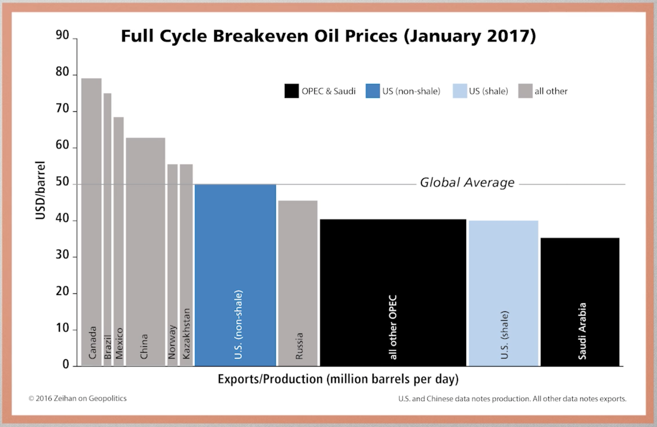
Above is a bar chart showing the break-even price for various oil-producing countries and OPEC. The ‘shale revolution’ has allowed the United States to produce a large portion its oil cheaper than any country in the world except Saudi Arabia. The dramatic fall in the price of oil (due in part to US production increase) hurts expensive ‘tar sands’ oil producing countries like Canada and Venezuela.
Tourism Rankings 2017
The map above displays the world’s countries sized by international tourism receipts in 2017. The top ten can be seen in tabular view below:
A few things jump out. The US gains more from international tourism than any other country by a factor of 3 and China spends more aboard than any other country by a factor of 2! Macau (ranked 9th) has three times the gambling revenue of Las Vegas, with much of this money origination in mainland China and spend ‘internationally’ in Macau. (Hong Kong ranks 11th with 33 billion in receipts in 2017) If Hong Kong, Macau, and Taiwan were counted as one country on this list, it would rank 2nd with 81 billion in receipts.
3 Religious Worlds
The map above is clustered into three groups depending on religious adherence: Magenta — the ‘Christian World’, Cyan — the ‘Muslum World’, and Yellow — the ‘Eastern World’. The darker the color, the higher the percentage of religious adherence. By total population: Magenta/Christians 2.4 billion (33%), Cyan/Muslim 1.8 billion (24%), and Yellow/Eastern 2.1 billion (29%)
Former USSR Population Change
Above is map color coding the former USSR countries by population change from 1989 to 2018. Surprisingly, several nations have decreased in population over the past 30 years! The largest decrease comes from Georgia which has 31.44% less population than it did in 1989. Contrast this with Azerbaijan (just across the border) which as increased by 40.7% over the same time period. For comparison, the United State had a population of 246.8 million in 1989 and a population of 325.7 million today (31.9% increase).