
Income & Wealth Inequality Over Time 1995-2020


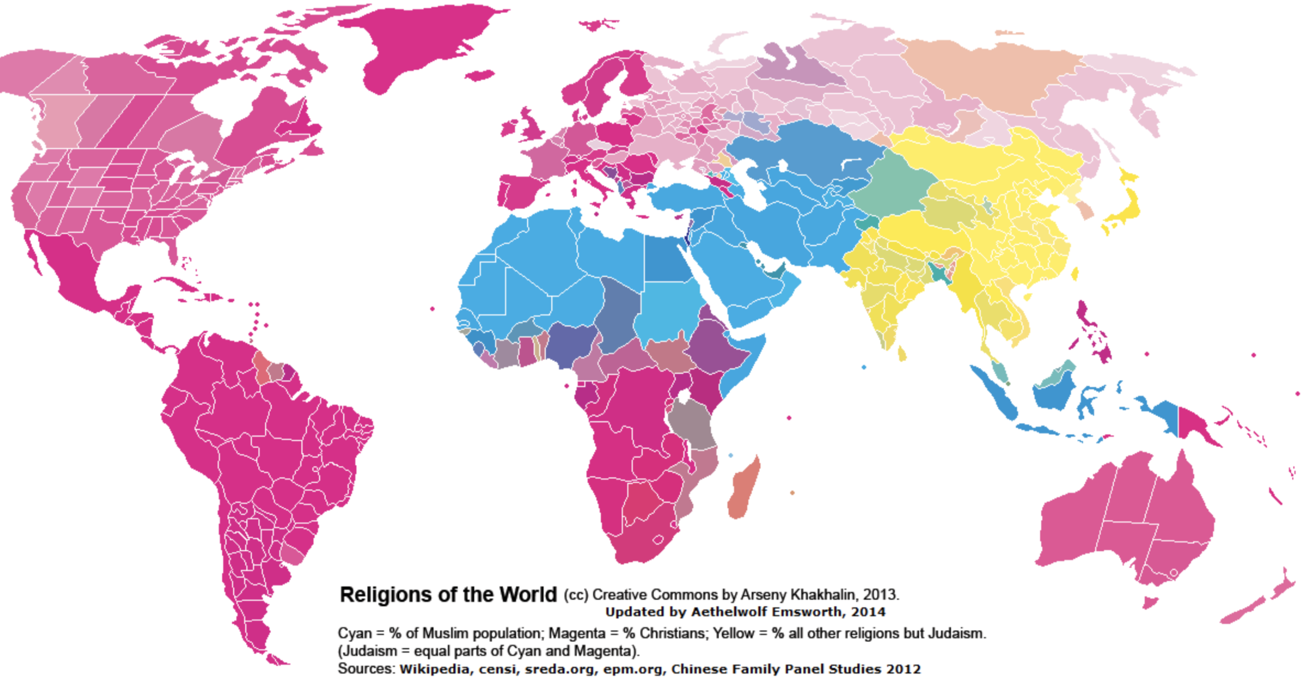
The map above is clustered into three groups depending on religious adherence: Magenta — the ‘Christian World’, Cyan — the ‘Muslum World’, and Yellow — the ‘Eastern World’. The darker the color, the higher the percentage of religious adherence. By total population: Magenta/Christians 2.4 billion (33%), Cyan/Muslim 1.8 billion (24%), and Yellow/Eastern 2.1 billion (29%)

Above is map color coding the former USSR countries by population change from 1989 to 2018. Surprisingly, several nations have decreased in population over the past 30 years! The largest decrease comes from Georgia which has 31.44% less population than it did in 1989. Contrast this with Azerbaijan (just across the border) which as increased by 40.7% over the same time period. For comparison, the United State had a population of 246.8 million in 1989 and a population of 325.7 million today (31.9% increase).
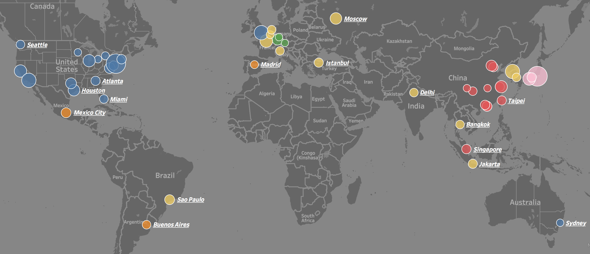
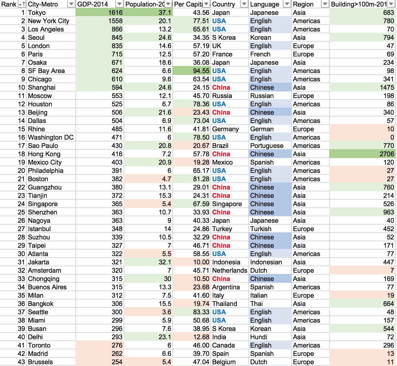
Visit the link to interactively play with the data: https://public.tableau.com/profile/brad.ballard#!/vizhome/Top50CitiesbyGDPComparision/Dashboard
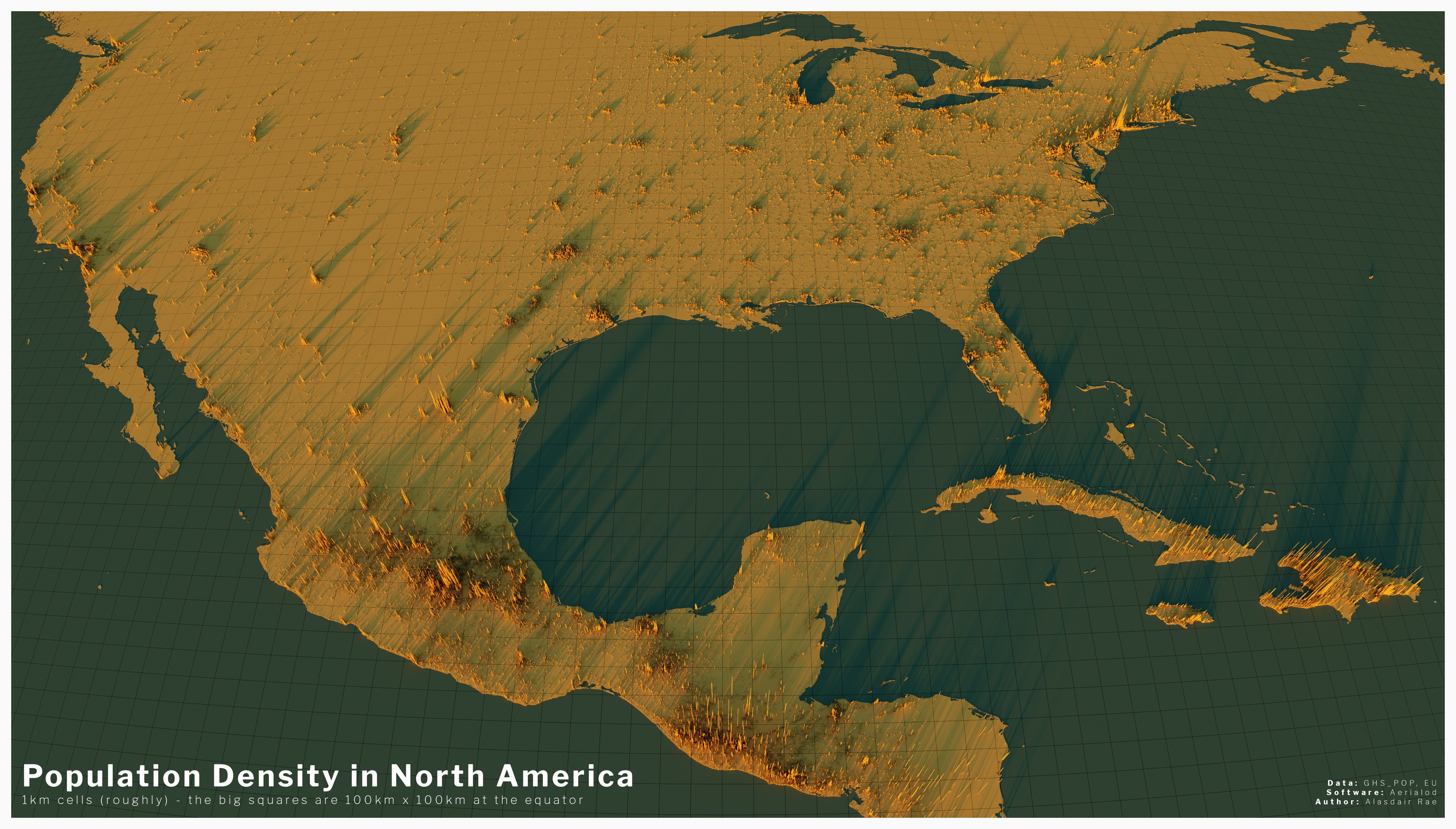
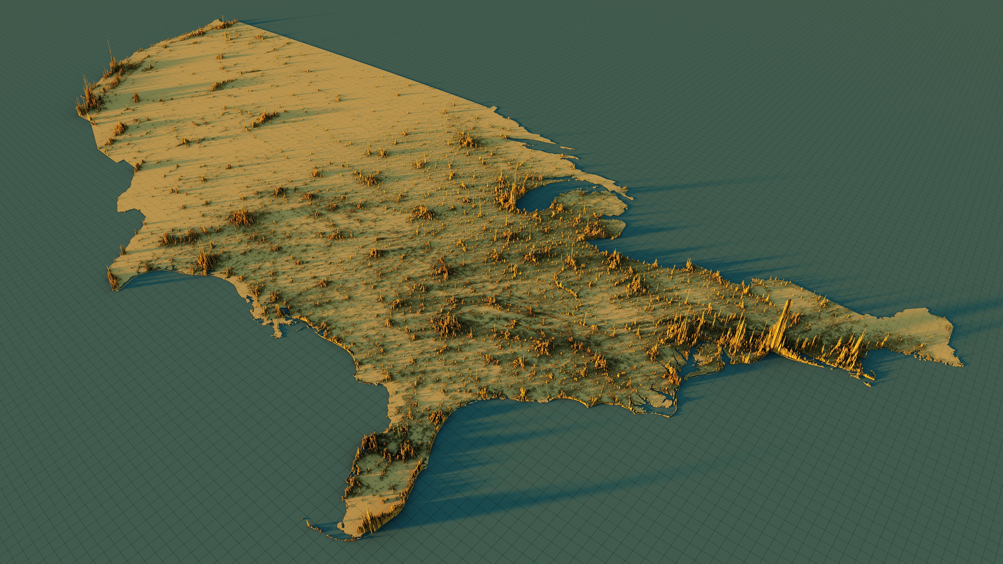
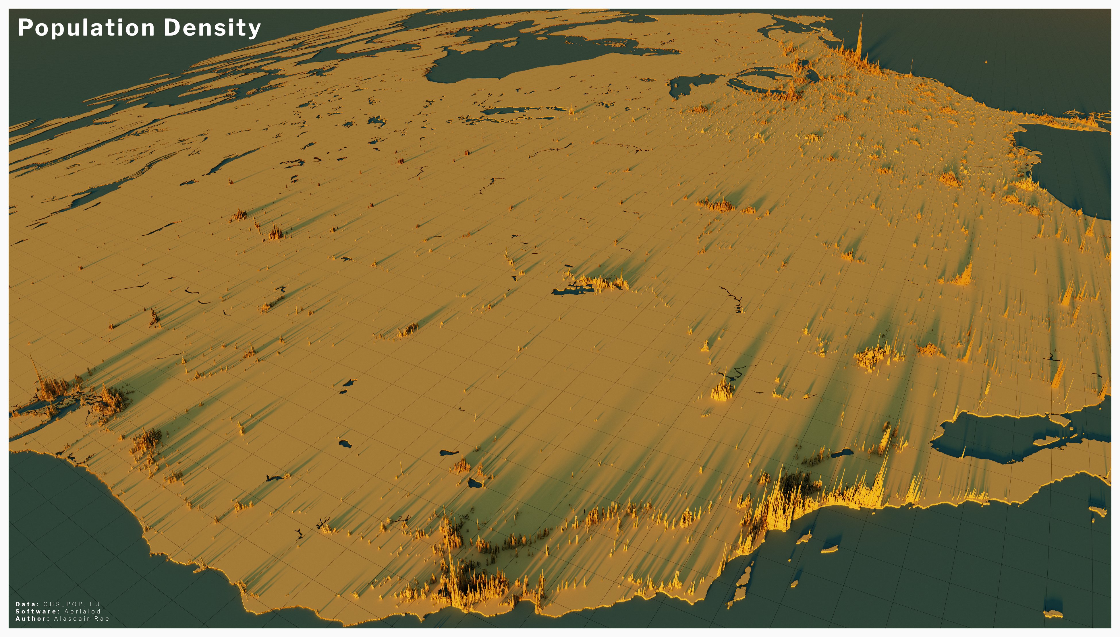
We often see lists of GDP by country, but rarely by city. This is puzzling because most countries are empty space and GDP output is concentrated in a few small areas. For example, about 50% of US GDP is generated on only 2% of its area – namely: cities. This is also the case around the world.
To put the importance of these 50 cities into perspective. The top 25 cities in the world generate 15.5 trillion dollars in GDP or 20.1% of total world GDP (2014 numbers). They do this with only 4.7% of world population and have a GDP per capita of 44 thousand dollars (4 times world average). The top 50 cities in the world generate 22.6 trillion dollars in GDP or 29.4% of total world GDP (2014 numbers). They do this with only 8.2% of world population and have a GDP per capita of 37 thousand dollars (3.5 times world average).
The GDP centers are clustered in geographic regions in North America, Western Europe, and Eastern Asia. Only a few cities are represented from the southern hemisphere and none from Africa or the Middle East. Asian cities tend to be larger in population, number of skyscrapers, and lower in GDP per capita. North American and Europen cities tend to have small-to-medium populations, low density, and a high GDP per capita.
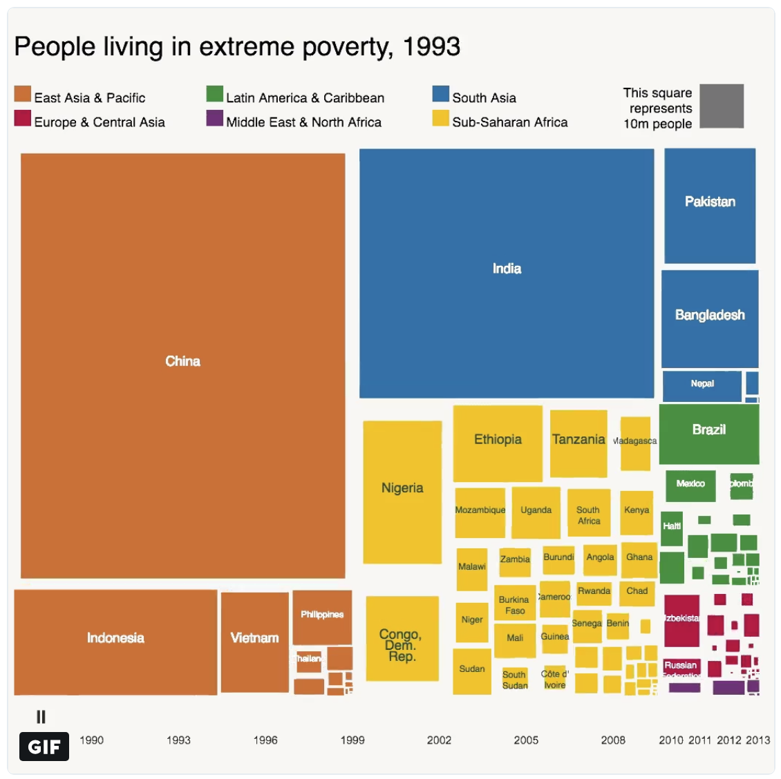
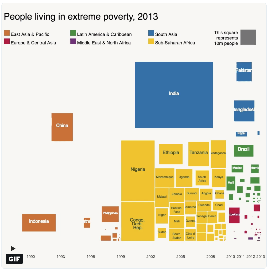
Above is two snapshots of the number of people living in extreme poverty for various countries around the world. Countries are colored by the geographic region they are in — East Asia & Pacific, South Asia, etc. The first snapshot is from 1993 and the other is 20 years later in 2013. What is striking the decrease in extreme poverty in China and for the East Asia/Pacific region generally. For a comparison, China and India have comparable population 1.4 billion and 1.3 billion respectively — however, China has been much more successful in lifting a much larger proportion of its citizens out of poverty; presumably due to double-digit GDP growth year after year over this period.
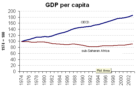
Another comparison: Africa has a population of 1.2 billion, again comparable in size to both India and China. Yet, the number of people in extreme poverty has actually increased over the past 20 years with the largest gains coming from Nigeria (Africa’s most populous country) and the Democratic Republic of the Congo. Economic growth numbers are typically hard to come by for many countries in Africa due to a large proportion of the workforce working in the informal economy (black market). Although, the poverty numbers (shown above) and the GDP per capita estimates (shown below) seem to indicate that African’s experienced negative GDP per capita growth throughout the 1970s, 1980s, and early 1990s.
The following are highlights from the World Urbanization Prospects 2014 report published by the United Nations Department of Economic and Social Affairs

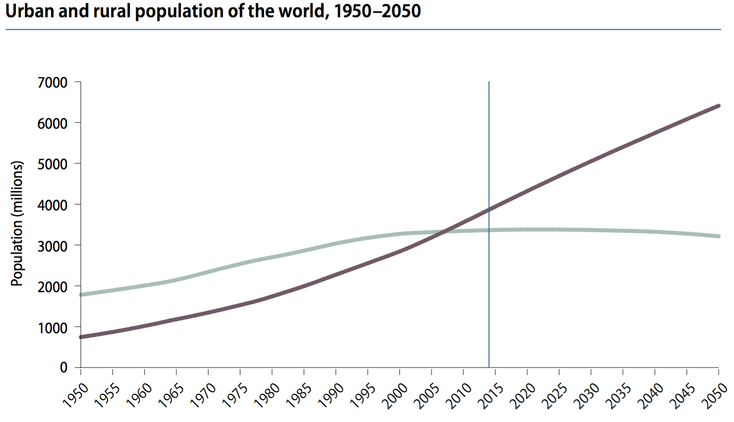
Globally, 54% of the world population lives in an urban area with at least 500k people. (note: urban in purple, rural in grey) The world has become more urban over time and is projected to continue.
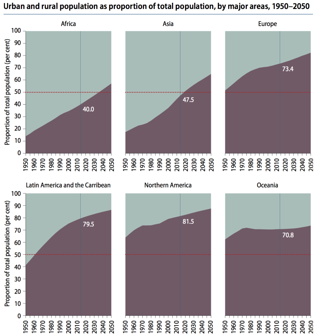
Urbanization differs across regions, with North American and Europe being the most urbanized — Africa and Asia least urbanized.
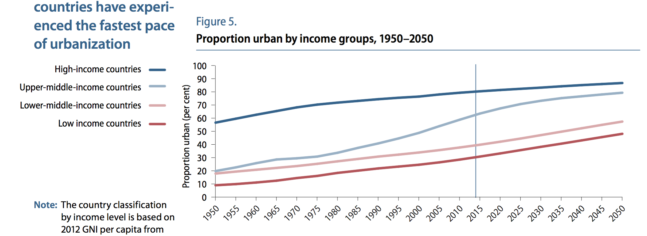
High-income countries tend to be more urban (80%) than low-income countries (30%) — implying that urbanization and development are related
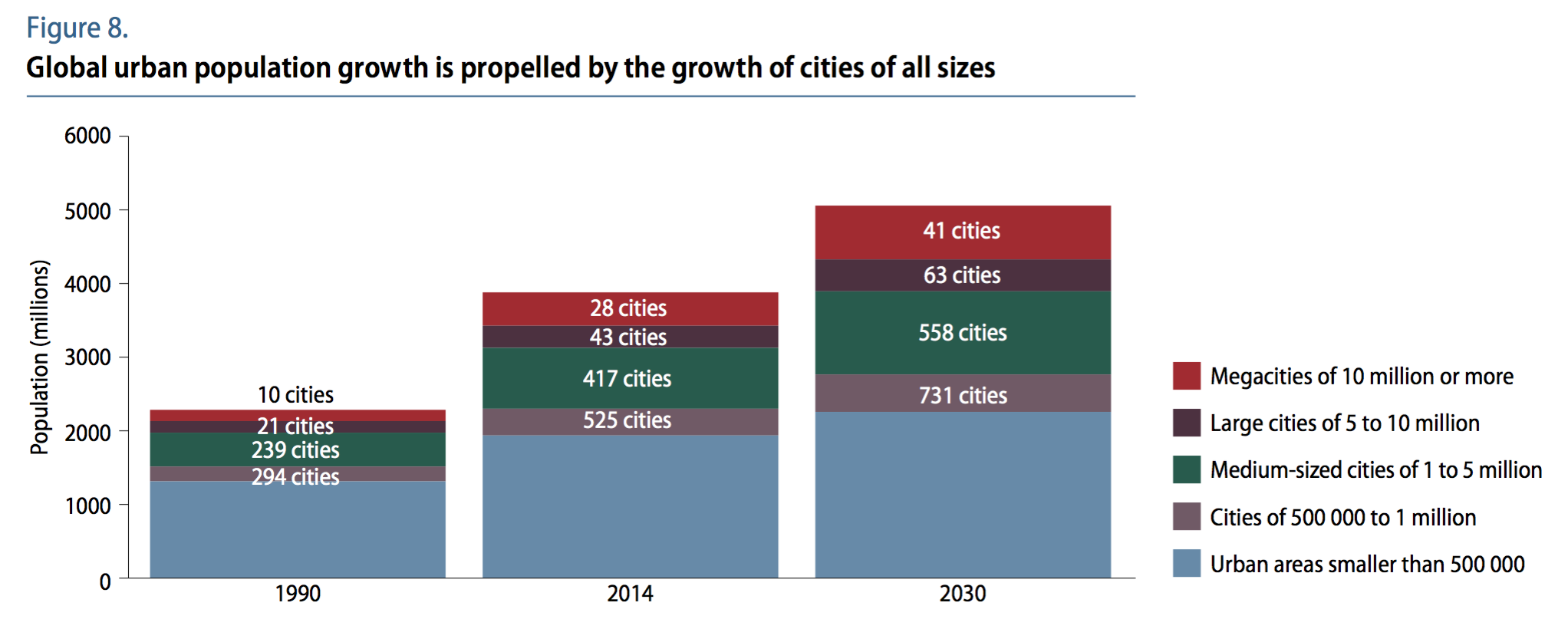
Urbanized areas are displayed below in various groups (ranging from small cities to megacities) for the years 1990, 2014, and projected 2030.
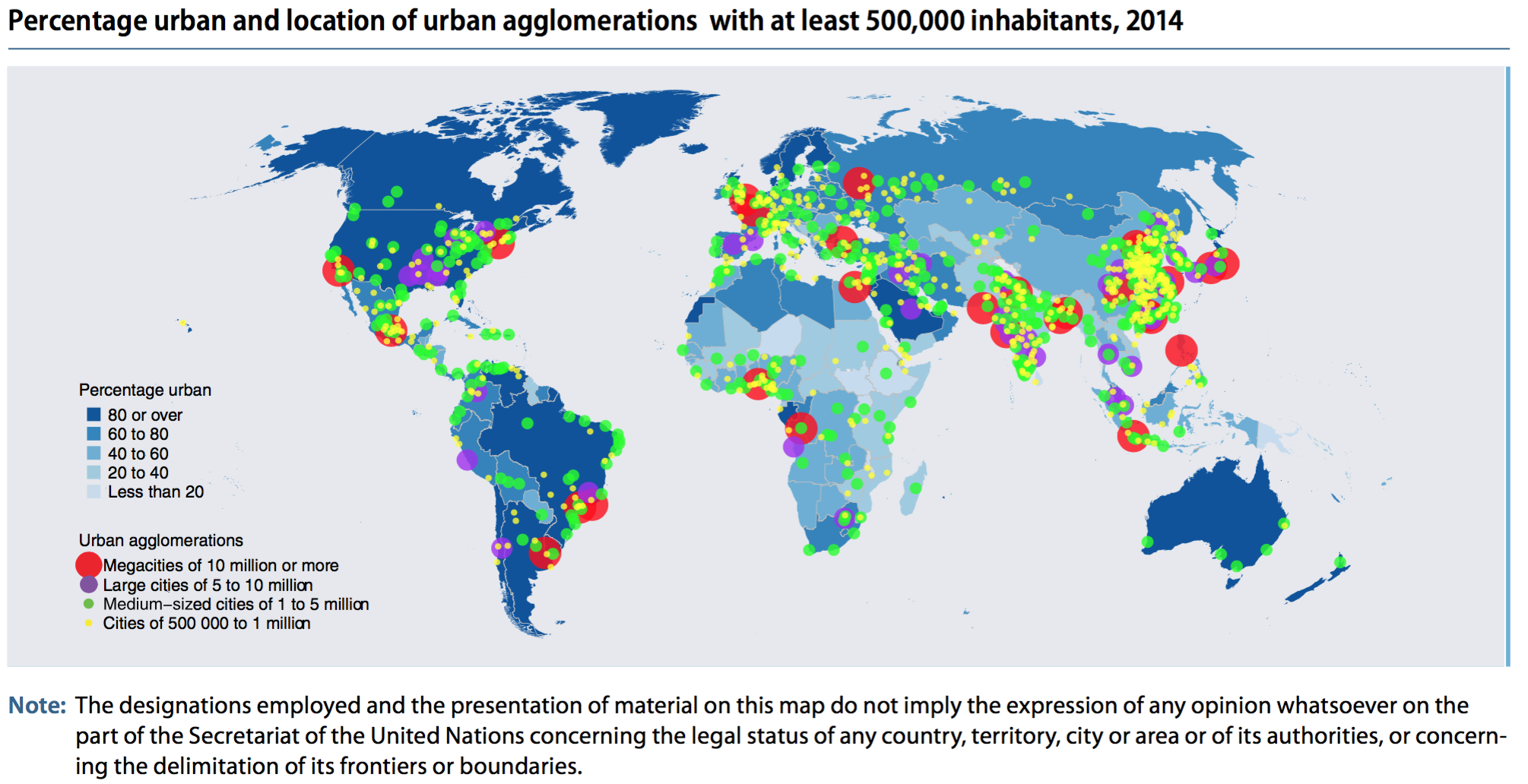
Urbanized areas (500k+ population) in 2014 are displayed on the map below
Other interesting notes:
Africa and Asia are home to 90% of the worlds rural population and have the lowest rate of urbanization by content 40% and 48%.
China, India, and Nigeria will account for 37% of urban pop growth between now and 2050.
One in eight people live in one of the world’s 28 megacities (10m+ pop)
Link to the full report here: https://esa.un.org/unpd/wup/publications/files/wup2014-highlights.pdf
Github is the world’s largest host of source code in the world with more than 57 million repositories. The site also has 26 million users as of March 2017. Software engineers and programmers actively use Gitbub to post projects and to collaborate in teams using versions control. It’s interesting to ask where do these programmers live – who and where is the user base on the site?
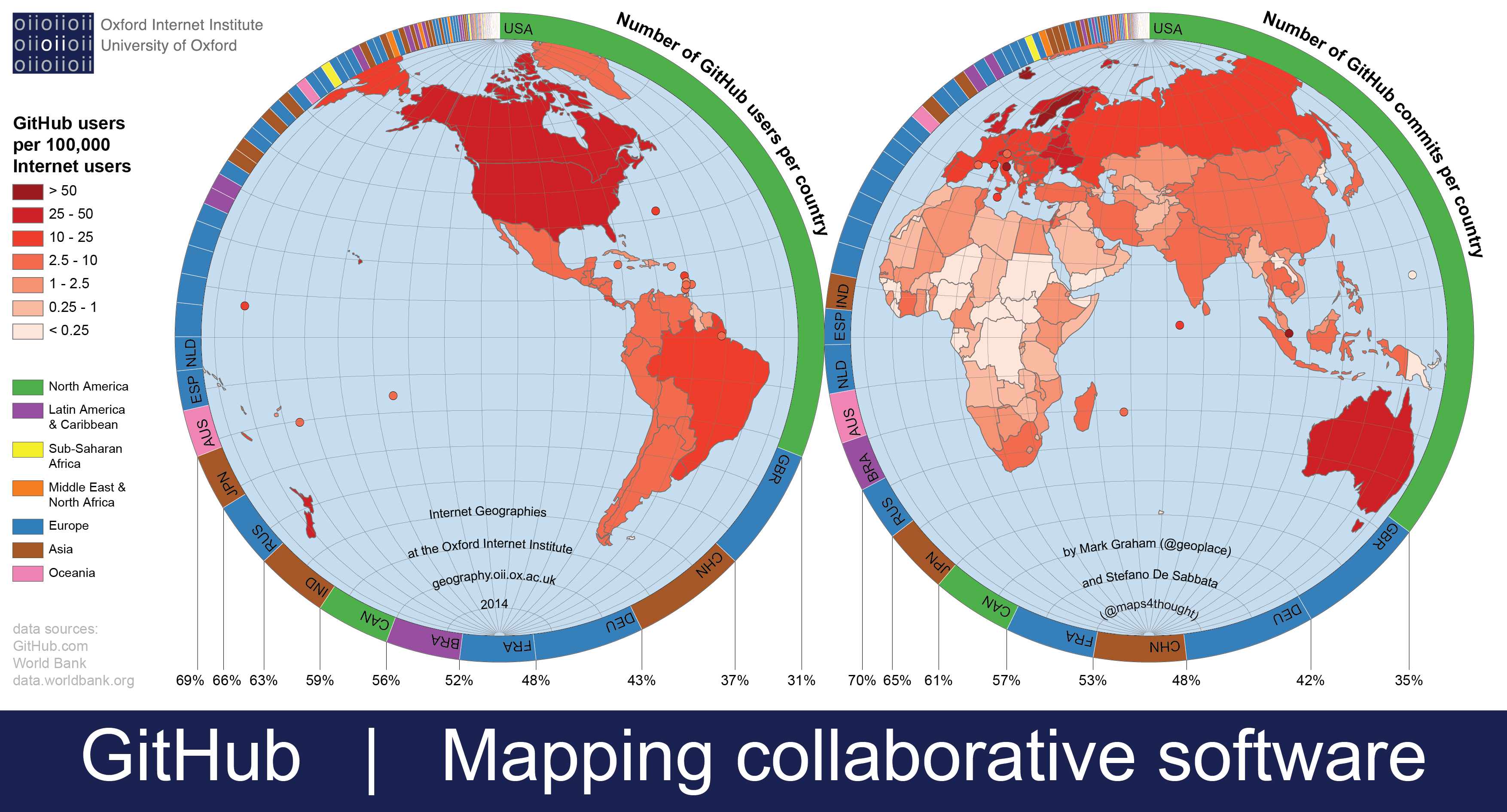
The map above displays the percentage of Github users by country and commits per country. The United States comprises 31% of Github’s users and 35% of Github commits. The next largest country is the United Kingdom with 6% of users and 7% of commits. Followed by Germany (5%, 6%) and China (6%, 5%). The top ten countries compose 70% of the users and over 70% of the commits. They are: US, UK, Germany, China, France, Brazil, Canada, India, Russia, and Japan.
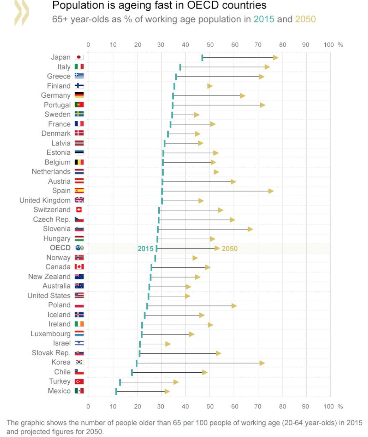
In 2015, the percentage of the population 65+ years old in OECD countries was 28%, this figure is expected to rise to over 50% by 2050. The graphic above display where each country stands or the population projects in the next 40 years. Japan, Italy, and Greece are already the oldest countries with 46%, 37%, and 35% of their population over 65 years old (in 2015), by 2050 these countries are projected to continue to lead with 78%, 75%, and 73% respectively. This is amazing to imagine. Think about it, Japan in 2050 with nearly 80% of its population over 65 years old. What will a country like that look like?
On the other end of the spectrum in the OCED – Mexico and Turkey are looking stable with only 35% and 37% of their population above 65 years old. This figure is approximately already what the average OCED country is at. The US, Canada, Australia, and New Zealand all look stable with a healthy inflow of immigrants that aid in slowing the growth in elderly people as a fraction of the overall population. Side note: South Korea is projected to undertake the most drastic population change. It is currently one of the youngest countries in the OCED, but in 40 years it will be among the oldest – moving from 19% of its population over 65 to over 70% by 2050.
