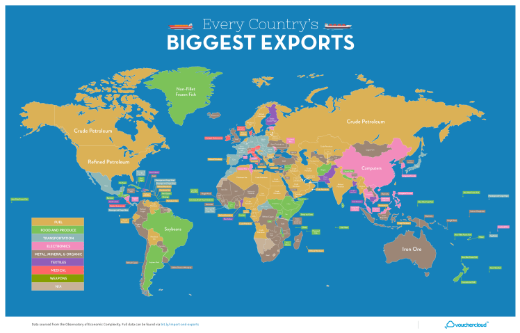
Europe GDP per Capita (PPP) 2017

Screen Shot 2017-11-10 at 12.17.54 PM.png

Above is a map of Europe displaying whether a country has a GDP per capita less than or greater than Turkey. The data is from the IMF in Oct 2017. Turkey has a GDP per capita of $24,912 at Purchasing Power Parity (PPP). The data displays the income divide Europe where all of western Europe and Russia (labeled in Blue) have a higher standard of living than Turkey and most the former USSR and former Yugoslavia countries (labeled Red) have a lower standard of living than Turkey. The income differences help to explain some of the internal migration within Europe.

Advertisement

The World in Money

money-world.jpg

Above is a map of the world displaying each country’s currency projected on top of the country’s territory. There are 180 currencies in the world – the British pound is the world’s oldest currency that’s still in use, dating back to the 8th century! Despite all these currencies, the exchange market is dominated by only a few (shown in the bar chart below). The US dollar and Euro makeup between 60-70 percent of the market and additionally about 30 percent of the world use the USD/Euro or have their currency pegged to one of them.

Screen Shot 2017-10-17 at 1.57.18 PM.png

Working Class Affordability 2017

Screen Shot 2017-09-05 at 3.23.54 PM.png

The above map was created on howmuch.net (https://howmuch.net/) showing how much a working class family can save or be indebted living in various cities across the United States. The software allows you to select different criteria – such as the number of working adults in the household, how much they earn, the number of children, amount spent on food, and size of the house in square feet – the algorithm then produces a map (such as the one above) that displays where the most and least affordable places for your family to live. The size of the bubbles are a larger dark shade of red for unaffordable locations or are a larger dark shade of green for affordable locations. For example, the map above is generated for a family of four with two incomes – a home appliance repairer and a manicurist/pedicurist with a low-cost food plan living in a 1500 sq ft home. This family would need an additional $91.2K annually to afford to live in New York City or additional $83.3K to live in San Francisco. Conversely, the family could save $10.1K annually if they lived in Glendale, Arizona.

US City Commute Patterns 2008

Screen Shot 2017-09-04 at 10.47.14 PM.png

Above is a graph displaying the percentage of people that commute by public transit on the x-axis and the percentage commuting by car on the y-axis for various cities around the United States. The size of the bubble relates the workforce population of each city. There doesn’t appear to be a relationship between the size of the city’s population and the percentage of those taking public transit, but if one looks at city density a relationship is clear. Of the top 20 cities in the US by population, the highest density in order are: New York City, San Francisco, Boston, Chicago, Miami, Philadephia, and Washington DC. With exception of Miami (commute data not listed), all of top 6 highest density cities also have the highest fraction of their workforce commuting by public transit.

BRIC Comparison

BRIC-compare.png

Above is a comparison of GDP per capita (nominal) figures for BRIC countries – that is, Brazil, Russia, India, and China. The data displayed ranges from 1980 through 2016. A few things stand out, both Brazil and Russia’s economies were overvalued post-2007 financial crisis, driven by high oil prices that have regressed back to the mean and inflated currently values. China economy has leveled off in recent years and India is still much poorer than the other three BRIC economies, yet show promise moving forward.

European Union Unemployment Rate 2017

Screen Shot 2017-08-09 at 12.29.33 PM.png

Above is a map displaying the unemployment rate for European Union member states as of May 2017. What sticks out is the slow economic recovery for the southern European states post-financial crisis, such as: Greece (with an unemployment rate of) 22.5%, Spain 17.5%, Itlay 11.3%, and Croatia 10.7%. Contrast this with the unemployment rate in the United States during the same period of 4.3%. The EU average unemployment rate stands at 7.8%, nearly twice as high of the US! An economic analysis of labor policies in most EU countries leads to this result as there is less fixability in the labor force among other factors. Despite this performance for the European Union as a whole, some countries are performing above average and are on par with the US in employment rate such as: Germany, Austria, Czech Republic, UK, Poland, and others.

SF Bay Area Median Home Price Apr 2017

Screen Shot 2017-06-02 at 10.20.10 AM.png

Above is a map displaying the median home prices for cities in the SF Bay Area as of April 2017 on Zillow. The most expensive cities in order are: Palo Alto 2.5 million, Cupertino 1.8m, Mountain View 1.5m, Sunnyvale 1.5m, Redwood City 1.3m, San Francisco 1.2m.

Below is a chart displaying the median home price changes for the four largest cities in the Bay Area since Jan 2012. Home prices have doubled in the past five years with cities such as Oakland up 123%, Mountain View up 112%, and Palo Alto up 103% over the period.Screen Shot 2017-06-02 at 10.24.56 AM.png

Country Exports to the US

US imports from Americas.png

The map above displays each country in the Americas largest export to the United States. It is color coded by various categories listed in the legend. Note that Cuba is grayed out with “No Data” as the US does not trade with them due to the long-standing embargo. Latin America’s two largest economies (Brazil and Mexico) export industrial goods to the US – Planes, Spacecraft, and Cars – while most other countries in South America export natural resources (Sugar, Gold, and Oil). The Caribbean typically exports food products and textiles: bananas, fish, t-shirt, sweaters, etc.

Europe Income Brackets

POST_Europe GDPpc.png

Above is a map of Europe color-coded into three income brackets – Dark green: greater than 40k euros per capita, Light green: between 20k and 40k euros per capita, and red: less than 20k euros per capita. Note the values are calculated in Purchasing Power Standards (PPS) a metric used by Eurostat for cross-country comparisons. PPS tires to correct for cost of living and price level differences, especially among nations with different currencies. For comparison to the United States, 40k euros converts to 44k dollars (2017 prices). US GDP per capita is 55k dollars, with the highest continental state: New York at 72k USD and lowest: Mississippi at 35k USD. This means the area’s in dark green in the map above (among the highest in Europe) would rank on the lower end of US states, around 40th out of 50.