People in Poverty, then and now

Screen Shot 2018-04-19 at 8.31.01 AM.pngScreen Shot 2018-04-19 at 8.31.35 AM.png

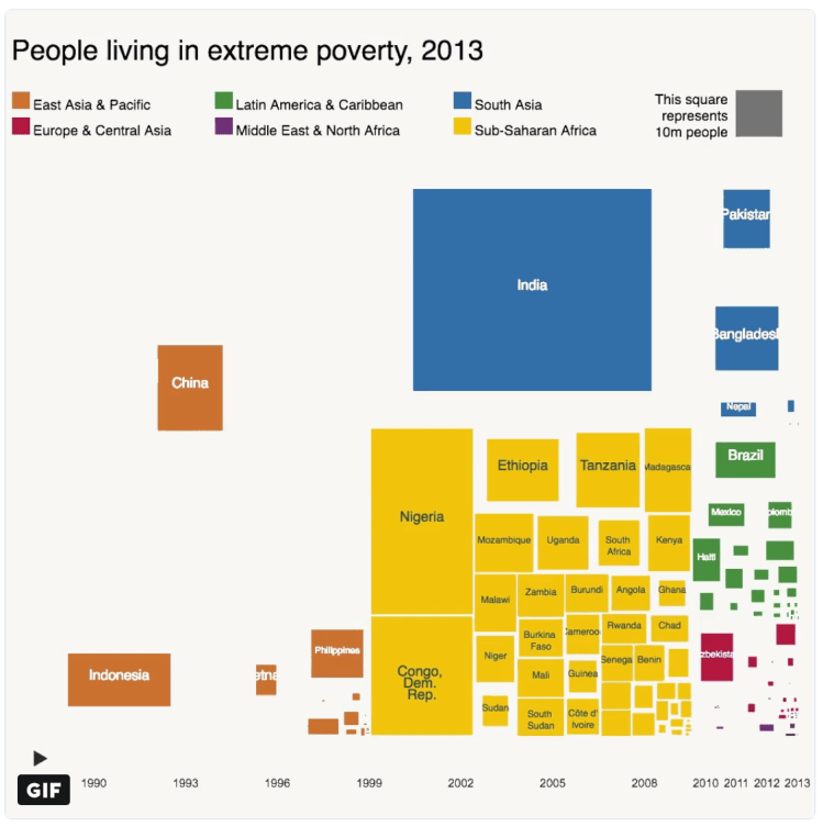
Above is two snapshots of the number of people living in extreme poverty for various countries around the world. Countries are colored by the geographic region they are in — East Asia & Pacific, South Asia, etc. The first snapshot is from 1993 and the other is 20 years later in 2013. What is striking the decrease in extreme poverty in China and for the East Asia/Pacific region generally. For a comparison, China and India have comparable population 1.4 billion and 1.3 billion respectively — however, China has been much more successful in lifting a much larger proportion of its citizens out of poverty; presumably due to double-digit GDP growth year after year over this period.

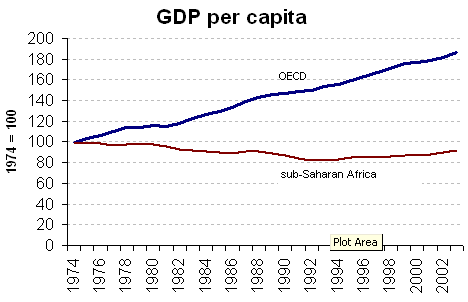
Another comparison: Africa has a population of 1.2 billion, again comparable in size to both India and China. Yet, the number of people in extreme poverty has actually increased over the past 20 years with the largest gains coming from Nigeria (Africa’s most populous country) and the Democratic Republic of the Congo. Economic growth numbers are typically hard to come by for many countries in Africa due to a large proportion of the workforce working in the informal economy (black market). Although, the poverty numbers (shown above) and the GDP per capita estimates (shown below) seem to indicate that African’s experienced negative GDP per capita growth throughout the 1970s, 1980s, and early 1990s.

Screen Shot 2018-05-06 at 3.45.28 PM.png

Advertisement

World Urbanization Prospects 2014

The following are highlights from the World Urbanization Prospects 2014 report published by the United Nations Department of Economic and Social Affairs

Screen Shot 2018-04-05 at 12.22.49 PM.png

Globally, 54% of the world population lives in an urban area with at least 500k people. (note: urban in purple, rural in grey) The world has become more urban over time and is projected to continue.

Screen Shot 2018-04-05 at 12.15.17 PM.png

Urbanization differs across regions, with North American and Europe being the most urbanized — Africa and Asia least urbanized.

Screen Shot 2018-04-05 at 11.55.25 AM.png

High-income countries tend to be more urban (80%) than low-income countries (30%) — implying that urbanization and development are related

Screen Shot 2018-04-05 at 11.56.57 AM.png

Urbanized areas are displayed below in various groups (ranging from small cities to megacities) for the years 1990, 2014, and projected 2030.

Screen Shot 2018-04-05 at 11.58.24 AM.png

Urbanized areas (500k+ population) in 2014 are displayed on the map below

Screen Shot 2018-04-05 at 11.56.03 AM.png

Other interesting notes:

Africa and Asia are home to 90% of the worlds rural population and have the lowest rate of urbanization by content 40% and 48%.

China, India, and Nigeria will account for 37% of urban pop growth between now and 2050.

One in eight people live in one of the world’s 28 megacities (10m+ pop)

Link to the full report here: https://esa.un.org/unpd/wup/publications/files/wup2014-highlights.pdf

The Country Across the Ocean

eNrIVp3.jpg

The map above displays the western hemisphere and shows with extending a horizontal line (longitudinal) which country is across the ocean from it. This is an interesting perspective from which to view the world given that these matching countries are likely to share the same climate and culture based on their position in the world. It’s amazing to see the north-south size of Africa projected onto the Americas – Its northern reach with Morocco across from (approximately) Washington DC in the United States to its southern point with South Africa across from Buenos Aires. Another stunning display is the north-south size of Japan which it the closest country to virtually the entire west coast of the US.

Africa Birth Rate

39zickwf0boz.png

No continent in the world outside of Africa averages more than 2.5 children per women – Africa averages 5! A society or country will remain at the same population level if it remains at the replacement level – 2.1 children per women – below this point, the location’s population is decreasing. Africa’s rate of 5 children per women is well above the replacement level, if fact, at this rate the continent will double in population in the next 30 years. As shown in the map of above, much of this growth is happening between Sub-Saharan Africa and north of southern Africa.

It also important to note the differences in birth rates intra-country. Nigeria is the most populous country in Africa with 185 million people and is the 7th largest in the world. Its fertility rate is 5.5 children per women which is the highest rate for any country already above 100 million people. The fertility rate is not evenly distributed (as pictured below) with a high rate of 8.4 children per women in rural northern regions compared with 3.8 in coastal urbanized areas. A staggering statistic is that: According to 2013 data, approximately 17% of Zamfara state’s women (the highest figure of 8.4 on this map) are currently pregnant!oeyem8ltks5z.png

Children per Woman

POST_Child_Women.png

There are currently 7.4 billion people on earth. This number is expected to rise to 10 billion by 2080 (based on U.N. estimates). These numbers beg the question – just how many people can the planet support? And, in what regions is population growing, remaining stable, or decreasing?

The map above colors each county by the number of children a woman is expected to have on average. Virtually all of the developed nations, such as: the US, Canada, Europe (except France), Japan, etc. average somewhere between 1-2 children per woman. This rate is actually below the replacement rate (2.1 children per women) indicating that the countries (labelled in blue above) will have decreasing populations internally over the coming decades. This does not mean, however, that the country’s population will decrease, that will depend on the number of immigrates it attracts. For example, the US and Canada attract the largest number of immigrates from across the globe which continue to bolster their population despite low birth rates internally. Conversely, a country with a low birth rate and restrictive immigration will show signs of drastic population decrease as in Japan – it has one of the lowest birth rates in the world with only 1.4 children per woman and has lost population in the past decade.

On the other end of the spectrum, Africa is exploding in population. The continent today has roughly 1 billion people. This figure is expected to double to 2 billion in just 30 years! Some countries – Niger, Mali, Burundi, Somalia – average more than 6 children per woman. It will be a time of drastic demographic change in central Africa over the next generation that may threaten the stability of the region further.

Middle income countries are mostly labeled in green in the above map indicating a healthy, moderate growth in population. For example, India (the world’s 2nd most populated country) averages 2.5 children per woman and Indonesia (the world’s 4th most populated country) averages 2.2.

How Old is Your Country?

The map below displays countries by the median age per citizen. Germany and Japan are the world’s oldest countries with an average age of 46; Conversely, Niger and Uganda are the world’s youngest countries with an average age of 15!

This map signals the future population tends coming — Europe is the world’s oldest continent by median age has been enmeshed in economic stagnation and debt crises (likewise for Japan) — These trends are likely to persistent into the future. Africa is the world’s youngest continent and is full of potential and economic growth. The current projections are Africa’s population will double from 1 billion to 2 billion people in the next 30 years. These drastic demographic changes are likely to upheave society (and possibly governments) in the region as these energetic youngsters will reshape the status quo.

POST_Avg age by country.png