Income & Wealth Inequality Over Time 1995-2020


The map above displays from whom countries import more from – either the US, EU, China, or Russia. Border countries import the most from their neighbor country and this trading influence propagates outward. Generally speaking, the US is the export center for a North American zone, France+Germany for a European zone, Russia for a Eurasian zone, and China an Asian zone + the nearly the entire southern hemisphere.

The World GDP as a pie chart. A rough and simple way to look at is: US ~1/4, China ~1/5, Europe ~1/4, Japan ~5%, India ~5%, everyone else ~20%.

It’s tough to compare costs across cities in different countries, but this study tries to do just that. It’s trying to answer the question: What is the average cost of a weeklong holiday trip to selected cities? The question is subject to the predefined assumptions – The trip is for two adults staying in Airbnb, walking & public transit, and doing typical tourist daytime activities like visiting museums, shows, or day-trips.
The graphic above is color-coded by region. The range of costs across cities in the sample fit closely to a normal distribution with the majority of cities falling in the $1000-2000 cost window. Africa and Asia have most of the cheaper cities while Western Europe and Coastal cities in the USA are the most expensive to visit.
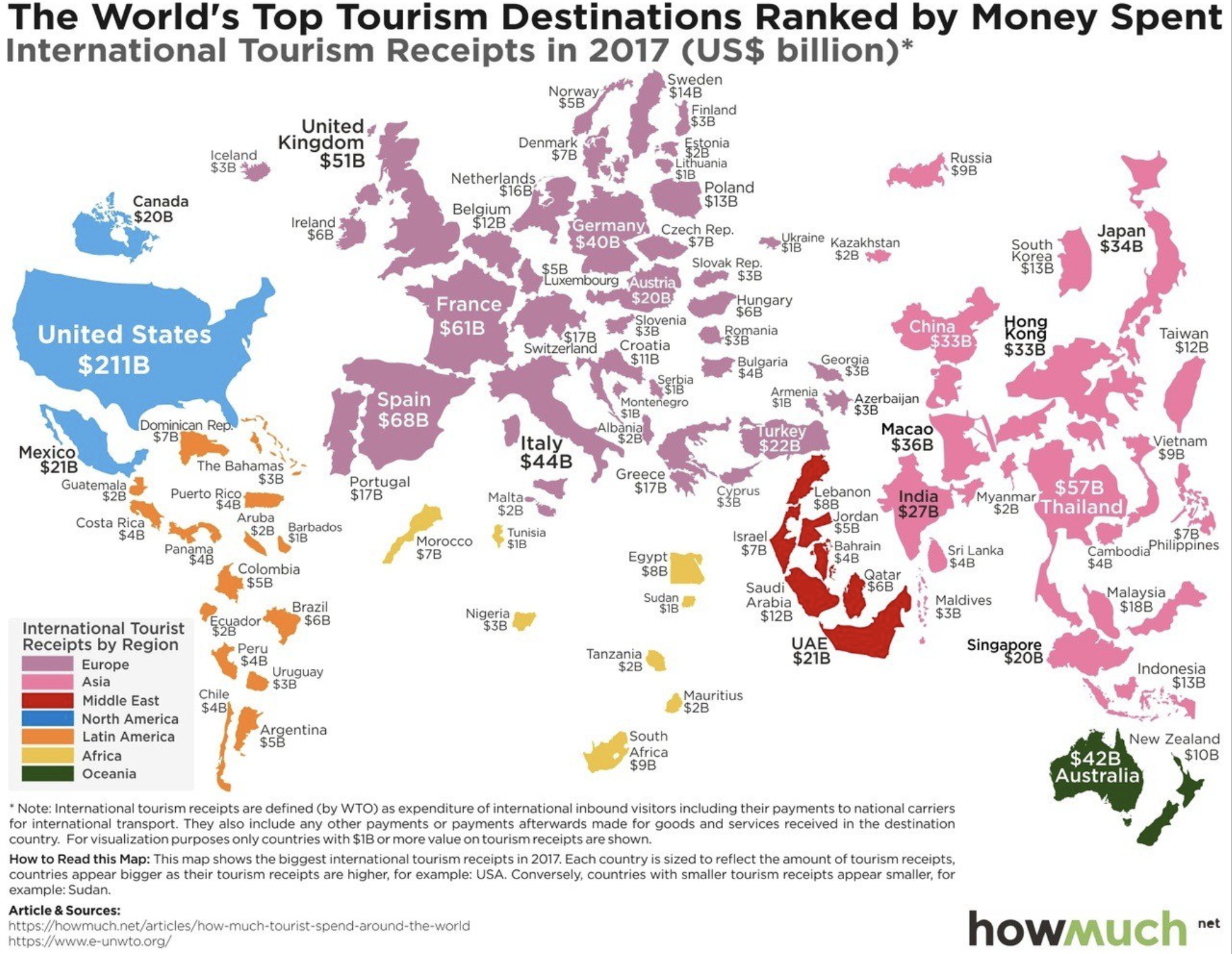
The map above displays the world’s countries sized by international tourism receipts in 2017. The top ten can be seen in tabular view below:

A few things jump out. The US gains more from international tourism than any other country by a factor of 3 and China spends more aboard than any other country by a factor of 2! Macau (ranked 9th) has three times the gambling revenue of Las Vegas, with much of this money origination in mainland China and spend ‘internationally’ in Macau. (Hong Kong ranks 11th with 33 billion in receipts in 2017) If Hong Kong, Macau, and Taiwan were counted as one country on this list, it would rank 2nd with 81 billion in receipts.

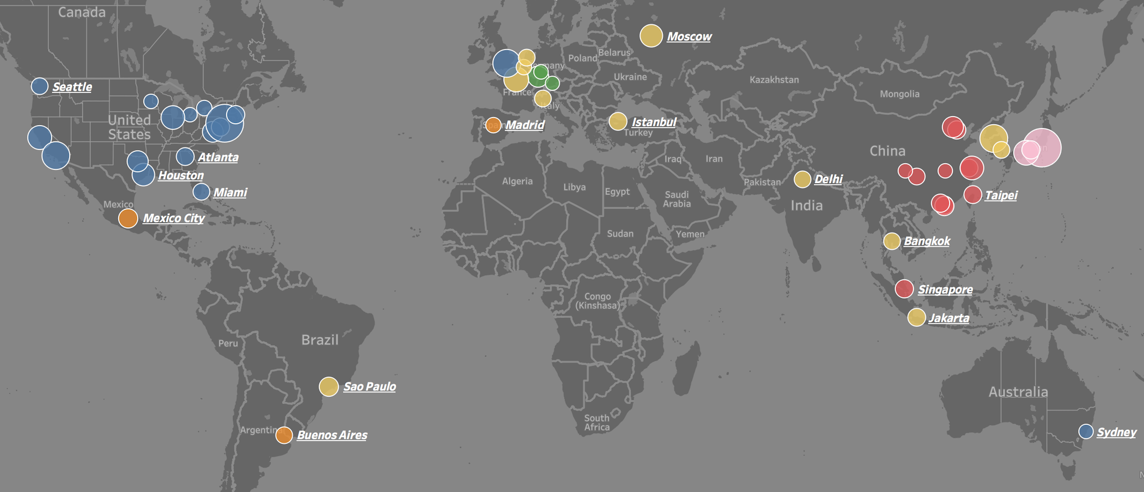
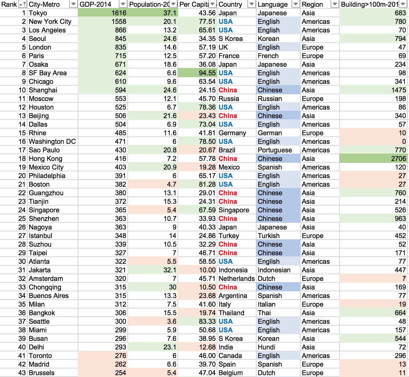
Visit the link to interactively play with the data: https://public.tableau.com/profile/brad.ballard#!/vizhome/Top50CitiesbyGDPComparision/Dashboard
We often see lists of GDP by country, but rarely by city. This is puzzling because most countries are empty space and GDP output is concentrated in a few small areas. For example, about 50% of US GDP is generated on only 2% of its area – namely: cities. This is also the case around the world.
To put the importance of these 50 cities into perspective. The top 25 cities in the world generate 15.5 trillion dollars in GDP or 20.1% of total world GDP (2014 numbers). They do this with only 4.7% of world population and have a GDP per capita of 44 thousand dollars (4 times world average). The top 50 cities in the world generate 22.6 trillion dollars in GDP or 29.4% of total world GDP (2014 numbers). They do this with only 8.2% of world population and have a GDP per capita of 37 thousand dollars (3.5 times world average).
The GDP centers are clustered in geographic regions in North America, Western Europe, and Eastern Asia. Only a few cities are represented from the southern hemisphere and none from Africa or the Middle East. Asian cities tend to be larger in population, number of skyscrapers, and lower in GDP per capita. North American and Europen cities tend to have small-to-medium populations, low density, and a high GDP per capita.
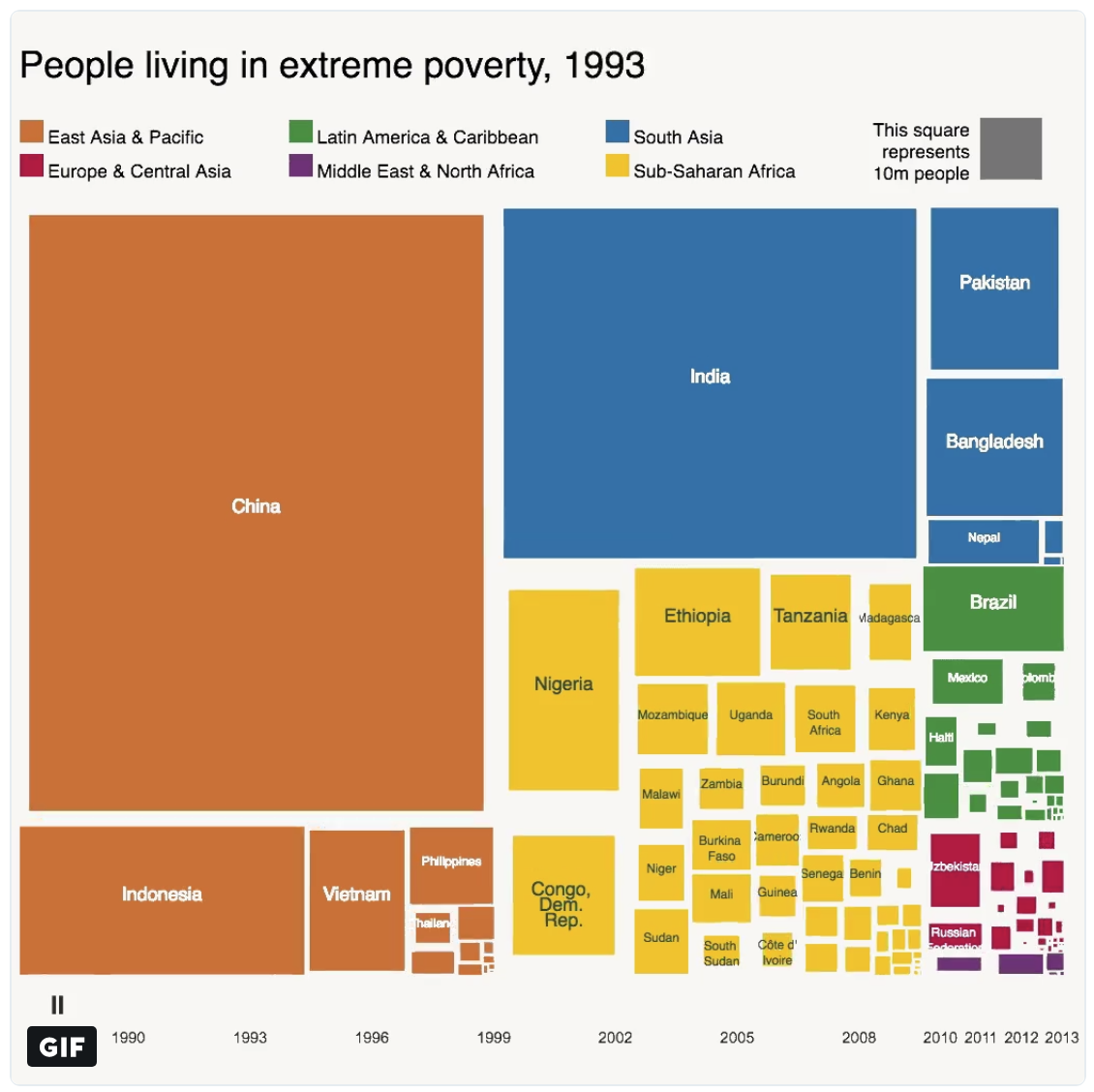
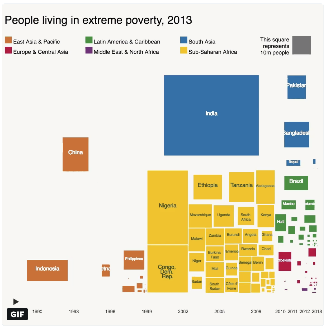
Above is two snapshots of the number of people living in extreme poverty for various countries around the world. Countries are colored by the geographic region they are in — East Asia & Pacific, South Asia, etc. The first snapshot is from 1993 and the other is 20 years later in 2013. What is striking the decrease in extreme poverty in China and for the East Asia/Pacific region generally. For a comparison, China and India have comparable population 1.4 billion and 1.3 billion respectively — however, China has been much more successful in lifting a much larger proportion of its citizens out of poverty; presumably due to double-digit GDP growth year after year over this period.
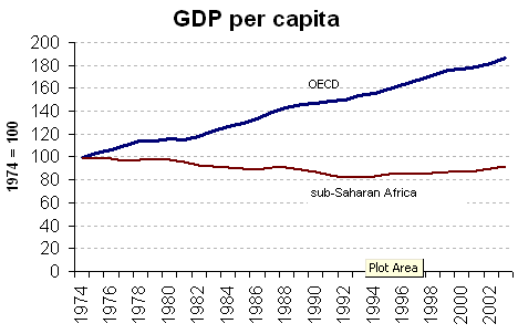
Another comparison: Africa has a population of 1.2 billion, again comparable in size to both India and China. Yet, the number of people in extreme poverty has actually increased over the past 20 years with the largest gains coming from Nigeria (Africa’s most populous country) and the Democratic Republic of the Congo. Economic growth numbers are typically hard to come by for many countries in Africa due to a large proportion of the workforce working in the informal economy (black market). Although, the poverty numbers (shown above) and the GDP per capita estimates (shown below) seem to indicate that African’s experienced negative GDP per capita growth throughout the 1970s, 1980s, and early 1990s.