Former USSR Population Change

POST_PopChange89-18.png

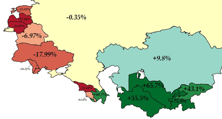
Above is map color coding the former USSR countries by population change from 1989 to 2018. Surprisingly, several nations have decreased in population over the past 30 years! The largest decrease comes from Georgia which has 31.44% less population than it did in 1989. Contrast this with Azerbaijan (just across the border) which as increased by 40.7% over the same time period. For comparison, the United State had a population of 246.8 million in 1989 and a population of 325.7 million today (31.9% increase).

Advertisement

World Map 1957

WorldPowers.jpg

Above is a map of the world in 1957 with highlights displaying various country alliances – NATO/Western allies in Purple/Light Purple, USSR/Communist countries in Orange/Light Orange, and Muslum countries in Green. The map does a great job displaying the encirclement of allies the US had surrounding the USSR, known as the US’s strategy of containment (seeking to prevent the spread of communism to other countries).

Screen Shot 2017-07-24 at 10.05.16 PM.png