
Income & Wealth Inequality Over Time 1995-2020

The World GDP as a pie chart. A rough and simple way to look at is: US ~1/4, China ~1/5, Europe ~1/4, Japan ~5%, India ~5%, everyone else ~20%.
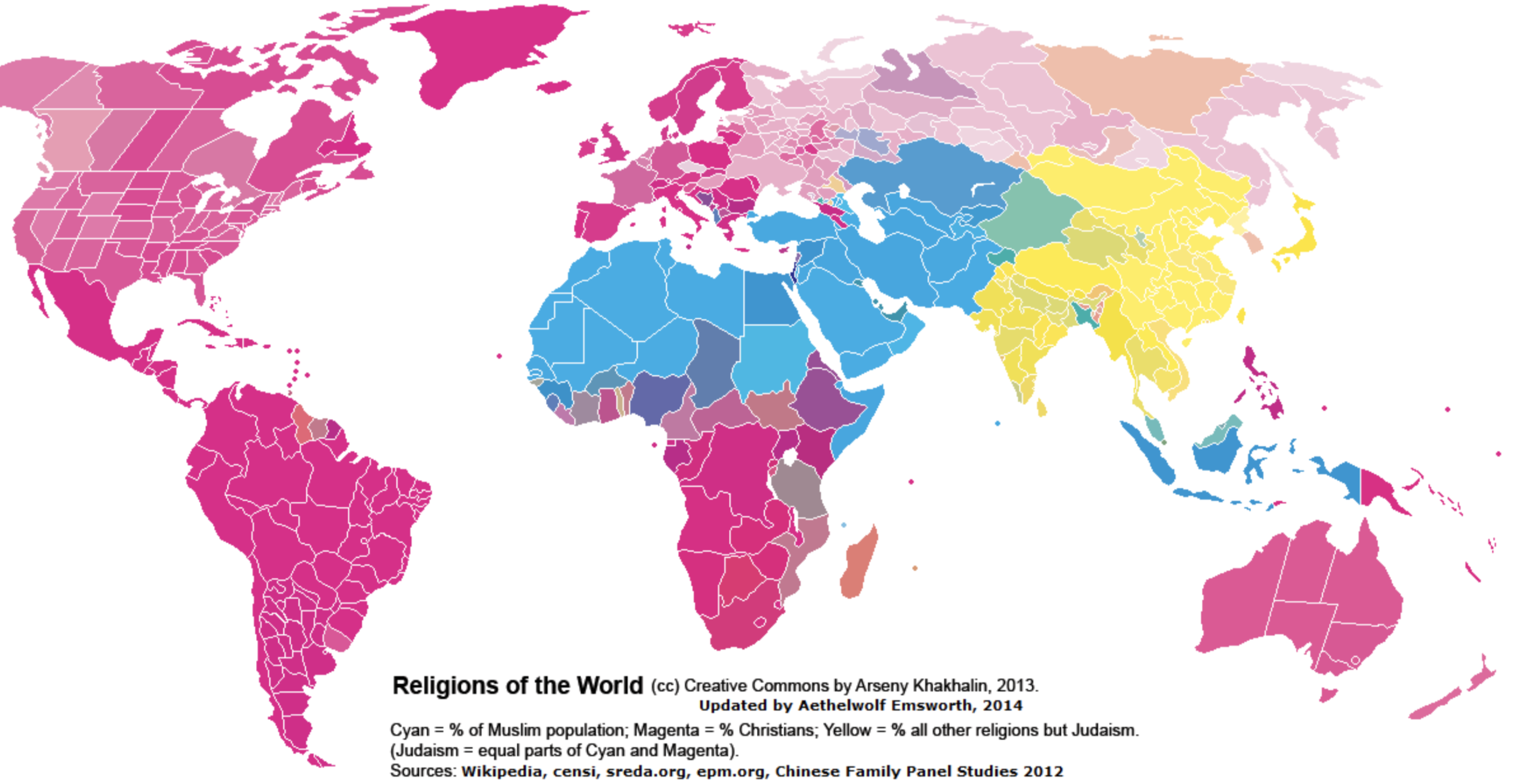
The map above is clustered into three groups depending on religious adherence: Magenta — the ‘Christian World’, Cyan — the ‘Muslum World’, and Yellow — the ‘Eastern World’. The darker the color, the higher the percentage of religious adherence. By total population: Magenta/Christians 2.4 billion (33%), Cyan/Muslim 1.8 billion (24%), and Yellow/Eastern 2.1 billion (29%)
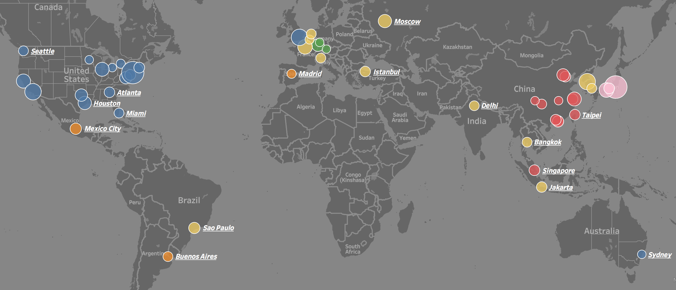
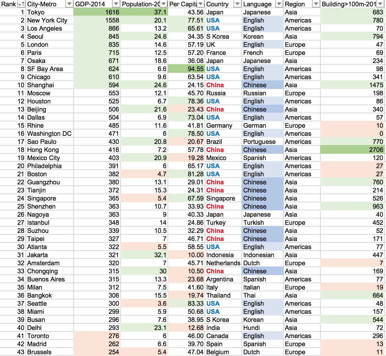
Visit the link to interactively play with the data: https://public.tableau.com/profile/brad.ballard#!/vizhome/Top50CitiesbyGDPComparision/Dashboard
We often see lists of GDP by country, but rarely by city. This is puzzling because most countries are empty space and GDP output is concentrated in a few small areas. For example, about 50% of US GDP is generated on only 2% of its area – namely: cities. This is also the case around the world.
To put the importance of these 50 cities into perspective. The top 25 cities in the world generate 15.5 trillion dollars in GDP or 20.1% of total world GDP (2014 numbers). They do this with only 4.7% of world population and have a GDP per capita of 44 thousand dollars (4 times world average). The top 50 cities in the world generate 22.6 trillion dollars in GDP or 29.4% of total world GDP (2014 numbers). They do this with only 8.2% of world population and have a GDP per capita of 37 thousand dollars (3.5 times world average).
The GDP centers are clustered in geographic regions in North America, Western Europe, and Eastern Asia. Only a few cities are represented from the southern hemisphere and none from Africa or the Middle East. Asian cities tend to be larger in population, number of skyscrapers, and lower in GDP per capita. North American and Europen cities tend to have small-to-medium populations, low density, and a high GDP per capita.
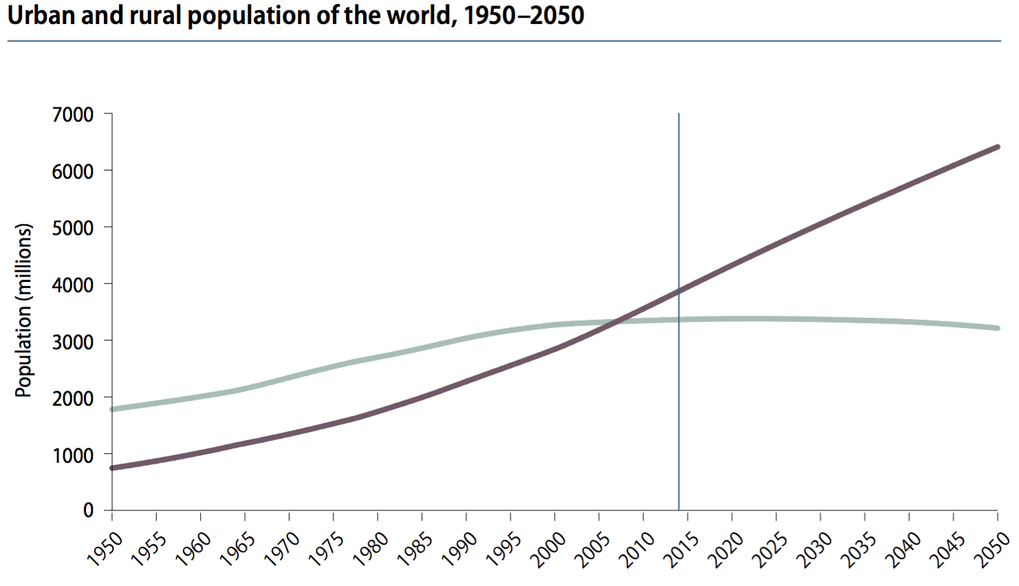
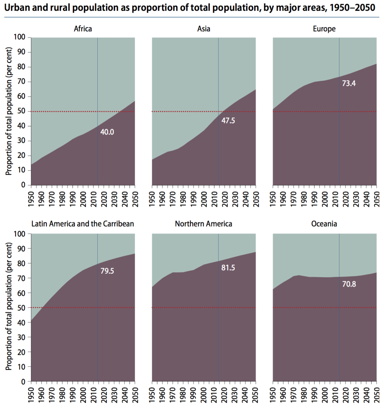
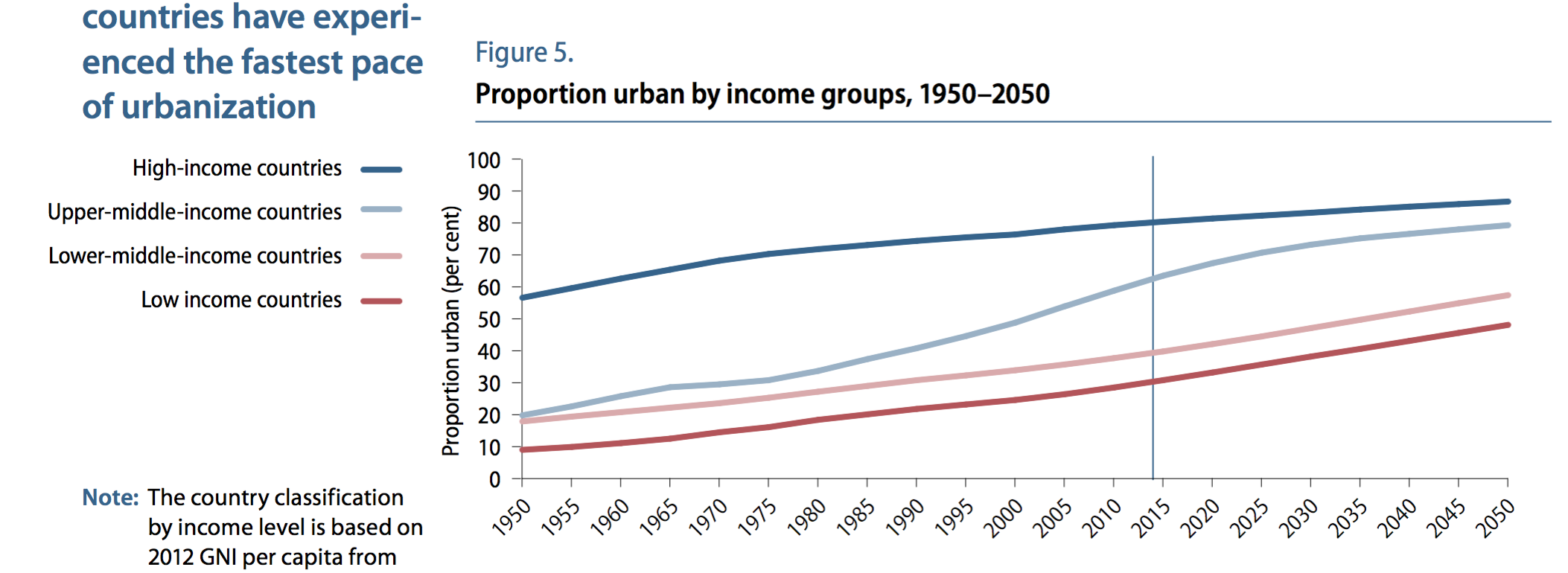
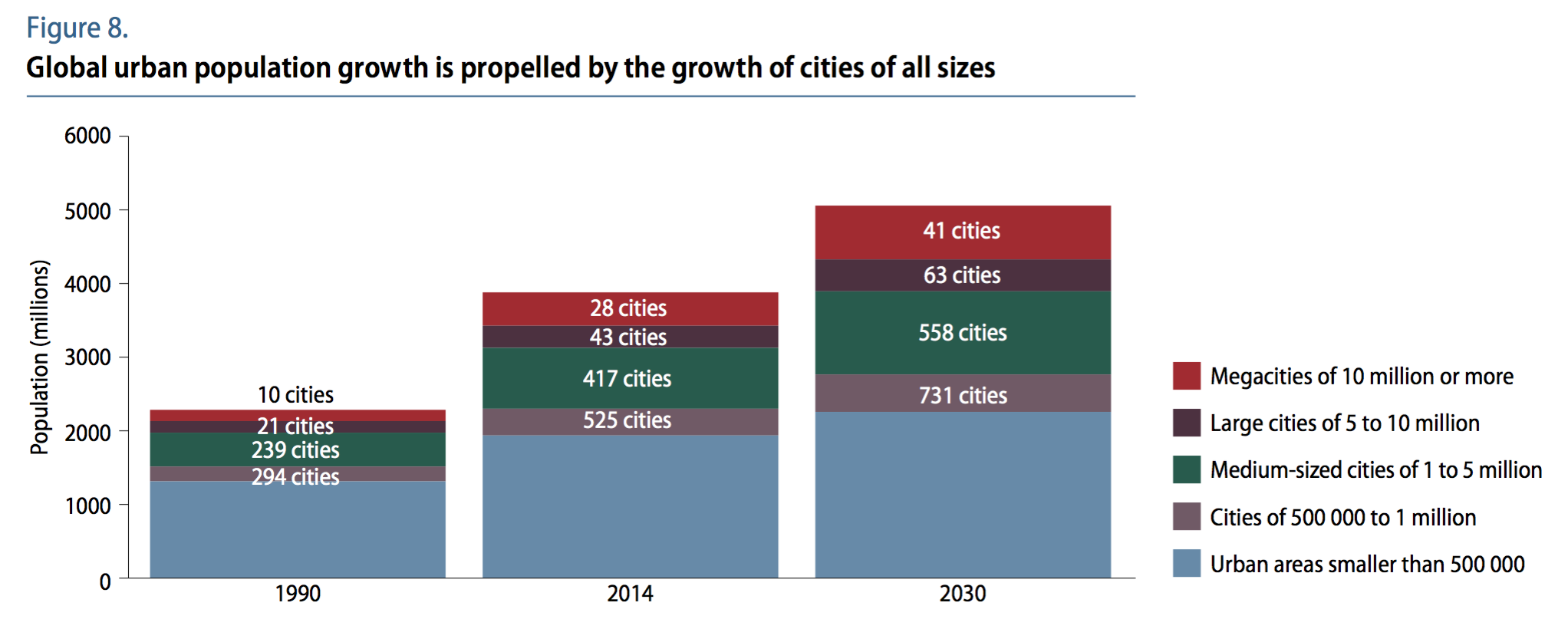
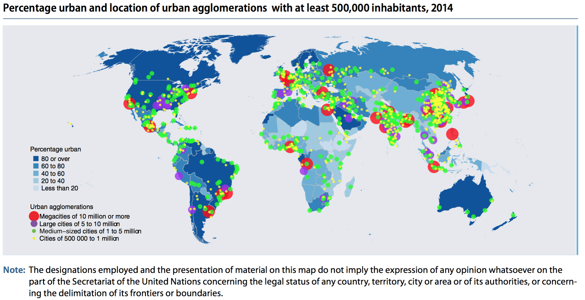
The following are highlights from the World Urbanization Prospects 2014 report published by the United Nations Department of Economic and Social Affairs

Globally, 54% of the world population lives in an urban area with at least 500k people. (note: urban in purple, rural in grey) The world has become more urban over time and is projected to continue.
Urbanization differs across regions, with North American and Europe being the most urbanized — Africa and Asia least urbanized.
High-income countries tend to be more urban (80%) than low-income countries (30%) — implying that urbanization and development are related
Urbanized areas are displayed below in various groups (ranging from small cities to megacities) for the years 1990, 2014, and projected 2030.
Urbanized areas (500k+ population) in 2014 are displayed on the map below
Other interesting notes:
Africa and Asia are home to 90% of the worlds rural population and have the lowest rate of urbanization by content 40% and 48%.
China, India, and Nigeria will account for 37% of urban pop growth between now and 2050.
One in eight people live in one of the world’s 28 megacities (10m+ pop)
Link to the full report here: https://esa.un.org/unpd/wup/publications/files/wup2014-highlights.pdf
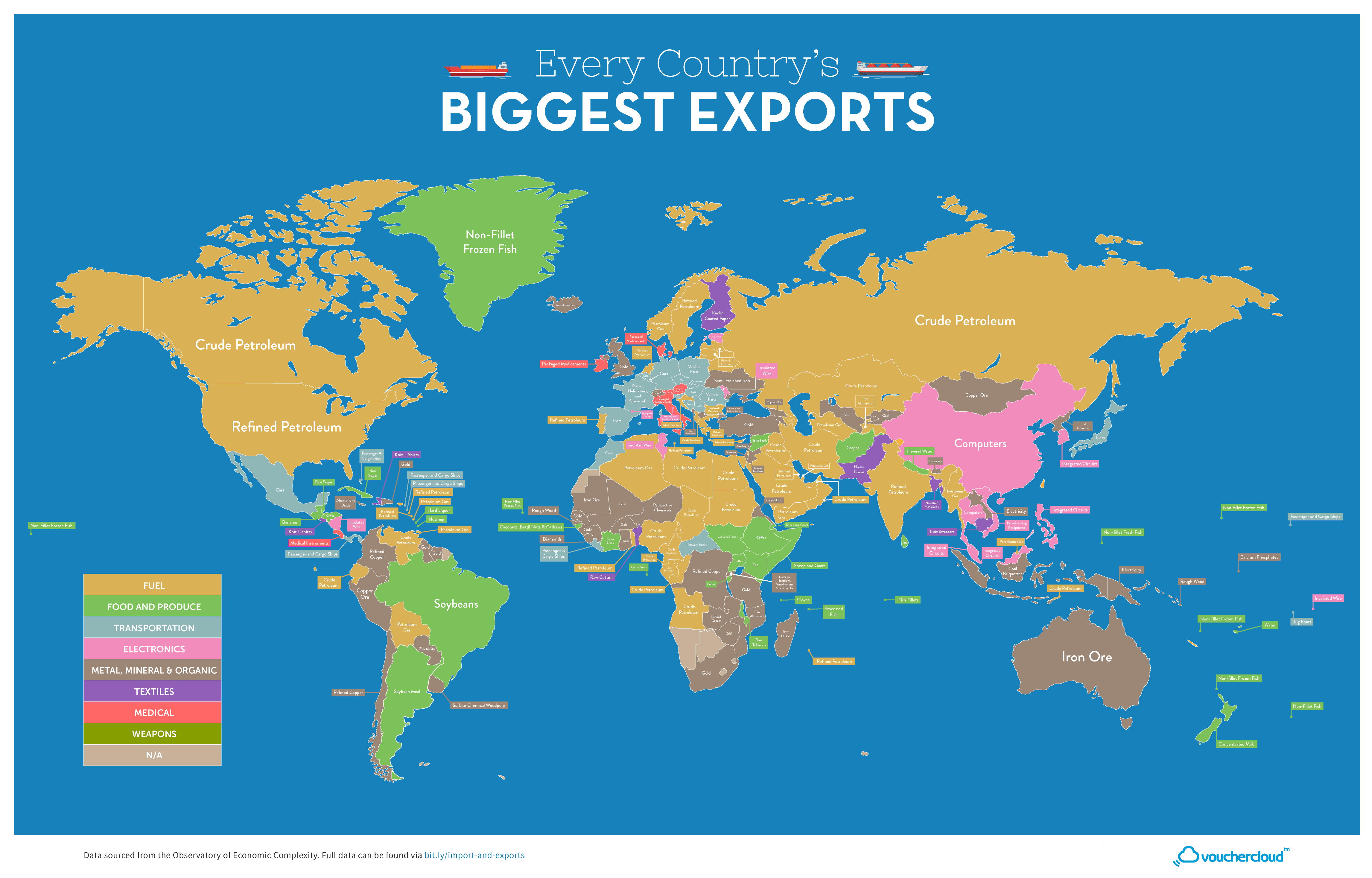
The map above is color-coded by each country’s largest export. Most countries are grouped into a few categories: Fuel, Food, Transportation, Electronics, or Mineral exports. Europe is a large exporter of cars, East Asia of Computers/Electronics, Sub-Sahara Africa of Minerals and Food. The largest export in the world and the one involved with the most countries is Petroleum/Fuel. It is the largest export in the Middle East, North Africa, India, Russia, the US, and Canada.
 The map above is color-coded by each country’s largest import. Most countries are grouped into a few categories: Fuel, Food, Transportation, or Electronics imports. The western world’s (the US, Canada, western Europe, Australia) largest import is Transportation/Cars. Developing Asia and Latin America’s largest import is Fuel/Petroleum. Northern Africa is an importer of Food and Southeast Asia an importer of Electronics.
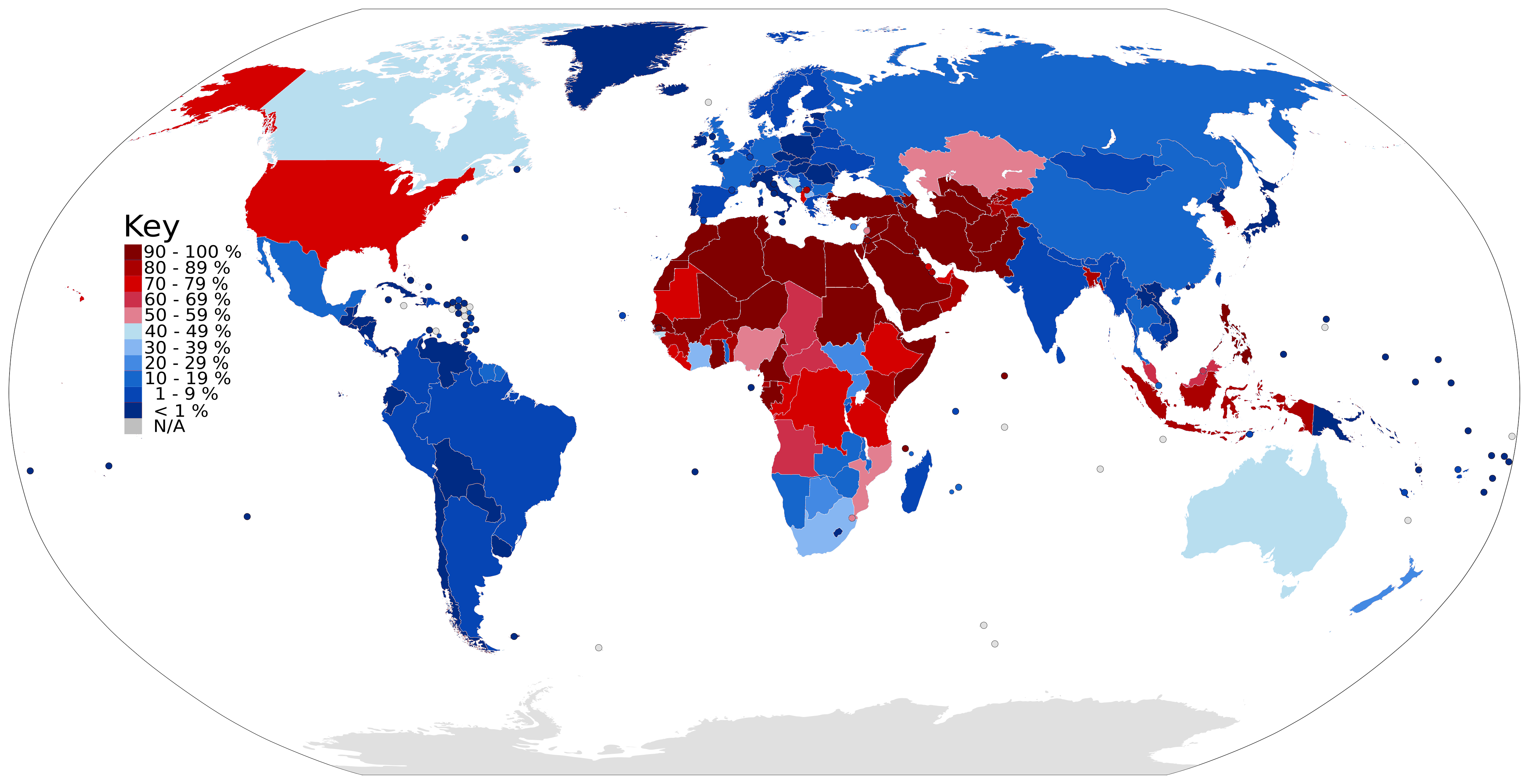
The United State and South Korea are outliers in the developed world with male circumcision rates above 50%. Most of the world’s countries and population are uncircumcised, many with percentages around only 10%. The map above displays each country’s male circumcision rate.
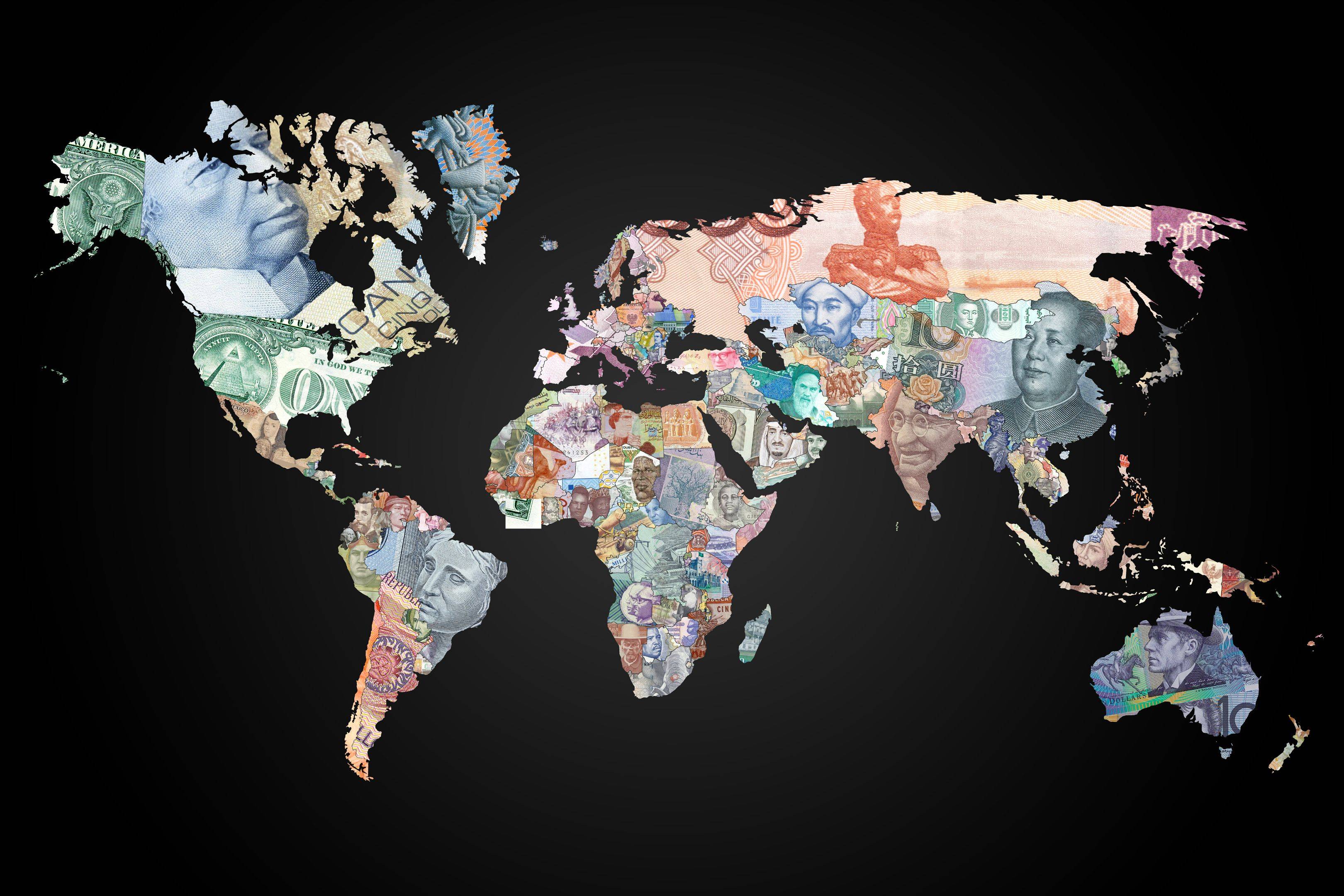
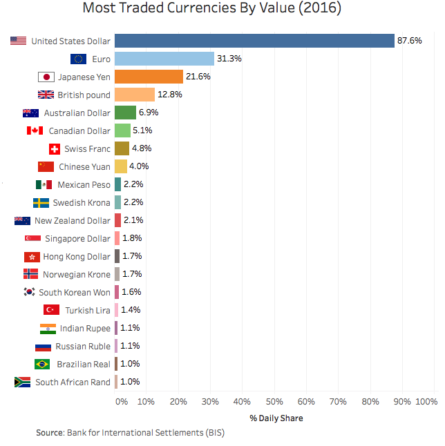
Above is a map of the world displaying each country’s currency projected on top of the country’s territory. There are 180 currencies in the world – the British pound is the world’s oldest currency that’s still in use, dating back to the 8th century! Despite all these currencies, the exchange market is dominated by only a few (shown in the bar chart below). The US dollar and Euro makeup between 60-70 percent of the market and additionally about 30 percent of the world use the USD/Euro or have their currency pegged to one of them.


Above is a map displaying the online world, that is, each country’s size on the map represents the number of websites registered to each country code top-level domain (ccTLD). What is clear is there is a large concentration of internet activity in a small number of countries – as of June 2017 there were 302 global ccTLD, the top 10 (shown above) compose 64.8% of all ccTLD domain name registrations.
Two other things jump out from the map above:
First, why is Tokelau (.tk), a New Zealand territory in the south Pacific – a county with a population of 1,499 people – second in the world with 19.1 million domain name registrations? Tokelau has specialized in web hosting by allowing any individual or business to register any number of domain names free of charge with very minimal restrictions or oversight. These policies have lead .tk domains to have a bad reputation. According to a 2011 report by the Anti-Phishing Working Group, .tk domains were involved in ~21.5% of all phishing attacks in the second half of 2010 internet-wide.
Second, why is the .us ccTLD not among the world’s largest? The United States is such an internet world power that most of its the first websites were already registered and growing their brand on Generic top-level domains (gTLD) before ccTLD domains were developed and extended for country-specific use. Americans are more familiar with gTLDs such as: .com, .org, .net, .info, .gov, .edu, and .mil – and have been low to transfer to the ccTLD .us. To have a more accurate picture of the internet world map – as of 2017, across all gTLDs, there were 331.0 million registered domains and only considering .com, .net, .org, and .info (the top 4 gTLDs combined) there are 160.6 million registered domains. Compare that with .cn (China’s top domain) the second most used domain in the world with only 21.4 million. The graph below displays the top ten domains, both ccTLD and gTLD combined – the US has four of the top ten in the world (all gTLD).

