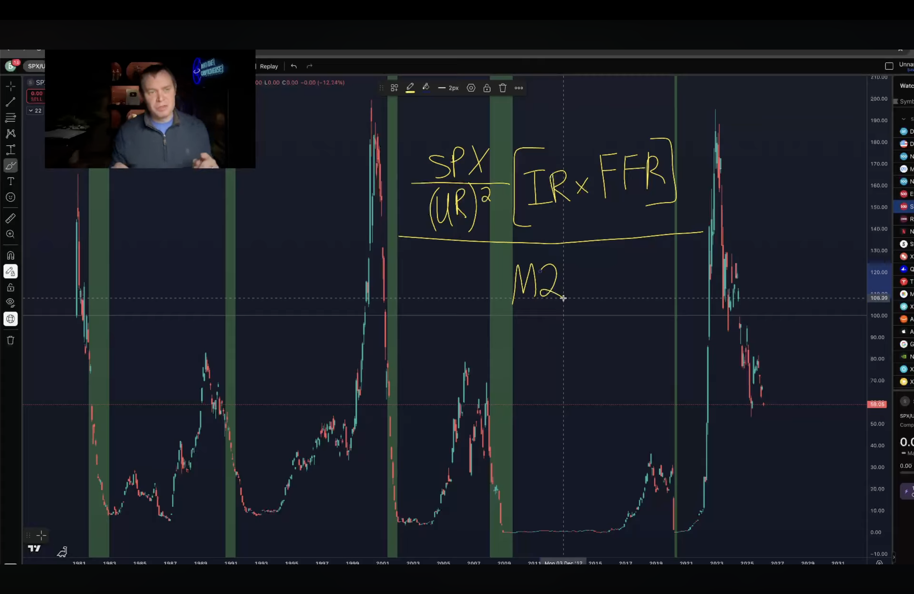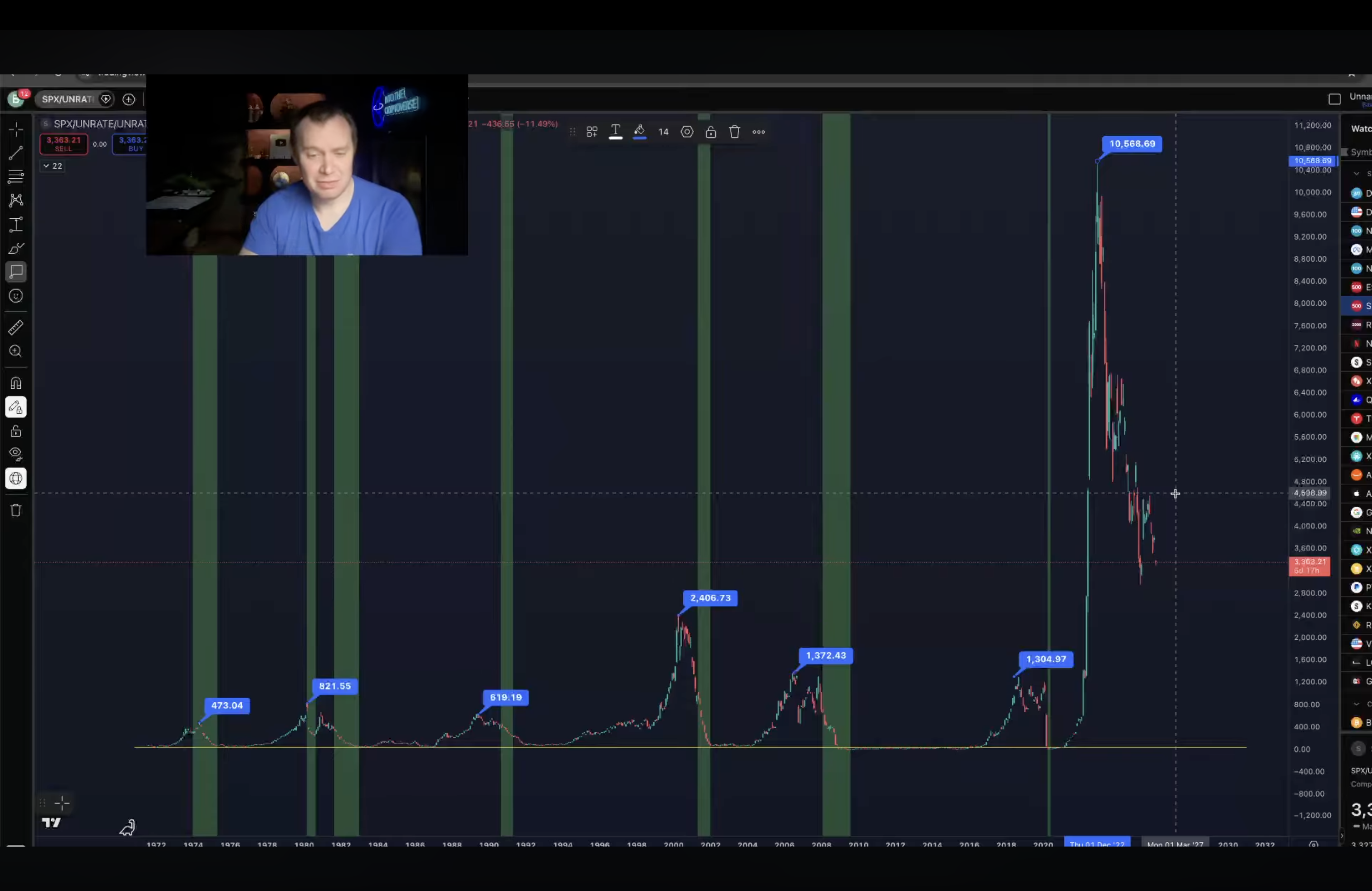
The top and bottom graphics are made by Ben Cowen (https://www.youtube.com/@benjaminjcowen), a quant analyst. The graph “visualizes the business cycle” by plotting the result of: the SP500 index divided by the unemployment rate squared. Then, that result is multiplied by the inflation rate times the federal funds rate. The top graph is that plot. The bottom graph is that result divided by M2 (the USD money supply). The green sections of the graph are recessions. Note: the USD money supply has increased ~4-5x from 2000 to 2026.
[SP500/(UR^2)][IR*FFR] / M2