Visualizing the Business Cycle

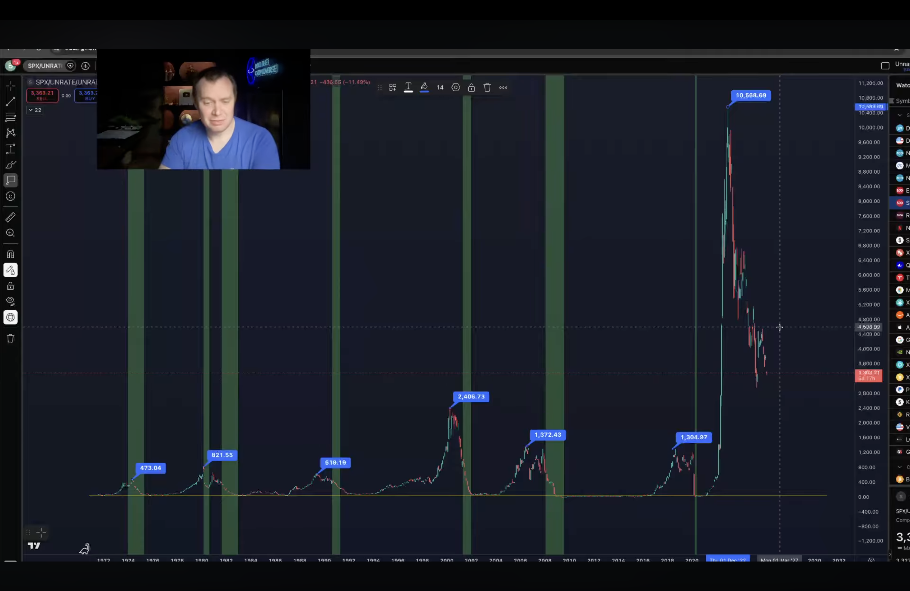
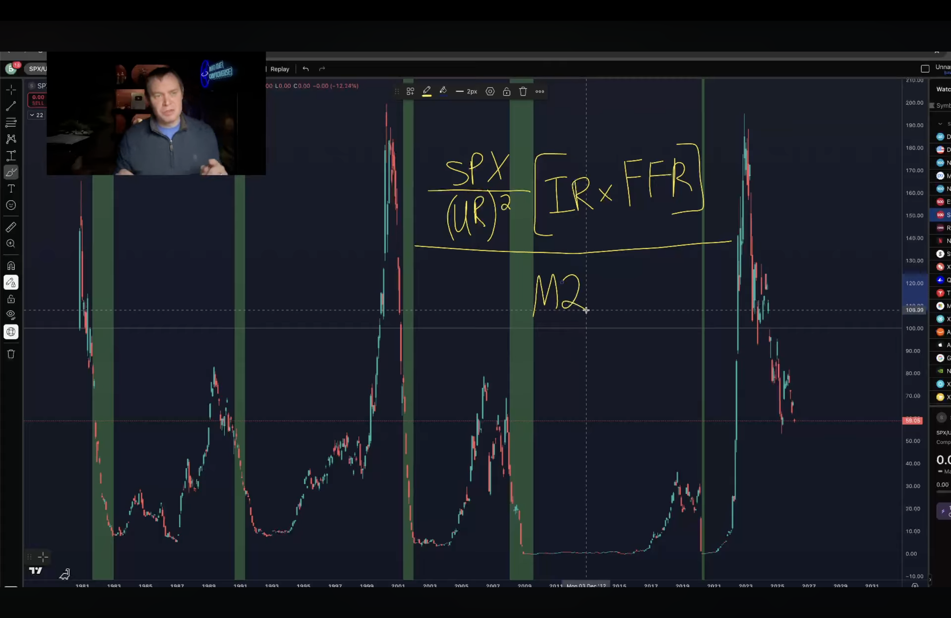
The top and bottom graphics are made by Ben Cowen (https://www.youtube.com/@benjaminjcowen), a quant analyst. The graph “visualizes the business cycle” by plotting the result of: the SP500 index divided by the unemployment rate squared. Then, that result is multiplied by the inflation rate times the federal funds rate. The top graph is that plot. The bottom graph is that result divided by M2 (the USD money supply). The green sections of the graph are recessions. Note: the USD money supply has increased ~4-5x from 2000 to 2026.

[SP500/(UR^2)][IR*FFR] / M2

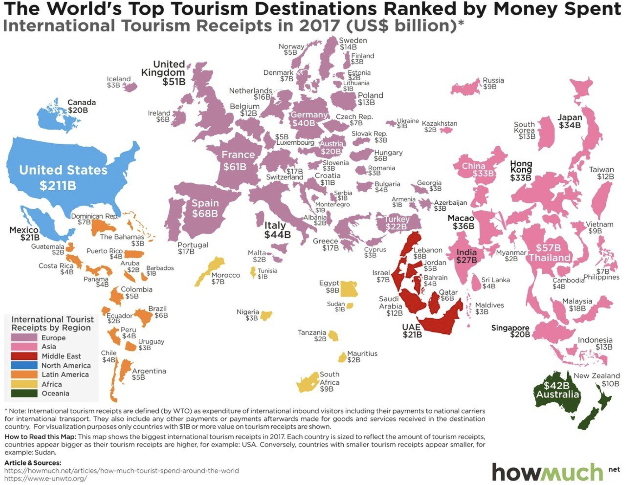
Tourism Rankings 2017

Screen Shot 2018-09-29 at 2.09.55 PM.png

The map above displays the world’s countries sized by international tourism receipts in 2017. The top ten can be seen in tabular view below:

Screen Shot 2018-10-07 at 8.43.46 AM.png

A few things jump out. The US gains more from international tourism than any other country by a factor of 3 and China spends more aboard than any other country by a factor of 2! Macau (ranked 9th) has three times the gambling revenue of Las Vegas, with much of this money origination in mainland China and spend ‘internationally’ in Macau. (Hong Kong ranks 11th with 33 billion in receipts in 2017) If Hong Kong, Macau, and Taiwan were counted as one country on this list, it would rank 2nd with 81 billion in receipts.

Screen Shot 2018-10-07 at 8.42.36 AM.png

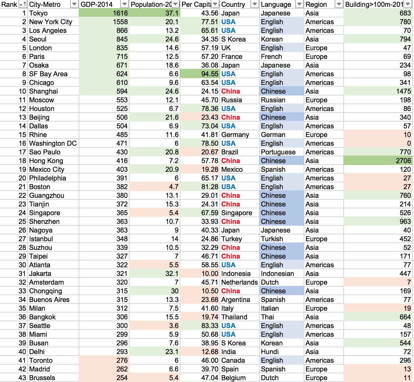
Top 50 Cities by GDP Comparision 2014

Screen Shot 2018-06-03 at 11.05.07 AM.png

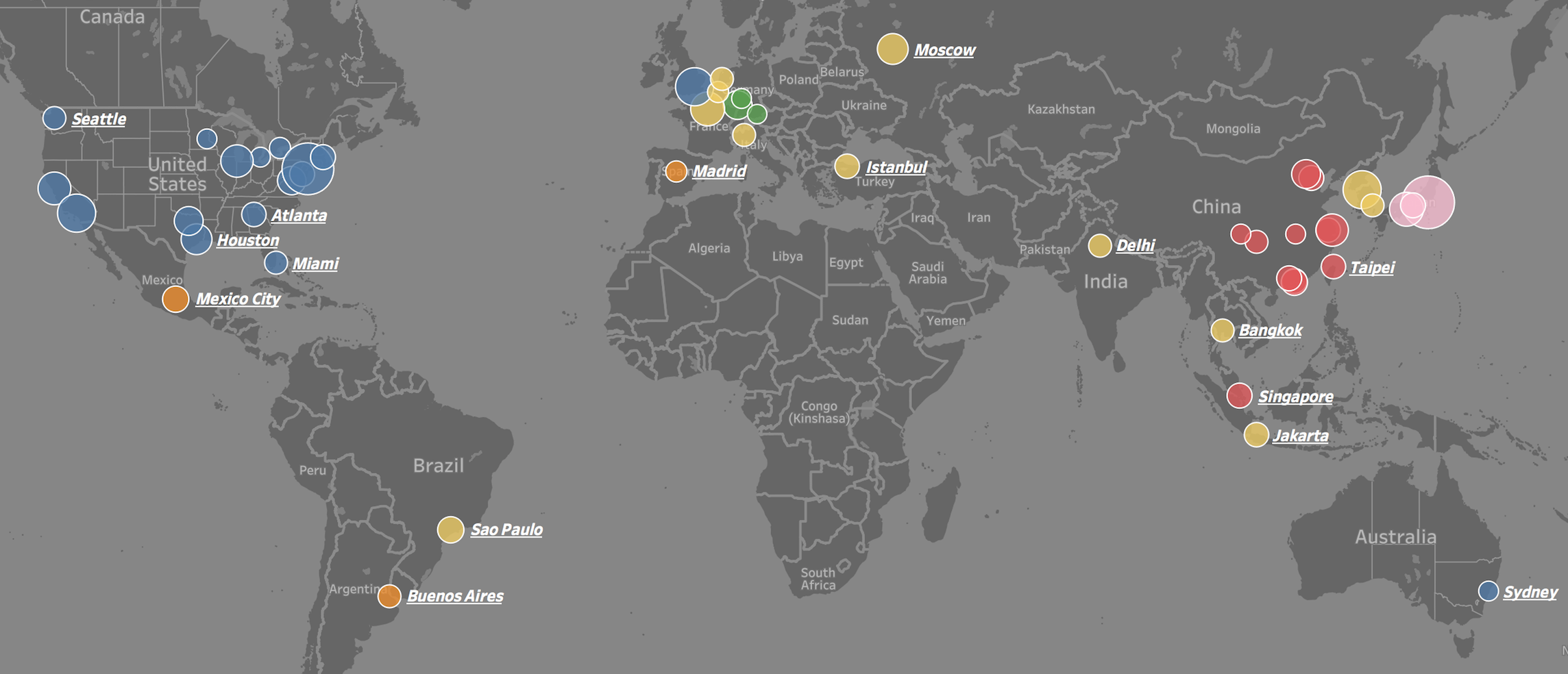
Visit the link to interactively play with the data: https://public.tableau.com/profile/brad.ballard#!/vizhome/Top50CitiesbyGDPComparision/Dashboard

We often see lists of GDP by country, but rarely by city. This is puzzling because most countries are empty space and GDP output is concentrated in a few small areas. For example, about 50% of US GDP is generated on only 2% of its area – namely: cities. This is also the case around the world.

To put the importance of these 50 cities into perspective. The top 25 cities in the world generate 15.5 trillion dollars in GDP or 20.1% of total world GDP (2014 numbers). They do this with only 4.7% of world population and have a GDP per capita of 44 thousand dollars (4 times world average). The top 50 cities in the world generate 22.6 trillion dollars in GDP or 29.4% of total world GDP (2014 numbers). They do this with only 8.2% of world population and have a GDP per capita of 37 thousand dollars (3.5 times world average).

The GDP centers are clustered in geographic regions in North America, Western Europe, and Eastern Asia. Only a few cities are represented from the southern hemisphere and none from Africa or the Middle East. Asian cities tend to be larger in population, number of skyscrapers, and lower in GDP per capita. North American and Europen cities tend to have small-to-medium populations, low density, and a high GDP per capita.

Screen Shot 2018-06-03 at 11.17.29 AM.png

US Average Daily Sunlight

Screen Shot 2018-02-21 at 8.10.52 PM.png

Above is a map measuring solar radiation per square meter, averaged to each county within the lower 48 states of the US. The units are a little difficult to translate, but the difference between the extremes (dark purple to light yellow) is a factor of two. This means that cities such as Los Angeles, Las Vegas, and Phoenix get about twice as much sunlight each day as Seattle, Portland, or Cleveland.

Ageing Population in Developed Countries

Screen Shot 2017-11-23 at 11.49.06 AM.png

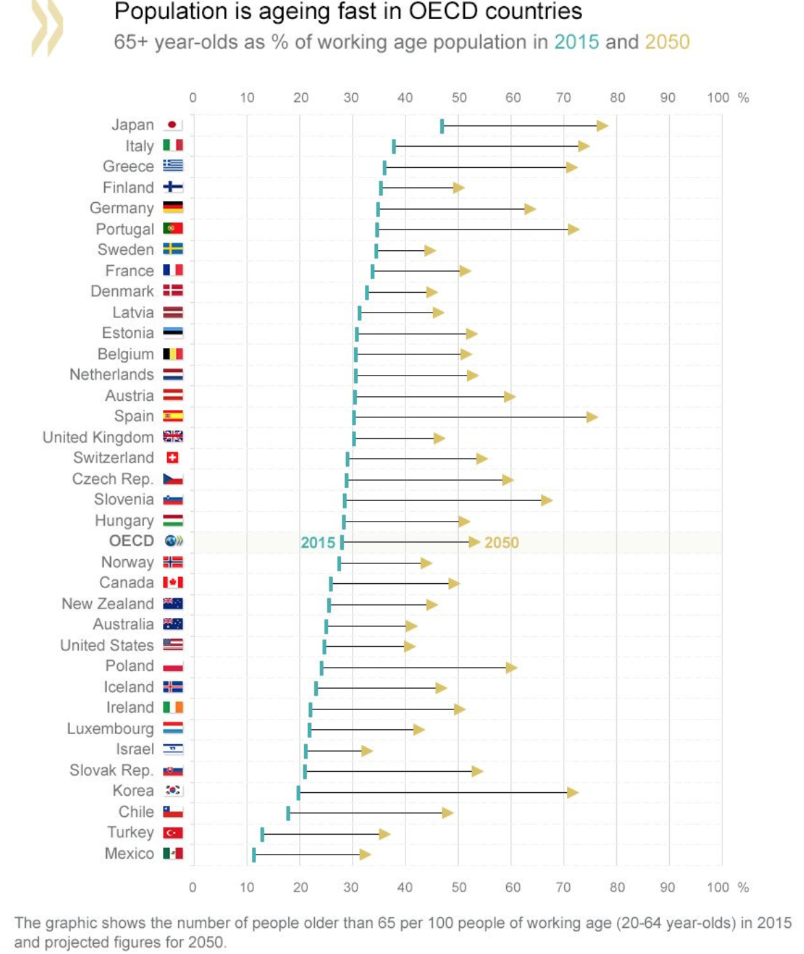
In 2015, the percentage of the population 65+ years old in OECD countries was 28%, this figure is expected to rise to over 50% by 2050. The graphic above display where each country stands or the population projects in the next 40 years. Japan, Italy, and Greece are already the oldest countries with 46%, 37%, and 35% of their population over 65 years old (in 2015), by 2050 these countries are projected to continue to lead with 78%, 75%, and 73% respectively. This is amazing to imagine. Think about it, Japan in 2050 with nearly 80% of its population over 65 years old. What will a country like that look like?

On the other end of the spectrum in the OCED – Mexico and Turkey are looking stable with only 35% and 37% of their population above 65 years old. This figure is approximately already what the average OCED country is at. The US, Canada, Australia, and New Zealand all look stable with a healthy inflow of immigrants that aid in slowing the growth in elderly people as a fraction of the overall population. Side note: South Korea is projected to undertake the most drastic population change. It is currently one of the youngest countries in the OCED, but in 40 years it will be among the oldest – moving from 19% of its population over 65 to over 70% by 2050.
California and Canada

Screen Shot 2017-12-11 at 9.52.49 PM.png

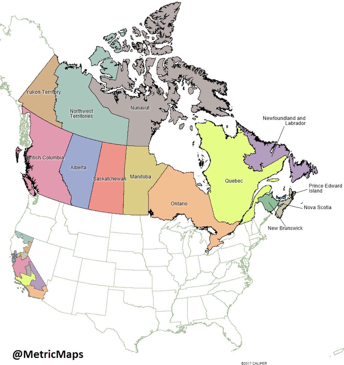
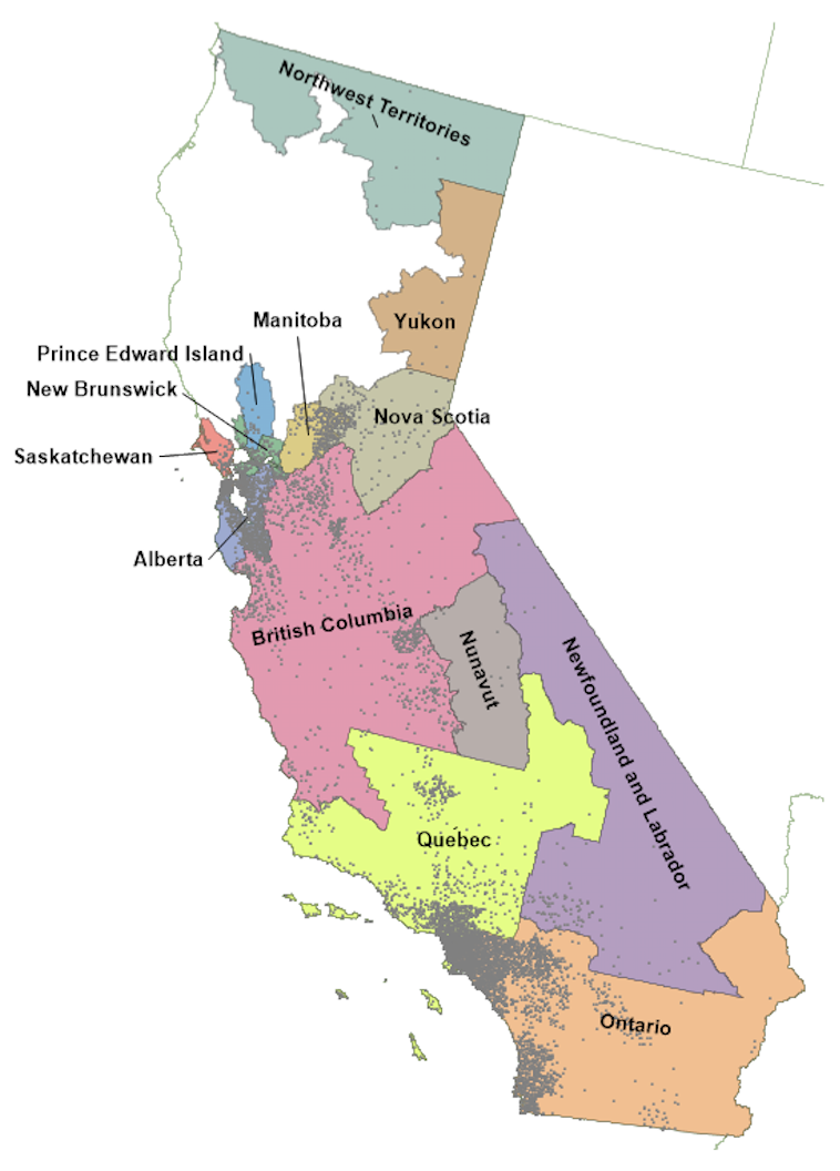
Did you know that California (39 million) has more population than Canada (36 million)? The map above displays the area comparison and map below shows how Canada’s population would fit into California. For example, most Canada’s population is concentrated in the two provinces of Ontario and Quebec – these provinces have approximately the same population of southern California. Even though Canada has an area larger than the entire United States, its population can fit into California with room to spare. Side note: California also has a substantially larger economy with a 2.6 trillion nominal GDP compared to 1.5 trillion for Canada (2017).

Screen Shot 2017-12-11 at 9.53.17 PM.png

The Country Across the Ocean

eNrIVp3.jpg

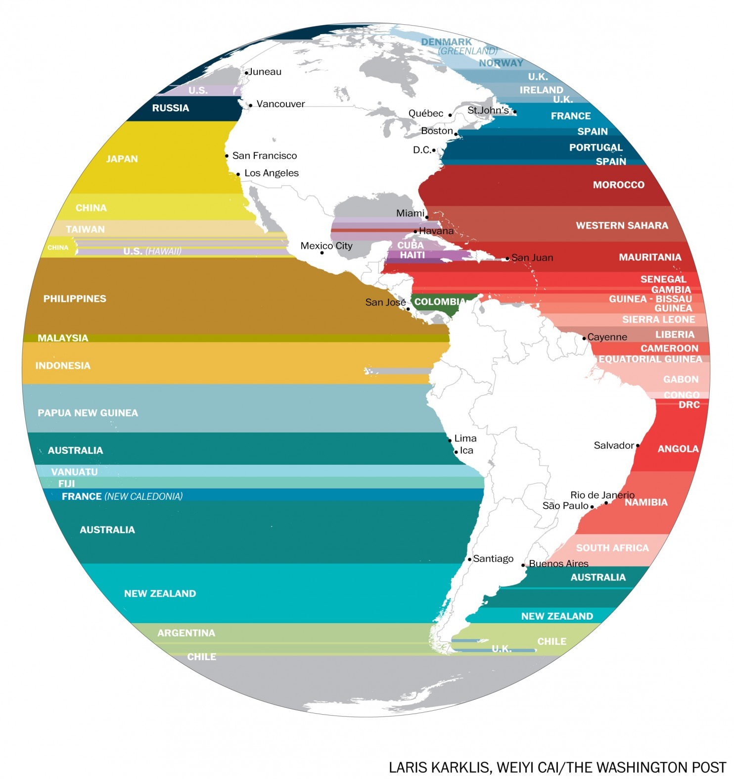
The map above displays the western hemisphere and shows with extending a horizontal line (longitudinal) which country is across the ocean from it. This is an interesting perspective from which to view the world given that these matching countries are likely to share the same climate and culture based on their position in the world. It’s amazing to see the north-south size of Africa projected onto the Americas – Its northern reach with Morocco across from (approximately) Washington DC in the United States to its southern point with South Africa across from Buenos Aires. Another stunning display is the north-south size of Japan which it the closest country to virtually the entire west coast of the US.

Coke, Soda, or Pop

soda-pop.png

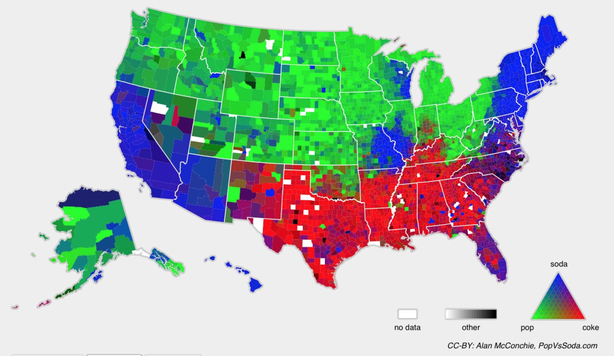
The United States has various regional quirks, one of which is what do you call a carbonated soft drink. Where I grew up in Ohio, we called it a Pop. As in, can you give me a pop? When I moved to South Carolina, I noticed that everyone referred to it as a ‘Coke’ – even if they were talking about another soft drink. Now where I live in California, it’s called a Soda.