Visualizing the Business Cycle

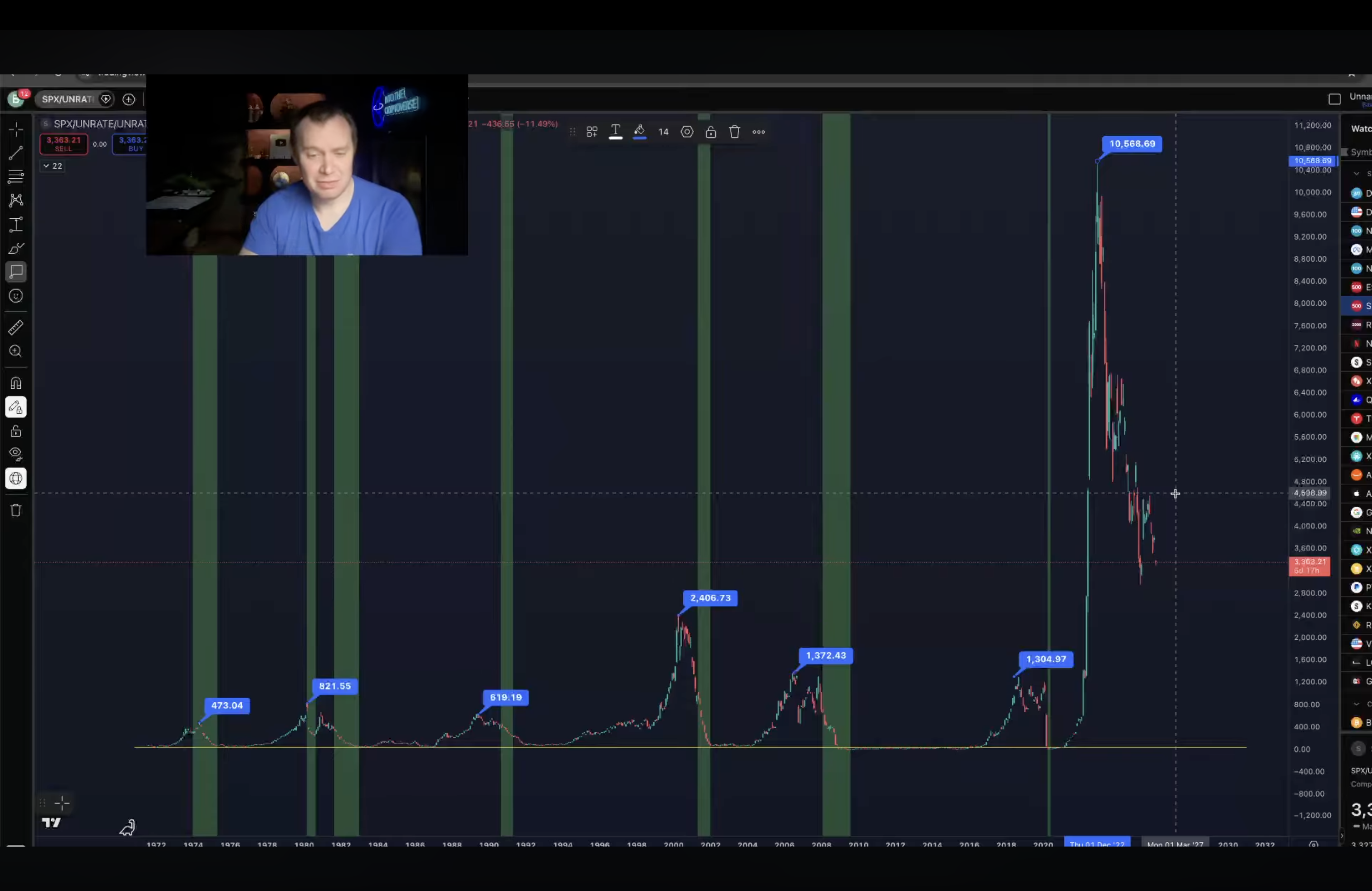
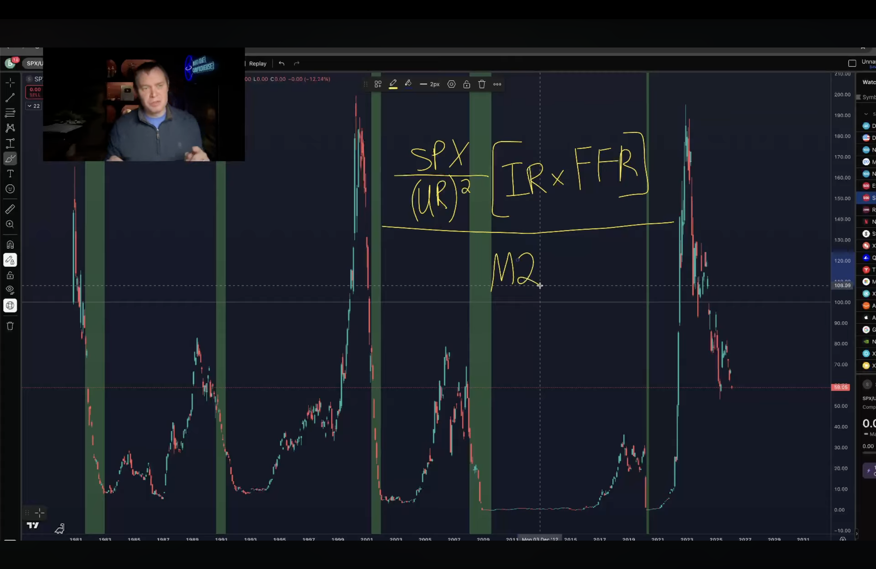
The top and bottom graphics are made by Ben Cowen (https://www.youtube.com/@benjaminjcowen), a quant analyst. The graph “visualizes the business cycle” by plotting the result of: the SP500 index divided by the unemployment rate squared. Then, that result is multiplied by the inflation rate times the federal funds rate. The top graph is that plot. The bottom graph is that result divided by M2 (the USD money supply). The green sections of the graph are recessions. Note: the USD money supply has increased ~4-5x from 2000 to 2026.

[SP500/(UR^2)][IR*FFR] / M2
Import Partners – US, EU, China, or Russia

ImportPartners.png

The map above displays from whom countries import more from – either the US, EU, China, or Russia. Border countries import the most from their neighbor country and this trading influence propagates outward. Generally speaking, the US is the export center for a North American zone, France+Germany for a European zone, Russia for a Eurasian zone, and China an Asian zone + the nearly the entire southern hemisphere.

Expensive Cities

rj65zma2r0121.png

It’s tough to compare costs across cities in different countries, but this study tries to do just that. It’s trying to answer the question: What is the average cost of a weeklong holiday trip to selected cities? The question is subject to the predefined assumptions – The trip is for two adults staying in Airbnb, walking & public transit, and doing typical tourist daytime activities like visiting museums, shows, or day-trips.

The graphic above is color-coded by region. The range of costs across cities in the sample fit closely to a normal distribution with the majority of cities falling in the $1000-2000 cost window. Africa and Asia have most of the cheaper cities while Western Europe and Coastal cities in the USA are the most expensive to visit.