China’s Population Density

Screen Shot 2017-04-12 at 9.37.57 AM.png

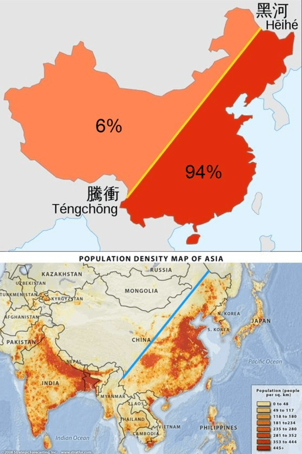
Only about 30 percent of China’s landmass is habitable with approximately 40% of it’s land covered by mountains (in the southwest) and an additional 25% deserts (in the northwest). The maps above display that 94% of China’s population lives on the eastern side of it’s territory. The map below displays the location of China’s deserts and arid regions.

China and India make of 40% of the world’s population and although this figure seems strikingly high, estimates from 1 AD indicate the China and India combined for 60% percent of world population back then! Anyone who has visited either country is aware that both have very high population density. For comparison, world population density is 140 people per square mile – India is about 10 times that with 1008 people per square mile (ppsm) and China is 370 ppsm. Given what we know about the geography of China, this density estimate is quite low and once discounting it’s uninhabitable land, China’s density is more around 1233 ppsm. (Given that about 25% of India’s land is uninhabitable, a more direct comparison would put India density at 1344 ppsm). For those interested, here is the population density for some other countries: European Union (UK included) 304 ppsm, United States 85 ppsm, Brazil 62 ppsm, Russia 21 ppsm, and Canada 9 ppsm.

Screen Shot 2017-04-14 at 2.59.30 PM.png

Advertisement

Expansion of Russia

Screen Shot 2017-03-20 at 12.45.13 PM.png

Russia is the world’s largest country in area with nearly 11% of the world’s landmass. This area is approximately the size of the United States and Canada combined! It is a transcontinental country with territory extending into Europe and Asia. In fact, its Asian land portion alone makes it the largest country in Asia and its European land portion alone makes it the largest country in Europe! Above is a map displaying the expansion of Russian territory from 1613 to 1914. Despite all this growth in territory over the years, approximately 80% of Russia’s population still lives in the Green or Yellow portions on the map above (territory Russia controlled dating back to 1613).

Cousin Marriage

POST_Cousin marriage.png

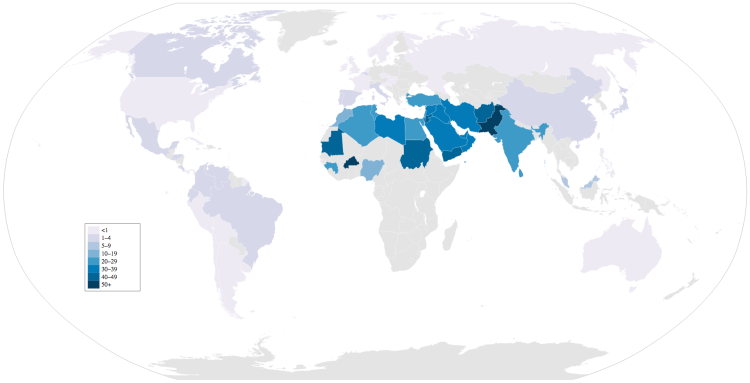
This may seem shocking, but worldwide approximately 10% of all marriages take place between first or second cousins. Above is a map displaying the relative percentages for marriages between first or second cousins for each country (Note: countries in gray mean there is not data). Marriages between cousins are concentrated in the middle east where some countries have as high as 50% of marriages between first or second cousins! The middle east region averages about 1/3 of all marriages to cousins – three times the world average.

Island Nations

Screen Shot 2017-03-04 at 3.39.11 PM.png

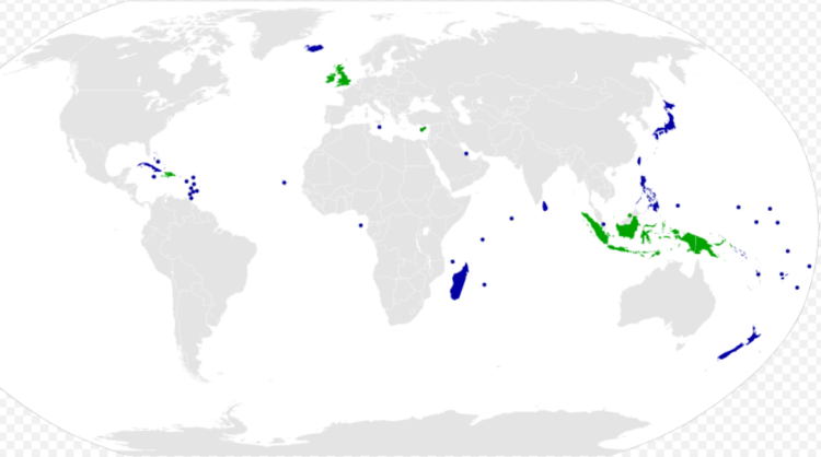
Of the 193 UN member nations, 46 are island nations. This means that nearly a quarter of the world’s sovereign countries are islands. The largest island nations by population are Indonesia (260 million), Japan (126 m), Philippines (102 m), and the United Kindom (65 m). Of the 46 island nations, 13 are in the Caribbean, 13 are in Oceania, 10 are off the coast of Asia, 6 are off the coast of Africa, and 4 are off the coast of Europe.

For those wondering why Australia is not considered an island due to its status as the world’s smallest continent – The size comparison below shows the world’s largest island by area (Greenland) next to Australia. Australia is 3.5 times larger than Greenland!

Screen Shot 2017-03-04 at 3.49.11 PM.png

Millennial Voting

Screen Shot 2017-01-22 at 8.27.57 PM.png

Above is a map displaying how millennials voted in the 2016 election. If only millennials were able to vote, it would have been an overwhelming victory for the Democratic Party: 504 to 23. Demographers William Straus and Neil Howe define ‘Millennials’ as being born between 1982 and 2004 – however, there is not an exact dividing line. Birth years can range between 1983 and 2001 for some demographers, such as Elwood Carlson. What seems to be clear is that as millennials age and become a larger political force, the country may become increasingly democratic in future elections.

US Hispanic Population

Latino percent 1940.png

The map on the left displays the Hispanic percentage for each US state in 1940. Contrast that with the map on the right displaying the Hispanic percentage for each US state in 2010. The Hispanic population in 1940 was mostly concentrated in the southwest border states of Arizona, New Mexico, and Texas, but over the next 70 years, migration and birth rates spread the population throughout the entire southwest, west coast, and major cities on the east coast. New Mexico continues to be the US state with the highest concentration of Hispanic population with 41% in 1940 to 46% in 2010. Nationwide the Hispanic population has increased dramatically over the past 70 years – from around 1.4% in 1940 to 16.3% in 2010!

US African American Percentage

Black percent 1940.png

The map on the left displays the African American percentage for each US state in 1910. Contrast that with the map on the right displaying the African American percentage for each US state in 2010. The African American population in 1910 was very concentrated in the southeast, but over the next 100 years migration spread up the east coast and into the midwest – this distributing the population more evenly in the eastern half of the US. It is interesting to note that every state in the western US (was in 1910 and remains to be in 2010) below the national average in African American population. Mississippi continues to be the US state with the highest concentration of American Americans but has decreased from 56% in 1910 to 37% in 2010. Nationwide the African American population has remained stable over the past 100 years -from around 10.7% in 1910 to 12.6% in 2010.

Coastal Population

Equal population.png

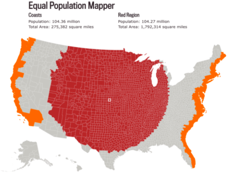
Above is a map comparing the population all of the United States coastal counties (counties boarding the Atlantic or Pacific Oceans) to the same population of counties from mid-point of the US spreading out. The map above has equal population – 104 million to 104 million. The area (in square miles) of the middle counties is 6.5 times the area of the coastal counties.

Trumpland and Clinton Islands

Clinton islands.png

It’s informative to display how small of the country, by area, Hilary Clinton won in the 2016 Presidental Election. Above is a map of the regions of the country Hilary won (Clinton Islands) and below is the area of the country Trump won (Trumpland). Given the area difference alone, it appears that Trump won in a landslide, however, in fact, he lost the popular vote by more than 2% to Clinton! This is due to the large differences in population density each candidate won – put simply, Clinton won in the cities and Trump won in the rural areas. The highest percentage Trump supporting region was the central plans while the largest Clinton supporting regions were the San Francisco Bay Area and eastern seaboard running from Washington DC to Boston.

Trumpland.png