
G20 Trade Network


The map above displays from whom countries import more from – either the US, EU, China, or Russia. Border countries import the most from their neighbor country and this trading influence propagates outward. Generally speaking, the US is the export center for a North American zone, France+Germany for a European zone, Russia for a Eurasian zone, and China an Asian zone + the nearly the entire southern hemisphere.
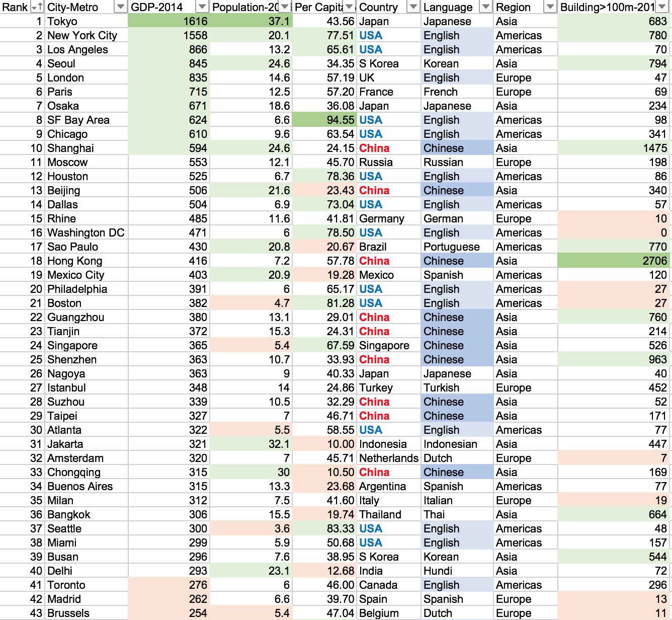
Visit the link to interactively play with the data: https://public.tableau.com/profile/brad.ballard#!/vizhome/Top50CitiesbyGDPComparision/Dashboard
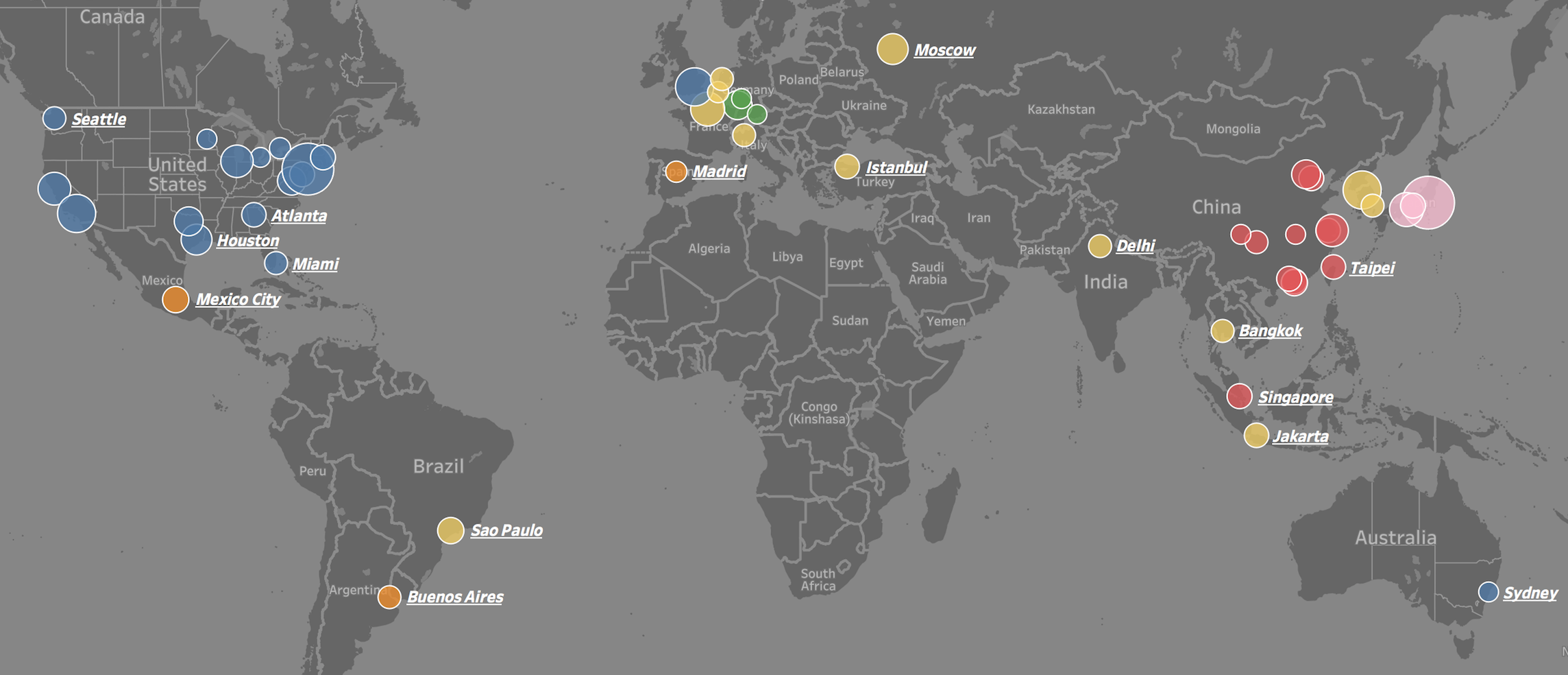
We often see lists of GDP by country, but rarely by city. This is puzzling because most countries are empty space and GDP output is concentrated in a few small areas. For example, about 50% of US GDP is generated on only 2% of its area – namely: cities. This is also the case around the world.
To put the importance of these 50 cities into perspective. The top 25 cities in the world generate 15.5 trillion dollars in GDP or 20.1% of total world GDP (2014 numbers). They do this with only 4.7% of world population and have a GDP per capita of 44 thousand dollars (4 times world average). The top 50 cities in the world generate 22.6 trillion dollars in GDP or 29.4% of total world GDP (2014 numbers). They do this with only 8.2% of world population and have a GDP per capita of 37 thousand dollars (3.5 times world average).
The GDP centers are clustered in geographic regions in North America, Western Europe, and Eastern Asia. Only a few cities are represented from the southern hemisphere and none from Africa or the Middle East. Asian cities tend to be larger in population, number of skyscrapers, and lower in GDP per capita. North American and Europen cities tend to have small-to-medium populations, low density, and a high GDP per capita.

Above is a map of Europe displaying whether a country has a GDP per capita less than or greater than Turkey. The data is from the IMF in Oct 2017. Turkey has a GDP per capita of $24,912 at Purchasing Power Parity (PPP). The data displays the income divide Europe where all of western Europe and Russia (labeled in Blue) have a higher standard of living than Turkey and most the former USSR and former Yugoslavia countries (labeled Red) have a lower standard of living than Turkey. The income differences help to explain some of the internal migration within Europe.

Above is a map of Europe (broken into sub-country subdivisions) displaying the number of patent applications per one million people. This measure can be used as an innovation proxy metric. It appears that southern Germany, Switzerland, and Southern Scandavaniva are the most innovative locations within Europe.

Above is a map displaying the unemployment rate for European Union member states as of May 2017. What sticks out is the slow economic recovery for the southern European states post-financial crisis, such as: Greece (with an unemployment rate of) 22.5%, Spain 17.5%, Itlay 11.3%, and Croatia 10.7%. Contrast this with the unemployment rate in the United States during the same period of 4.3%. The EU average unemployment rate stands at 7.8%, nearly twice as high of the US! An economic analysis of labor policies in most EU countries leads to this result as there is less fixability in the labor force among other factors. Despite this performance for the European Union as a whole, some countries are performing above average and are on par with the US in employment rate such as: Germany, Austria, Czech Republic, UK, Poland, and others.

Above is a map displaying the local sunset time on the summer solstice (June 20th), the longest sunlight day of the year. Time zones are indicated by gray vertical lines. You will notice that ‘local’ sunset time will vary based upon your east-west location within your time zone and also vary depending upon your north-south location within your time zone. Said differently, areas to the northwest within their time zones will have a later local sunset time. For example, eastern Alabama (far southeast) has a local sunset time before 8:00 pm, whereas northwestern North Dakota has a local sunset time close to 10:00 pm (both are in US Central Time Zone). Some areas are so far north that, during the summer months, they experience 24 hours of daylight (and conversely, during the winter months 24 hours of darkness). The map of Europe below also displays the local sunset time on the summer solstice.

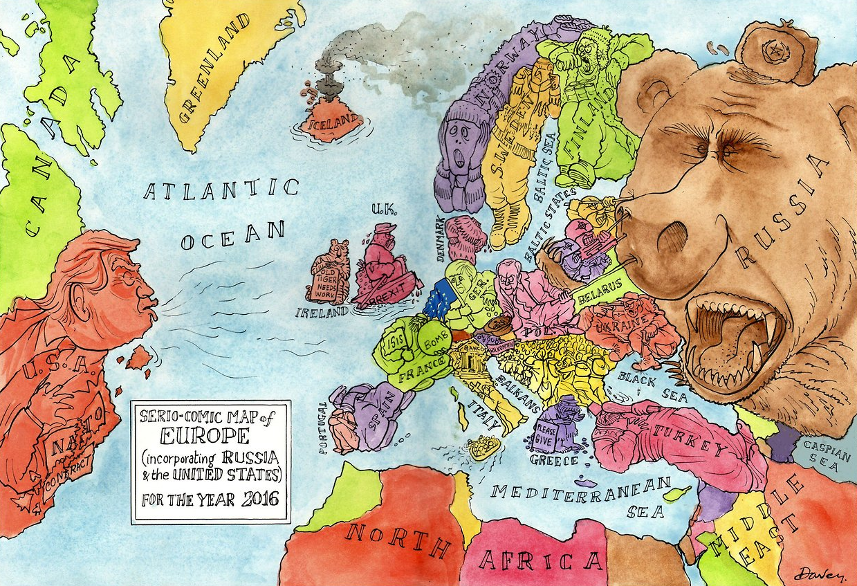
Above is a cartoon map displaying Europe’s current political climate. Trump re-writing the NATO agreement, the Baltic States pushing back Russian expansion into Eastern Europe, Britain moving further away from the EU after their Brexit vote – what else stands out to you from the map?

Only about 30 percent of China’s landmass is habitable with approximately 40% of it’s land covered by mountains (in the southwest) and an additional 25% deserts (in the northwest). The maps above display that 94% of China’s population lives on the eastern side of it’s territory. The map below displays the location of China’s deserts and arid regions.
China and India make of 40% of the world’s population and although this figure seems strikingly high, estimates from 1 AD indicate the China and India combined for 60% percent of world population back then! Anyone who has visited either country is aware that both have very high population density. For comparison, world population density is 140 people per square mile – India is about 10 times that with 1008 people per square mile (ppsm) and China is 370 ppsm. Given what we know about the geography of China, this density estimate is quite low and once discounting it’s uninhabitable land, China’s density is more around 1233 ppsm. (Given that about 25% of India’s land is uninhabitable, a more direct comparison would put India density at 1344 ppsm). For those interested, here is the population density for some other countries: European Union (UK included) 304 ppsm, United States 85 ppsm, Brazil 62 ppsm, Russia 21 ppsm, and Canada 9 ppsm.

