Above is a map of the world in 1957 with highlights displaying various country alliances – NATO/Western allies in Purple/Light Purple, USSR/Communist countries in Orange/Light Orange, and Muslum countries in Green. The map does a great job displaying the encirclement of allies the US had surrounding the USSR, known as the US’s strategy of containment (seeking to prevent the spread of communism to other countries).
Tag Archives: History
Cousin Marriage
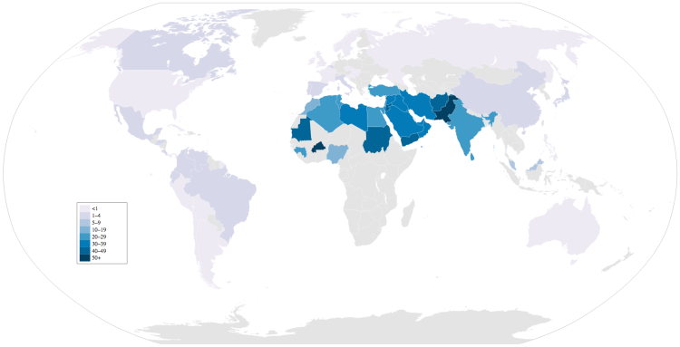
This may seem shocking, but worldwide approximately 10% of all marriages take place between first or second cousins. Above is a map displaying the relative percentages for marriages between first or second cousins for each country (Note: countries in gray mean there is not data). Marriages between cousins are concentrated in the middle east where some countries have as high as 50% of marriages between first or second cousins! The middle east region averages about 1/3 of all marriages to cousins – three times the world average.
Historic Economic Power
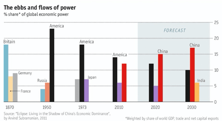
The chart above shows the percent of global economic power (defined as the weighted share of world GDP, trade, and net capital exports) for the top three countries in selected years ranging from 1870 to (projected) 2030. To me, the graph shows the decline in power of Britain from 1870 through 1950, the decline in power for the United States from 1950 through 2030 (although less quickly than Britain), and the rise of China from 2010 into the near future. What once was a European-centric world in the 1800’s is giving why to an East Asian-centric world in the 21 century with the rise of China and India. Side note: If the European Union is considered as a unified entity in the chart above, its scale and decline would closely match that of the US.