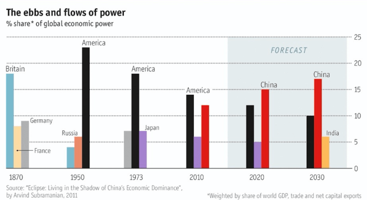
The chart above shows the percent of global economic power (defined as the weighted share of world GDP, trade, and net capital exports) for the top three countries in selected years ranging from 1870 to (projected) 2030. To me, the graph shows the decline in power of Britain from 1870 through 1950, the decline in power for the United States from 1950 through 2030 (although less quickly than Britain), and the rise of China from 2010 into the near future. What once was a European-centric world in the 1800’s is giving why to an East Asian-centric world in the 21 century with the rise of China and India. Side note: If the European Union is considered as a unified entity in the chart above, its scale and decline would closely match that of the US.
