Who Moves? Who Stays?

Screen Shot 2016-12-15 at 10.52.43 PM.png

Recent data from the Pew Research Center gives insight into the demographic profile of US citizens and their moving behavior relative to age, location, and education level. Some highlights: 37% of people have never lived outside their hometowns, 57% of adults have never lived outside their home state, and on the opposite side of the spectrum, only 15% of people have lived in four or more states. The effect of college is a significant difference between ‘movers’ and ‘stayers’ – 77% of college graduates have changed communities at least once compared to only 56% for high school graduates.

The above graph shows the age profile for movers. Most movers are between the age of 18 and 35. There is an initial peak at 18 years old as a large portion of people leave high school for college and there is an even higher peak for movement post college graduation. The most likely age someone will move is around 24 years old – about 37% of people change locations at this age. The graph below shows the net regional US migration patterns in 2007. The South and West are making the largest population gains at the expense of the Northeast and Midwest.

Screen Shot 2016-12-15 at 10.55.40 PM.png

Advertisement

Job Tenure by Cohort

POST_JobGeneration.png

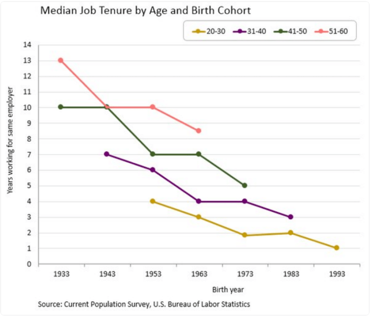
Above is a graphic displaying the number of years working for the same employer relative to birth year. What is clear is that over time, people are working for the same employer for less years on average. This trend is consistent across all age brackets. The change is quite stark, the average worker born in 1933 stayed with the same employer for 13 years, a worker born in 1943 for 10 years, and for someone born in 1993 only one year on average. The takeaway, the workforce is becoming more dynamic and workers in the 21st century economy can expect to work for ten or more employers over the course of their career.

United States GDP

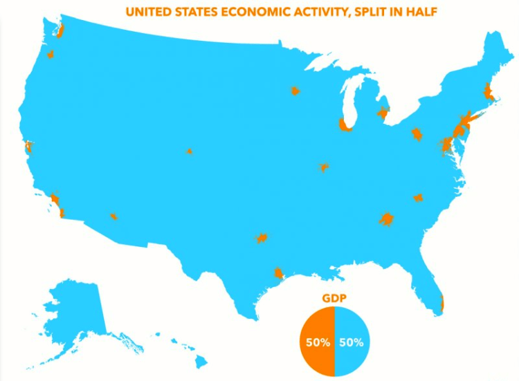
In the United States only 2 percent of the land area produces 50 percent of the GDP. These areas (cities) are displayed on the map below. Displaying GDP production this way makes clear how, even if GDP for the country is increasing, it may only have a positive effect on a small part of the country. Disparities like this are common globally also – 54% of the world’s GDP is produced on just 10% of the land.

US Econ activity.png

Tech Job Locations

POST_TechJobs.png

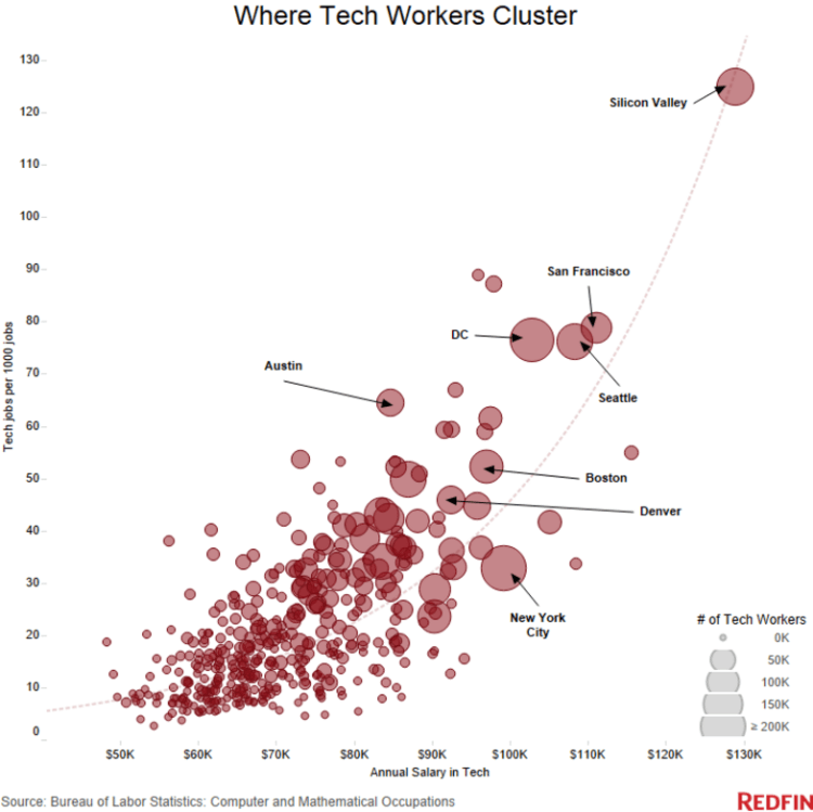
There are approximately 4 million technology related jobs located in the United States – that number translates to about 2% of the US labor force working in tech. How does that 2% figure compare with tech concentrated cities around the country? The graphic above displays the number of tech jobs per 1000 jobs compared with the annual salary of tech workers. What’s striking at first glance is that not only do tech workers make higher incomes the more tech jobs are concentrated, but they make exponentially higher incomes. This finding seems to indicate that tech workers skill sets compliment each other leading to an exponential increase in each worker’s productivity.

Not surprisingly, Silicon Valley tops the list (by a large margin) in the number of tech jobs per capita by city (or region in this case). Silicon Valley has approximately 13% of it’s workforce working in tech – almost 7 times the US average of just 2%. Further, the next closest city to this figure is San Francisco at 8%, literally the next closest city to Silicon Valley by proximity. SV and SF also lead in annual salaries for tech workers in large cities following the model’s prediction above. Other leading tech concentrations are: Washington D.C. with 7.8% of it’s workforce in tech, Seattle 7.6%, Austin 6.4%, Boston 5.2%, and Denver 4.6%

US Labor Market Trends

Over the past few decades the US labor market is undergoing some noticeable trends. One such trend is a consistent decrease in the percentage of the US population employed following a recession (highlighted in grey in the top graphic). This makes since as economic recessions cause unemployment, but a puzzling trends is following – After each of the past two recession the fraction of US population employed (the labor participation rate) has not returned to the previous pre-recession level. In 2001, labor participation was around 64.5%, but only returned to 63.5% by 2007 before the great recession hit. The 2007 recession’s impact has been even more drastic pushing labor participation down further to just 58.5%.

The US labor force composition is also changing quite drastically over the past 60 years. In 1950, the labor participation for men was 87% and for women 32%. That is, 87% of working age men where employed and just 32% of working age women. By 2010, labor participation for men fell to 70% and women’s participation rose to just under 60%. We are becoming a more gender neutral labor force.

POST_US labor market trends.PNG