Expensive Cities

rj65zma2r0121.png

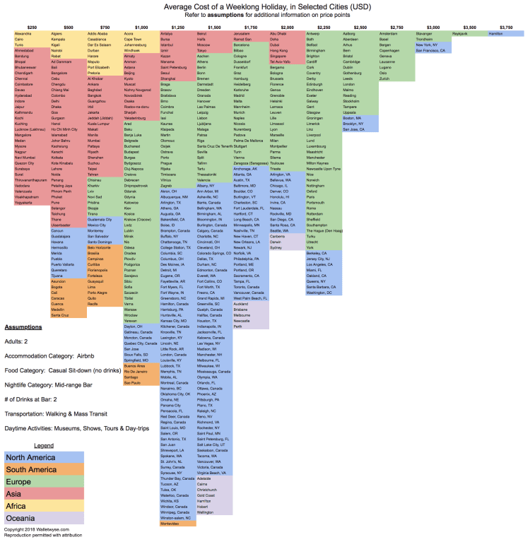
It’s tough to compare costs across cities in different countries, but this study tries to do just that. It’s trying to answer the question: What is the average cost of a weeklong holiday trip to selected cities? The question is subject to the predefined assumptions – The trip is for two adults staying in Airbnb, walking & public transit, and doing typical tourist daytime activities like visiting museums, shows, or day-trips.

The graphic above is color-coded by region. The range of costs across cities in the sample fit closely to a normal distribution with the majority of cities falling in the $1000-2000 cost window. Africa and Asia have most of the cheaper cities while Western Europe and Coastal cities in the USA are the most expensive to visit.

Advertisement

Working Class Affordability 2017

Screen Shot 2017-09-05 at 3.23.54 PM.png

The above map was created on howmuch.net (https://howmuch.net/) showing how much a working class family can save or be indebted living in various cities across the United States. The software allows you to select different criteria – such as the number of working adults in the household, how much they earn, the number of children, amount spent on food, and size of the house in square feet – the algorithm then produces a map (such as the one above) that displays where the most and least affordable places for your family to live. The size of the bubbles are a larger dark shade of red for unaffordable locations or are a larger dark shade of green for affordable locations. For example, the map above is generated for a family of four with two incomes – a home appliance repairer and a manicurist/pedicurist with a low-cost food plan living in a 1500 sq ft home. This family would need an additional $91.2K annually to afford to live in New York City or additional $83.3K to live in San Francisco. Conversely, the family could save $10.1K annually if they lived in Glendale, Arizona.

US City Commute Patterns 2008

Screen Shot 2017-09-04 at 10.47.14 PM.png

Above is a graph displaying the percentage of people that commute by public transit on the x-axis and the percentage commuting by car on the y-axis for various cities around the United States. The size of the bubble relates the workforce population of each city. There doesn’t appear to be a relationship between the size of the city’s population and the percentage of those taking public transit, but if one looks at city density a relationship is clear. Of the top 20 cities in the US by population, the highest density in order are: New York City, San Francisco, Boston, Chicago, Miami, Philadephia, and Washington DC. With exception of Miami (commute data not listed), all of top 6 highest density cities also have the highest fraction of their workforce commuting by public transit.

Europe Income Brackets

POST_Europe GDPpc.png

Above is a map of Europe color-coded into three income brackets – Dark green: greater than 40k euros per capita, Light green: between 20k and 40k euros per capita, and red: less than 20k euros per capita. Note the values are calculated in Purchasing Power Standards (PPS) a metric used by Eurostat for cross-country comparisons. PPS tires to correct for cost of living and price level differences, especially among nations with different currencies. For comparison to the United States, 40k euros converts to 44k dollars (2017 prices). US GDP per capita is 55k dollars, with the highest continental state: New York at 72k USD and lowest: Mississippi at 35k USD. This means the area’s in dark green in the map above (among the highest in Europe) would rank on the lower end of US states, around 40th out of 50.

Cities and Affordability

POST_Afford cities.png

Above is a map displaying median home prices by city and the salary needed to afford living there. Most of the mid-west and south have affordable housing requiring income’s below the US average. (Currently US average income is around $53,750) The most expensive cities to live in are located in the northeast and in California. Current data indicates that San Francisco is the most expensive city to afford with a needed salary of $147,996. This is followed by San Diego at $103,165, Los Angeles at $95,040, New York at $86,770, Boston at $83,151, Washington DC at $78,626, and Seattle at $78,425.

Gay Marriage Percentage by State

Gas marriage heat map.png

Above is heat map displaying same-sex marriage as a percent of all marriages in each three-digit zip code area. The darker the color, the higher percentage of same-sex marriages. Below is a bar-chart displaying results at the state level (Only the top 25 states by population are shown). The number displayed is the percentage of same-sex marriages relative to all marriages in the state. Only 7 of the 25 states have a percentage above the national average of 0.35%. They are: Massachusetts, Washington, California, New York, Maryland, Minnesota, and Arizona.

Gay marriage % for top 25 states.png

US State Population Growth

US state pop growth.png

Above is a graph displaying the five most populous states in the United States from 1900 to 2013. These states – California, Texas, New York, Florida, and Illinois – combine for 119 million people, 37% of US total population.

What’s striking from the graph above is the growth behavior from California, Texas, and Florida compared to New York and Illinois – the latter leveling off and the former having exponential growth. California and New York had the same population in the mid 1950’s, now California is twice as populous as New York.

State population projects are displayed in the table below. California is expected in grow to 44 million people by 2030, Texas to 31 million, and New York to 22 million.

Screen Shot 2016-06-12 at 9.02.42 PM.png