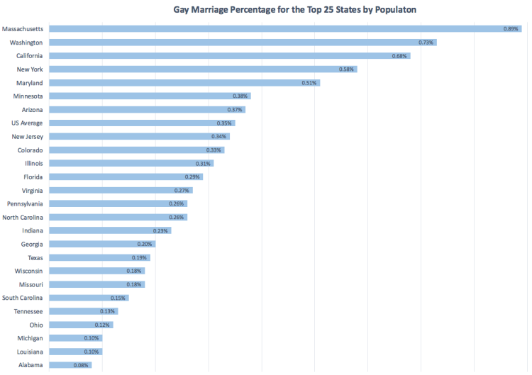
Above is heat map displaying same-sex marriage as a percent of all marriages in each three-digit zip code area. The darker the color, the higher percentage of same-sex marriages. Below is a bar-chart displaying results at the state level (Only the top 25 states by population are shown). The number displayed is the percentage of same-sex marriages relative to all marriages in the state. Only 7 of the 25 states have a percentage above the national average of 0.35%. They are: Massachusetts, Washington, California, New York, Maryland, Minnesota, and Arizona.