


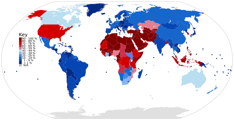
The map above is clustered into three groups depending on religious adherence: Magenta — the ‘Christian World’, Cyan — the ‘Muslum World’, and Yellow — the ‘Eastern World’. The darker the color, the higher the percentage of religious adherence. By total population: Magenta/Christians 2.4 billion (33%), Cyan/Muslim 1.8 billion (24%), and Yellow/Eastern 2.1 billion (29%)
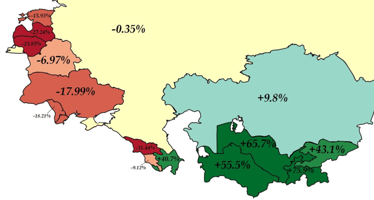
Above is map color coding the former USSR countries by population change from 1989 to 2018. Surprisingly, several nations have decreased in population over the past 30 years! The largest decrease comes from Georgia which has 31.44% less population than it did in 1989. Contrast this with Azerbaijan (just across the border) which as increased by 40.7% over the same time period. For comparison, the United State had a population of 246.8 million in 1989 and a population of 325.7 million today (31.9% increase).

Did you know that California (39 million) has more population than Canada (36 million)? The map above displays the area comparison and map below shows how Canada’s population would fit into California. For example, most Canada’s population is concentrated in the two provinces of Ontario and Quebec – these provinces have approximately the same population of southern California. Even though Canada has an area larger than the entire United States, its population can fit into California with room to spare. Side note: California also has a substantially larger economy with a 2.6 trillion nominal GDP compared to 1.5 trillion for Canada (2017).

The United State and South Korea are outliers in the developed world with male circumcision rates above 50%. Most of the world’s countries and population are uncircumcised, many with percentages around only 10%. The map above displays each country’s male circumcision rate.
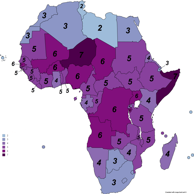
No continent in the world outside of Africa averages more than 2.5 children per women – Africa averages 5! A society or country will remain at the same population level if it remains at the replacement level – 2.1 children per women – below this point, the location’s population is decreasing. Africa’s rate of 5 children per women is well above the replacement level, if fact, at this rate the continent will double in population in the next 30 years. As shown in the map of above, much of this growth is happening between Sub-Saharan Africa and north of southern Africa.
It also important to note the differences in birth rates intra-country. Nigeria is the most populous country in Africa with 185 million people and is the 7th largest in the world. Its fertility rate is 5.5 children per women which is the highest rate for any country already above 100 million people. The fertility rate is not evenly distributed (as pictured below) with a high rate of 8.4 children per women in rural northern regions compared with 3.8 in coastal urbanized areas. A staggering statistic is that: According to 2013 data, approximately 17% of Zamfara state’s women (the highest figure of 8.4 on this map) are currently pregnant!
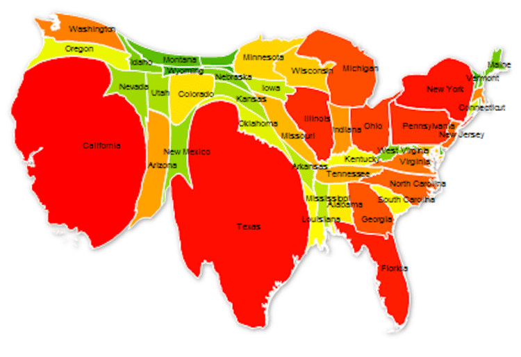
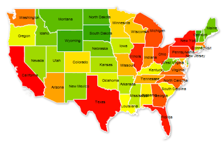
As of 2017, the United States population stands at 324 million – the third largest country in the world by population behind India and China. The population ranges across the nation from state to state, from a high of 39 million in California to a low of 585 thousand in Wyoming. The map above distorts each state’s normal area to display its relative population size. In order words, California population represents 12% of the US total and thus takes up 12% of the map, Texas 8.6%, Florida 6.3%, and so on until Wyoming with 0.18%. The states are color coded by groups of ten with the largest ten in red, the next ten in orange, then yellow, light green, and dark green. California and Texas represent 1/5th of US population and the top 5 states make up 37%. The map below is of the United States as normally displayed, with each state relative to it area.
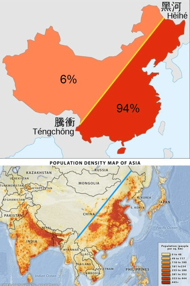
Only about 30 percent of China’s landmass is habitable with approximately 40% of it’s land covered by mountains (in the southwest) and an additional 25% deserts (in the northwest). The maps above display that 94% of China’s population lives on the eastern side of it’s territory. The map below displays the location of China’s deserts and arid regions.
China and India make of 40% of the world’s population and although this figure seems strikingly high, estimates from 1 AD indicate the China and India combined for 60% percent of world population back then! Anyone who has visited either country is aware that both have very high population density. For comparison, world population density is 140 people per square mile – India is about 10 times that with 1008 people per square mile (ppsm) and China is 370 ppsm. Given what we know about the geography of China, this density estimate is quite low and once discounting it’s uninhabitable land, China’s density is more around 1233 ppsm. (Given that about 25% of India’s land is uninhabitable, a more direct comparison would put India density at 1344 ppsm). For those interested, here is the population density for some other countries: European Union (UK included) 304 ppsm, United States 85 ppsm, Brazil 62 ppsm, Russia 21 ppsm, and Canada 9 ppsm.


The map on the left displays the Hispanic percentage for each US state in 1940. Contrast that with the map on the right displaying the Hispanic percentage for each US state in 2010. The Hispanic population in 1940 was mostly concentrated in the southwest border states of Arizona, New Mexico, and Texas, but over the next 70 years, migration and birth rates spread the population throughout the entire southwest, west coast, and major cities on the east coast. New Mexico continues to be the US state with the highest concentration of Hispanic population with 41% in 1940 to 46% in 2010. Nationwide the Hispanic population has increased dramatically over the past 70 years – from around 1.4% in 1940 to 16.3% in 2010!
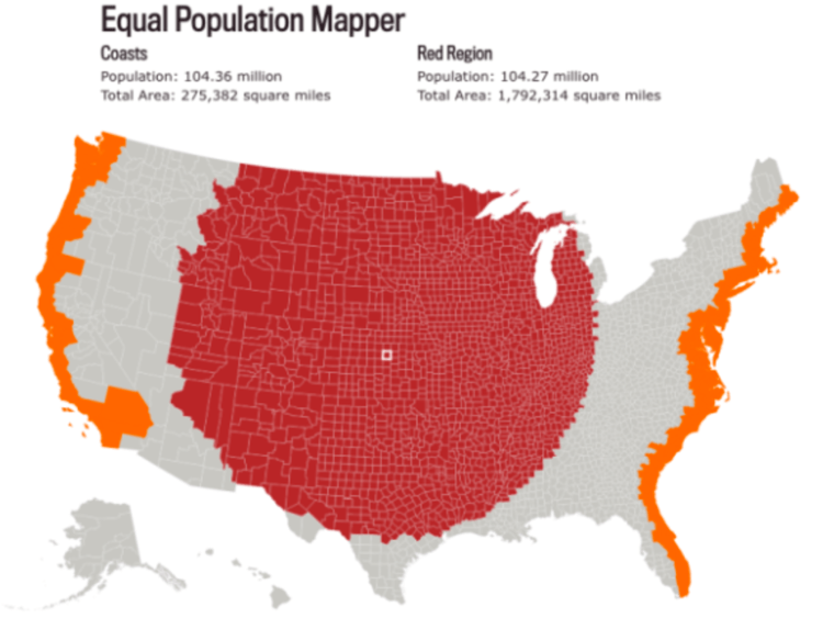
Above is a map comparing the population all of the United States coastal counties (counties boarding the Atlantic or Pacific Oceans) to the same population of counties from mid-point of the US spreading out. The map above has equal population – 104 million to 104 million. The area (in square miles) of the middle counties is 6.5 times the area of the coastal counties.
