US Income Inequality 1970-2010

Screen Shot 2016-12-01 at 4.35.57 PM.png

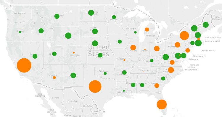
There is increased attention focused on US income inequality in recent years. It remains a challenge to isolate different contributing factors for this inequality growth over the past generation although some reasons have been cited, such as: increased trade with developing countries, increased income for those with university degrees (only around 30% of the US population), increased role of technology in the economy, etc. This post will not dive into trying to uncover why income inequality is happening, but rather, how the various income groups have been affected since 1970.

Above is a chart displaying the US population grouped into five income brackets. What is clear from the data is for the bottom 80% of US income earners, all groups are receiving a smaller share of total US income than compared to 1970 and 1990. Meanwhile, across this same period, the highest fifth of income-earners in the US have received an increasing share of income compensation – from 43.3% in 1970 to 46.6% in 1990 to 50.3 percent in 2010.

Although, to play devil’s advocate, what makes this issue even more complicated is that individuals are not in the same group over time, it is hard to factor in changes in the quality of goods, or even, the modern luxuries of goods that didn’t even exist 40 years ago such as the internet, smart phones, laptop computers, etc. Even though the percentage of income the bottom 80% of income earners is responsible for has decreased over the period, it’s clear that they are living better lives considering all the improvements in technology, safety, and healthcare.

Advertisement

US Income Distribution 2015

Screen Shot 2016-12-09 at 10.25.56 PM.png

Income data from the 2015 US census reveals some insight. 39% of all households had two or more income earners resulting in 25% of households having a combined income above $100k. Meanwhile, only 9% of US workers (population age 15 or older) have individual incomes over $100k. These high earners are typically associated with high education levels as half of all people with graduate degrees are also among the top 15% of income earners (individual incomes greater than $75k).

In 2015, US median personal income was $30k and the mean personal income was $44k. For the US population aged 15 and above, 43% make less than $25k, 70% make less than $50k, 84% make less than $75k, and 91% make less than $100k. Similar data is displayed in the bar chart above – one chart shows the distribution for ages 25 through 64 and the other for ages 25 and above.

Who Moves? Who Stays?

Screen Shot 2016-12-15 at 10.52.43 PM.png

Recent data from the Pew Research Center gives insight into the demographic profile of US citizens and their moving behavior relative to age, location, and education level. Some highlights: 37% of people have never lived outside their hometowns, 57% of adults have never lived outside their home state, and on the opposite side of the spectrum, only 15% of people have lived in four or more states. The effect of college is a significant difference between ‘movers’ and ‘stayers’ – 77% of college graduates have changed communities at least once compared to only 56% for high school graduates.

The above graph shows the age profile for movers. Most movers are between the age of 18 and 35. There is an initial peak at 18 years old as a large portion of people leave high school for college and there is an even higher peak for movement post college graduation. The most likely age someone will move is around 24 years old – about 37% of people change locations at this age. The graph below shows the net regional US migration patterns in 2007. The South and West are making the largest population gains at the expense of the Northeast and Midwest.

Screen Shot 2016-12-15 at 10.55.40 PM.png

Electoral College Vs. US Population

EC vs Pop map.png

Hilary Clinton won the popular election 47.7% to 47.4% despite losing the electoral college by a wide margin to Donald Trump. This is only the second time since 1888 that a candidate has won the popular vote, but not the election. This situation has lead some to question if the electoral college system is really the best way to select a president. Liberals claim that it is not fair as large, densely populated states have proportionally less say then less populated rural states that have a minimum 3 electoral votes regardless of population. This claim was interesting, so I decided to investigate further.

Above is a map displaying the relative difference among the states regarding their ‘over representation’ or ‘under representation’ given population. Orange colored bubbles mean the state has a higher fraction of US population than the fraction of electoral college votes. For example, California has 12.2% of US population, yet only 10.2% of electoral college votes. This is also the case for Texas (8.5% of population verse 7% of electoral college) and likewise for all other orange colored states. The size of the bubble signals a larger margin of under representation.

On the other end of the spectrum, the green colored bubbles mean the state has a higher fraction of electoral college votes compared to their fraction of US population. For example, Wyoming has 0.18% of US population yet has 0.56% of the electoral college – that is, 3 votes out of 538. Again the larger the green bubble signals a wider margin between electoral college votes compared to relative population.

The smaller the bubbles, whether green or orange, means that state was very close to proportional representation between the electoral college and population. For example, Washington state had 2.2% of US population and 2.2% of electoral college votes.

Comparing how the 18 most over represented states voted results in 9 Republican and 9 Democratic states. That is, for every rural over represented Republican state like Wyoming, Alaska, and North Dakota – there are an equal number of small over represented Democratic states like Vermont, Washington DC, and Delaware. To claim the election was lost due to under populated Republican states is inaccurate. The election was won in the battle ground, medium sized swing states of Ohio, Michigan, Wisconsin, and Pennsylvania – all of whom voted Republican this year instead of Democratic was they did in 2012 and 2008.

Screen Shot 2016-11-13 at 5.27.51 PM.png

Above is a table of the 18 most over represented states by electoral college votes. The ‘Elect Diff’ column is the difference between the electoral college percentage minus the US population percent the state has. The ‘Demo16’ column is the Democratic vote percentage, ‘Rep16’ is the Republican vote percentage, ‘Other16’ is the sum of third party vote percentage, and ‘D-R Spread’ is the Democratic vote percentage minus the Republican vote percentage.

Gay Marriage Percentage by State

Gas marriage heat map.png

Above is heat map displaying same-sex marriage as a percent of all marriages in each three-digit zip code area. The darker the color, the higher percentage of same-sex marriages. Below is a bar-chart displaying results at the state level (Only the top 25 states by population are shown). The number displayed is the percentage of same-sex marriages relative to all marriages in the state. Only 7 of the 25 states have a percentage above the national average of 0.35%. They are: Massachusetts, Washington, California, New York, Maryland, Minnesota, and Arizona.

Gay marriage % for top 25 states.png

US County Population

Screen Shot 2016-09-12 at 3.05.08 PM.png

The United States has 3007 counties. The top 100 by population (3.3% of counties) have a total of 129 million people (40% of US population). The map above displays these top 100 – those colored orange are counties with more than 1 million people and those colored green have less than 1 million people. The cut-off population to be in the top 100 is 626,000 people. There are 39 counties with more than 1 million people and only 14 with more than 2 million people. A third of US States do not have one county in the top 100 and only 14 States have at least one county over 1 million people – CA: 9, NY: 7, TX: 5, FL: 5, PA/OH/MI: 2 each, IL/AZ/WA/NV/MA/VA/UT: 1 each.

United States GDP

In the United States only 2 percent of the land area produces 50 percent of the GDP. These areas (cities) are displayed on the map below. Displaying GDP production this way makes clear how, even if GDP for the country is increasing, it may only have a positive effect on a small part of the country. Disparities like this are common globally also – 54% of the world’s GDP is produced on just 10% of the land.

US Econ activity.png

US And Europe Size

US, Europe size.png

The map above projects western and central Europe on top of a map of the United States. The European Union has 510 million people people living within a territory of 4,324,782 square km. Compare that to the Unites States with a population of 324 million people living within 9,883,517 square km of territory – the US is more than twice as big as the EU in area with only 2/3 its population.

What can be inferred from the numbers above is the population density between two areas. The EU has a population density of 304 people per square mile (almost as much as China at 370). Compare that the US with a population density of only 85 people per square mile! The world average population density is 140 people per square mile – if the US increases in population enough meet the world average, it’s population would increase to 530 million people. If the US ever become as densely populated as Europe, its population will swell to over 1.1 billion people – almost as much as present day China!

Tech Job Locations

POST_TechJobs.png

There are approximately 4 million technology related jobs located in the United States – that number translates to about 2% of the US labor force working in tech. How does that 2% figure compare with tech concentrated cities around the country? The graphic above displays the number of tech jobs per 1000 jobs compared with the annual salary of tech workers. What’s striking at first glance is that not only do tech workers make higher incomes the more tech jobs are concentrated, but they make exponentially higher incomes. This finding seems to indicate that tech workers skill sets compliment each other leading to an exponential increase in each worker’s productivity.

Not surprisingly, Silicon Valley tops the list (by a large margin) in the number of tech jobs per capita by city (or region in this case). Silicon Valley has approximately 13% of it’s workforce working in tech – almost 7 times the US average of just 2%. Further, the next closest city to this figure is San Francisco at 8%, literally the next closest city to Silicon Valley by proximity. SV and SF also lead in annual salaries for tech workers in large cities following the model’s prediction above. Other leading tech concentrations are: Washington D.C. with 7.8% of it’s workforce in tech, Seattle 7.6%, Austin 6.4%, Boston 5.2%, and Denver 4.6%