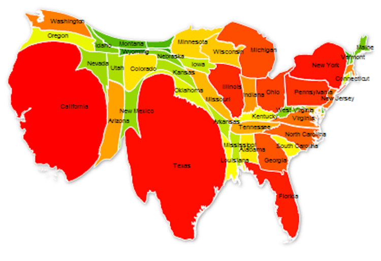
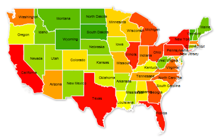
As of 2017, the United States population stands at 324 million – the third largest country in the world by population behind India and China. The population ranges across the nation from state to state, from a high of 39 million in California to a low of 585 thousand in Wyoming. The map above distorts each state’s normal area to display its relative population size. In order words, California population represents 12% of the US total and thus takes up 12% of the map, Texas 8.6%, Florida 6.3%, and so on until Wyoming with 0.18%. The states are color coded by groups of ten with the largest ten in red, the next ten in orange, then yellow, light green, and dark green. California and Texas represent 1/5th of US population and the top 5 states make up 37%. The map below is of the United States as normally displayed, with each state relative to it area.

Thank for making the population map, I found it very insightful and I appreciate your work. I really like your site layout as well.
LikeLike
I’m not sure if my first comment posted so I’m trying again. Thank you for making the map that displays the difference in population through the distortion of shape & size, it was a very insightful and interesting way to display the grand disparity in population across the US. Have a good day!
LikeLike