G20 Trade Network


The map above displays from whom countries import more from – either the US, EU, China, or Russia. Border countries import the most from their neighbor country and this trading influence propagates outward. Generally speaking, the US is the export center for a North American zone, France+Germany for a European zone, Russia for a Eurasian zone, and China an Asian zone + the nearly the entire southern hemisphere.

The World GDP as a pie chart. A rough and simple way to look at is: US ~1/4, China ~1/5, Europe ~1/4, Japan ~5%, India ~5%, everyone else ~20%.
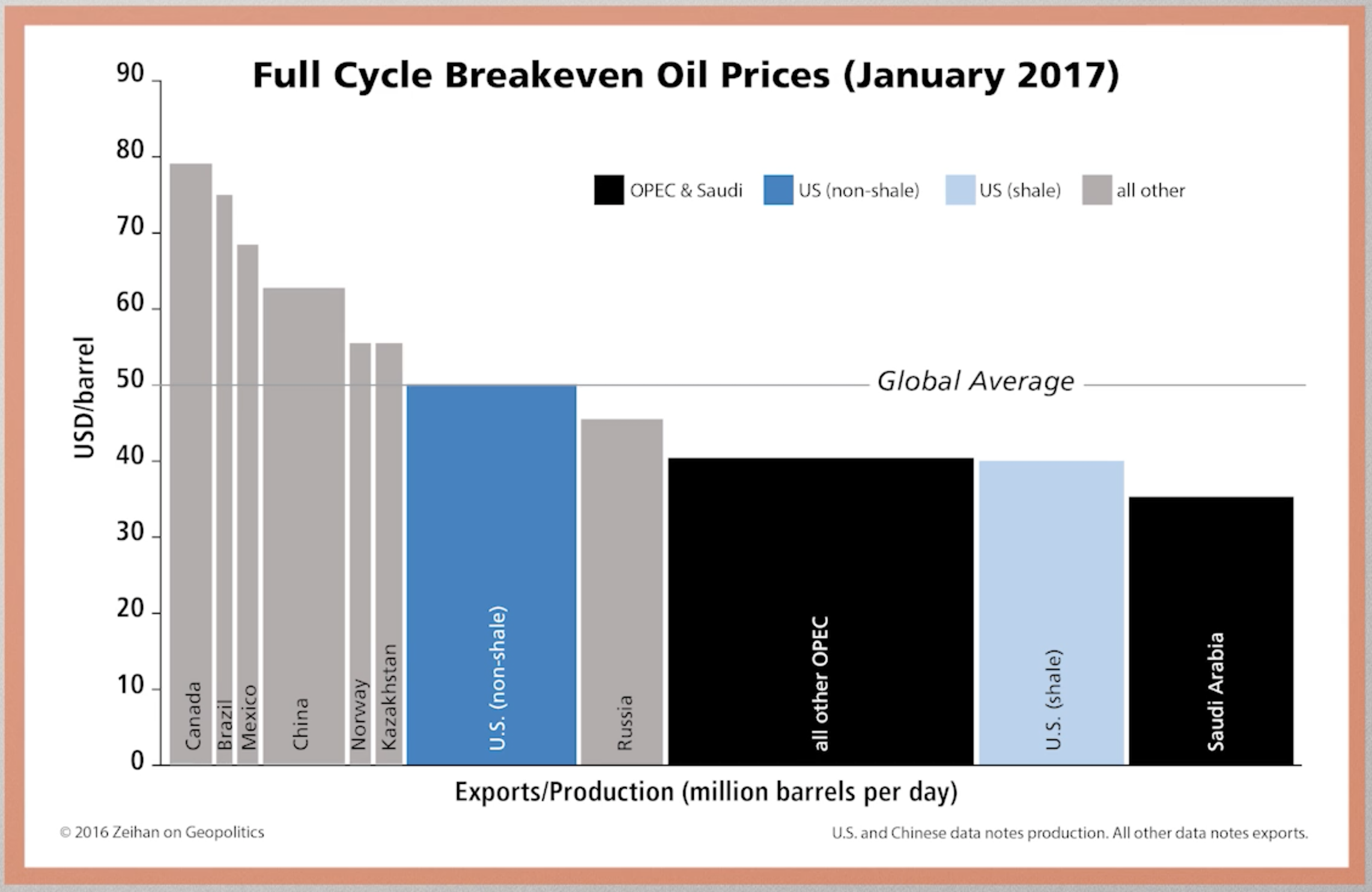
Above is a bar chart showing the break-even price for various oil-producing countries and OPEC. The ‘shale revolution’ has allowed the United States to produce a large portion its oil cheaper than any country in the world except Saudi Arabia. The dramatic fall in the price of oil (due in part to US production increase) hurts expensive ‘tar sands’ oil producing countries like Canada and Venezuela.
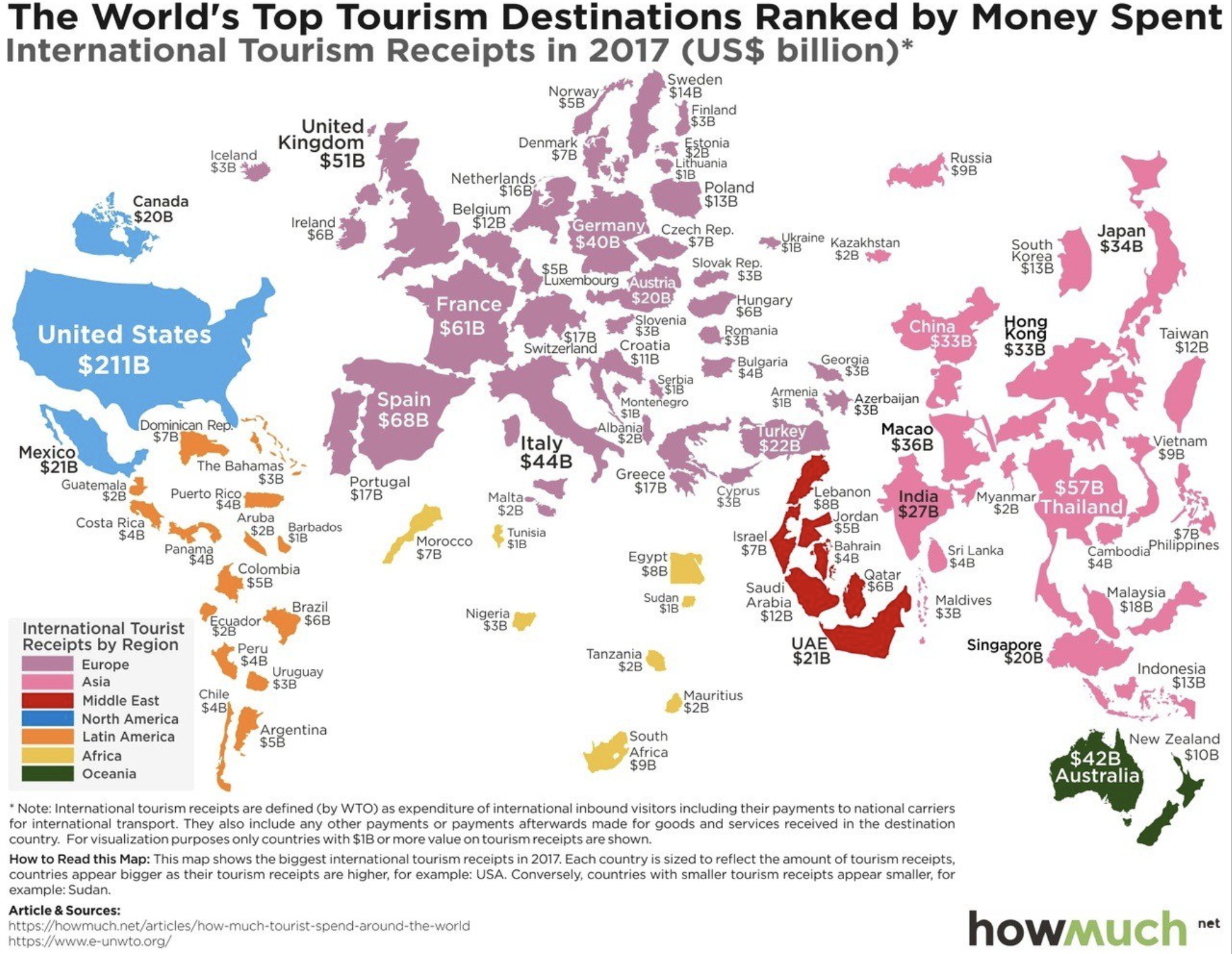
The map above displays the world’s countries sized by international tourism receipts in 2017. The top ten can be seen in tabular view below:

A few things jump out. The US gains more from international tourism than any other country by a factor of 3 and China spends more aboard than any other country by a factor of 2! Macau (ranked 9th) has three times the gambling revenue of Las Vegas, with much of this money origination in mainland China and spend ‘internationally’ in Macau. (Hong Kong ranks 11th with 33 billion in receipts in 2017) If Hong Kong, Macau, and Taiwan were counted as one country on this list, it would rank 2nd with 81 billion in receipts.


Above is map color coding the former USSR countries by population change from 1989 to 2018. Surprisingly, several nations have decreased in population over the past 30 years! The largest decrease comes from Georgia which has 31.44% less population than it did in 1989. Contrast this with Azerbaijan (just across the border) which as increased by 40.7% over the same time period. For comparison, the United State had a population of 246.8 million in 1989 and a population of 325.7 million today (31.9% increase).

Above is a map of Europe displaying whether a country has a GDP per capita less than or greater than Turkey. The data is from the IMF in Oct 2017. Turkey has a GDP per capita of $24,912 at Purchasing Power Parity (PPP). The data displays the income divide Europe where all of western Europe and Russia (labeled in Blue) have a higher standard of living than Turkey and most the former USSR and former Yugoslavia countries (labeled Red) have a lower standard of living than Turkey. The income differences help to explain some of the internal migration within Europe.

Above is a comparison of GDP per capita (nominal) figures for BRIC countries – that is, Brazil, Russia, India, and China. The data displayed ranges from 1980 through 2016. A few things stand out, both Brazil and Russia’s economies were overvalued post-2007 financial crisis, driven by high oil prices that have regressed back to the mean and inflated currently values. China economy has leveled off in recent years and India is still much poorer than the other three BRIC economies, yet show promise moving forward.
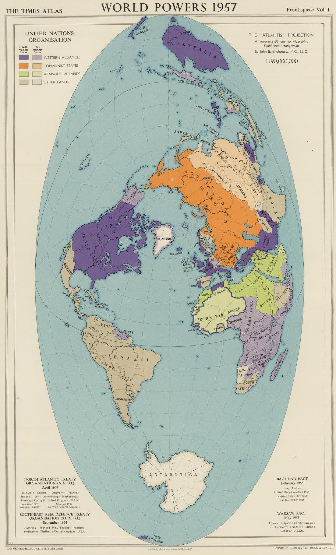
Above is a map of the world in 1957 with highlights displaying various country alliances – NATO/Western allies in Purple/Light Purple, USSR/Communist countries in Orange/Light Orange, and Muslum countries in Green. The map does a great job displaying the encirclement of allies the US had surrounding the USSR, known as the US’s strategy of containment (seeking to prevent the spread of communism to other countries).