The above map was created on howmuch.net (https://howmuch.net/) showing how much a working class family can save or be indebted living in various cities across the United States. The software allows you to select different criteria – such as the number of working adults in the household, how much they earn, the number of children, amount spent on food, and size of the house in square feet – the algorithm then produces a map (such as the one above) that displays where the most and least affordable places for your family to live. The size of the bubbles are a larger dark shade of red for unaffordable locations or are a larger dark shade of green for affordable locations. For example, the map above is generated for a family of four with two incomes – a home appliance repairer and a manicurist/pedicurist with a low-cost food plan living in a 1500 sq ft home. This family would need an additional $91.2K annually to afford to live in New York City or additional $83.3K to live in San Francisco. Conversely, the family could save $10.1K annually if they lived in Glendale, Arizona.
Tag Archives: San Francisco
US City Commute Patterns 2008
Above is a graph displaying the percentage of people that commute by public transit on the x-axis and the percentage commuting by car on the y-axis for various cities around the United States. The size of the bubble relates the workforce population of each city. There doesn’t appear to be a relationship between the size of the city’s population and the percentage of those taking public transit, but if one looks at city density a relationship is clear. Of the top 20 cities in the US by population, the highest density in order are: New York City, San Francisco, Boston, Chicago, Miami, Philadephia, and Washington DC. With exception of Miami (commute data not listed), all of top 6 highest density cities also have the highest fraction of their workforce commuting by public transit.
SF Bay Area Median Home Price Apr 2017
Above is a map displaying the median home prices for cities in the SF Bay Area as of April 2017 on Zillow. The most expensive cities in order are: Palo Alto 2.5 million, Cupertino 1.8m, Mountain View 1.5m, Sunnyvale 1.5m, Redwood City 1.3m, San Francisco 1.2m.
Below is a chart displaying the median home price changes for the four largest cities in the Bay Area since Jan 2012. Home prices have doubled in the past five years with cities such as Oakland up 123%, Mountain View up 112%, and Palo Alto up 103% over the period.
Bay Area Median Home Price 2016
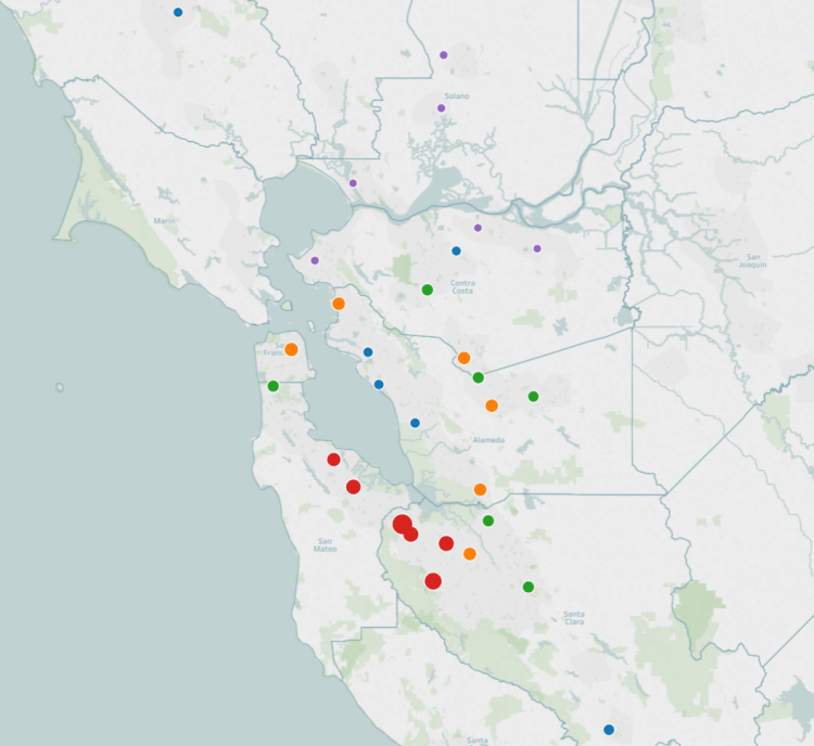
The San Francisco Bay Area is one of the most expensive places to live in the United States. The map above displays the median home price for the top 30 most populated cities in the Bay Area. The larger the bubble, the higher the median home price. The bubbles are also color coded – Red the highest 20%, Orange the next 20%, then Green, Blue, and Purple the lowest 20% by median home price.
Regionally, the cities comprising Silicon Valley are the most expensive and the cities in the northeastern bay are the cheapest. In order, the most expensive cities in the bay area by median home price (via Zillow) as of 2016: Palo Alto at 2.5 million, Cupertino 1.8 million, Mountain View 1.4 million, Sunnyvale 1.4 million, Redwood City 1.3 million, San Mateo 1.1 million, and San Francisco 1.1 million.
The most affordable housing in the Bay Area (of the top 30 by population) are: Richmond 411k, Vacaville 391k, Fairfield 390k, Antioch 364k, Pittsburg 357k, and Vallejo 326k.
US Median Home Price 2015
Above is a map of the top 100 metropolitan areas by population in the United States colored and sized according to the median home price. The larger the bubble, the higher the house price. Also, there are color tiers – Red the highest, Orange upper-mid, Green middle, Blue lower-mid, and purple lowest. The national average home price was $215,000.
In 2015, the metro area with the highest median home price is San Jose, CA at $900,000, followed by San Francisco-Oakland at $850,000, Los Angeles at $590,000, New York City at $585,000, and Oxnard at $507,000. The five lowest metro areas by median home price were Akron, OH at $93,000, St. Louis, MO at $89,900, Youngstown, OH at $88,500, McAllen, TX at $85,000, and Dayton, OH at $63,000.
Cities and Affordability
Above is a map displaying median home prices by city and the salary needed to afford living there. Most of the mid-west and south have affordable housing requiring income’s below the US average. (Currently US average income is around $53,750) The most expensive cities to live in are located in the northeast and in California. Current data indicates that San Francisco is the most expensive city to afford with a needed salary of $147,996. This is followed by San Diego at $103,165, Los Angeles at $95,040, New York at $86,770, Boston at $83,151, Washington DC at $78,626, and Seattle at $78,425.
House Prices and Tech
The bar chart on the left displays the number of technology related jobs per 1000 jobs for select cities. The bar chart on the right displays the median house price for the same cities on the left. What jumps out from this comparison is how expensive house prices are in the Bay Area compared with other tech centers around the country. Despite having roughly the same number of tech related jobs (7.9% and 7.6%) home prices in San Francisco are more than two and a half times more expensive than homes in Seattle (1.2 million compared with 430k). Another finding is that even if cities have a higher fraction of their laborforce working in tech jobs, most cities in this sample do not have home prices far above the US Average.
3-D Bay Area Population Density Map
The Bay Area is home to 7.6 million people. The graphic below displays the population density across the various regions. The North Bay is sparsely populated with mostly agricultural and mountainous terrain. San Jose is the largest city in the Bay Area at 1 million inhabitants, although it’s population density is average for a large city with only 5,600 people/sq mile. Compare that with Oakland (at 7,417 people/sq mile) or San Francisco (the densest city in the US outside of NYC) at 17,246 people/sq mile!