Children per Woman

POST_Child_Women.png

There are currently 7.4 billion people on earth. This number is expected to rise to 10 billion by 2080 (based on U.N. estimates). These numbers beg the question – just how many people can the planet support? And, in what regions is population growing, remaining stable, or decreasing?

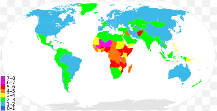
The map above colors each county by the number of children a woman is expected to have on average. Virtually all of the developed nations, such as: the US, Canada, Europe (except France), Japan, etc. average somewhere between 1-2 children per woman. This rate is actually below the replacement rate (2.1 children per women) indicating that the countries (labelled in blue above) will have decreasing populations internally over the coming decades. This does not mean, however, that the country’s population will decrease, that will depend on the number of immigrates it attracts. For example, the US and Canada attract the largest number of immigrates from across the globe which continue to bolster their population despite low birth rates internally. Conversely, a country with a low birth rate and restrictive immigration will show signs of drastic population decrease as in Japan – it has one of the lowest birth rates in the world with only 1.4 children per woman and has lost population in the past decade.

On the other end of the spectrum, Africa is exploding in population. The continent today has roughly 1 billion people. This figure is expected to double to 2 billion in just 30 years! Some countries – Niger, Mali, Burundi, Somalia – average more than 6 children per woman. It will be a time of drastic demographic change in central Africa over the next generation that may threaten the stability of the region further.

Middle income countries are mostly labeled in green in the above map indicating a healthy, moderate growth in population. For example, India (the world’s 2nd most populated country) averages 2.5 children per woman and Indonesia (the world’s 4th most populated country) averages 2.2.

3-D Bay Area Population Density Map

The Bay Area is home to 7.6 million people. The graphic below displays the population density across the various regions. The North Bay is sparsely populated with mostly agricultural and mountainous terrain. San Jose is the largest city in the Bay Area at 1 million inhabitants, although it’s population density is average for a large city with only 5,600 people/sq mile. Compare that with Oakland (at 7,417 people/sq mile) or San Francisco (the densest city in the US outside of NYC) at 17,246 people/sq mile! Screen Shot 2016-04-10 at 11.51.01 AM.png

World University Rankings

Screen Shot 2016-05-07 at 10.14.44 PM.png

The graphic above displays a world map distorted relative to the population of each country and has pink bubbles indicating the location of the top 200 ranked universities in the world. The relative size of the bubbles indicate that the university is located closer to the top of the rankings and vise versa for smaller bubbles. What is striking about this map is the inequality of top universities globally, with virtually all of the top 200 schools located in the developed world.

Further, the concentration gets even more extreme at the very top of the rankings. From the 2015 numbers, the top 50 universities in the world are located in just 12 countries. The United States has a huge advantage in premier universities with 25 of the top 50 and 10 of the top 15! The next closest on the list is the United Kingdom with 7 in the top 50 (3 of these 7 in the top 10 – Oxford, Cambridge, and Imperial College London).

North America, Europe, and Australia account for 45 of the top 50 universities in the world. The remaining 5 located outside the western world are: National University of Singapore (26th), Peking University (42nd), University of Tokyo (43rd), University of Hong Kong (44th), and Tsinghua University (47th).

Percent of Global GDP

Percent of Global GDP.png

The graphic above displays the change in regional and country GDP as a fraction of global GDP from the period 1820 through 2012. The picture tells a story of the rise of ‘the west’ during the industrial revolution and the corresponding fall of the Asian world powers from 1820 through the mid 1900’s. Then following economic reforms in the late 1900’s, Asian giants re-emerging and gaining market share of global GDP corresponding with a fall by western powers.

In 1820, China and India together made up 49% of world GDP, but by the late 1970’s this figure had fallen to less than 5% combined. That is, China and India – countries that make up 37% of the world population, only accounted for 5% of world GDP. Since that time, China and India have had drastic economic growth and now account for 21% of global GDP.

The graphic also tells the tale of the United States emerging as a global super power. From 2% of global GDP in 1820 to a peak of 36% following WWII. In fact, the 36% of world GDP figure is the highest mark by any country in history – All this accomplished by a country with only 5% of world population. The stagnate economic growth since the 1970’s is comparable to Europe, although not quite as drastic. The US and Europe still account for 35% of world GDP combined.

Internet speeds

Internet speed.png

As more of the economy and economic growth is intertwined with the internet – speed and connectivity are highly important to the success of countries in the 21st century. As displayed above, there is large disparities in internet access and connectivity speeds between countries in the developed world and in undeveloped areas.

In the 2015 Q3 ranking by Akamai, the top ten countries by average connection speed (in Mb/s) were: (1) South Korea 20.5, (2) Sweden 17.4, (3) Norway 16.4, (4) Switzerland 16.2, (5) Hong Kong 15.8, (6) Netherlands 15.6, (7) Japan 15.0, (8) Finland 14.8, (9) Latvia 14.5, and (10) Czech Republic 14.5.

In comparison to other developing countries in the world: Mexico ranks 68th at 5.5 Mb/s, China 91st at 3.7 MB/s, Brazil 93rd at 3.6 Mb/s, and India 116th at 2.5 Mb/s.

The United States is ranked 16th in the world by average connection speed at 12.6 Mb/s, slightly above average in the developed world. Although, the numbers are skewed in favor of small density connected countries without rural areas to bring the average down. The US average may be slower than some small dense northern European countries, but when compared the the European Union as a whole, the US is much faster – 12.6 Mb/s to 8.1 Mb/s.

If the US states where ranked individually, Washington D.C. would rank 2nd in the world in average internet connection speed, Delaware 3rd, Utah 6th, Massachusetts 7th, and Rhode Island 10th. As of 2014, the US state with the slowest average internet speed was Alaska at 7 Mb/s.

Screen Shot 2016-04-10 at 9.43.04 PM.png

World Legal Systems

World Legal systems.png

The legal systems of countries around the world can be said to fit generally into three distinctive categories – Civil law, Common law, and Sharia law. Civil law makes up the majority of countries in the world and is derived originally from Roman law and later the Napoleonic code spread by the French empire across Europe. Civil law can be described simply a law structure that is highly codified into a referable system. It leaves little room for interpretation from judges as each law should be referable to a previous statute.

In contrast to Common law, also know as case law or precedent law, is derived from the English legal tradition. Common law puts much more power into the hands of judges and their interpretation of the law over time.  These judge-made decisions create precedential authority to prior court decisions which bound the judge’s opinion to pervious court rulings. This legal system was spread by the British Empire to it’s dominions across the globe including: the United States, Canada, Australia, New Zealand, and is a hybrid system in many others.

Sharia law or Muslim law is present in muslim majority countries in the Middle East and North Africa. This legal tradition is derived directly from the Quran and was spread during Islamic Caliphate in 750 AD. The remaining parts of the world including most of the countries in Africa, South Asia, and Southeast Asia have some hybrid law system mixed between Civil, Common, Sharia, and Customary law. Refer to legend below for what category your country falls into.

Legal systems legend.png

Country Executions

The United States is the only country in the western world to still retain the death penalty. It is also with the minority of the world – just 58 of 198 countries (29%) have used the death penalty in the last 10 years.

The chart below displays the top 25 countries ranked by executions over the past decade. China and Iran ‘lead’ in this category by a large margin. Iran has the distinction of having highest number of execution per capita. Meanwhile in China, the number of executions is officially unknown and regarded as a “state secret” – Estimates range from as high as 2500 to 5000 per year, more than the rest of the world combined!

The United States does not fair very well either – 5th in the world in executions with 350 since 2007.

POST_Executions by country.png

State Politics

POST_Screen Shot 2012-10-11 at 12.00.51 AM.png

The above graphic displays the number of visits by presidential candidates (hand waves) and the amount of money spent (dollars signs) per state during the 2004 election. What is quickly apparent is only a few states are (politically speaking) “important” – these states being the so-called “swing states”.

The map below shows what states were within in +/- 4% margin of victory between the two opposing parties during the 2012 campaign – namely: Ohio, Florida, North Carolina, and Virginia. Florida and Ohio are particularly important as they are both swing states and have large population. Florida has 27 electoral college votes (third most in the US) and Ohio has 20 (seven most). The relative importance of these states and other “swing states” are highlighted above in the amount money and visits by political candidates. Do you still think your vote counts?

Screen Shot 2016-03-06 at 9.15.03 PM.png

Internet Population

POST_Internet population.png

A majority of the world’s population today still does not have internet access. Currently only around 40% of the world is actively using the internet – in the poorest quarter of the world, only about 20%. In the developed world, internet penetration is over 80% – some dense and connected countries (such as Qatar, Netherlands, South Korea) have over 90% of their population online. On the other end of the spectrum, some 22 countries are under 5% internet penetration (such as Myanmar, Ethiopia, Congo).

The map above displays a distorted world map with each country’s area representing their internet population. The map is also color coded to show the relative internet penetration among regions.

US Labor Market Trends

Over the past few decades the US labor market is undergoing some noticeable trends. One such trend is a consistent decrease in the percentage of the US population employed following a recession (highlighted in grey in the top graphic). This makes since as economic recessions cause unemployment, but a puzzling trends is following – After each of the past two recession the fraction of US population employed (the labor participation rate) has not returned to the previous pre-recession level. In 2001, labor participation was around 64.5%, but only returned to 63.5% by 2007 before the great recession hit. The 2007 recession’s impact has been even more drastic pushing labor participation down further to just 58.5%.

The US labor force composition is also changing quite drastically over the past 60 years. In 1950, the labor participation for men was 87% and for women 32%. That is, 87% of working age men where employed and just 32% of working age women. By 2010, labor participation for men fell to 70% and women’s participation rose to just under 60%. We are becoming a more gender neutral labor force.

POST_US labor market trends.PNG