Voter Demographics 2016

Screen Shot 2016-11-19 at 9.43.36 PM.png

Above is a graphic displaying the Republican share of the two-party votes relative to square miles per voter (i.e. population density). As expected, Democrats won a larger fraction of urban areas, on average, while Republicans won more rural areas. Democrats also won a larger share of college graduates, all be it a slim margin 49% to 45%, but won by a substantial margin in both non-white college graduates and the non-white non-college graduate population – 71% and 75% respectively.

Below is a graphic displaying the percentage change in voting behavior for various demographic groups compared to the 2012 election. Trump won a larger percentage of votes in all categories (including Male, White, Black, Hispanic, and Asian) except for Women voters who voted by a 1% larger margin for Hillary than for Obama in 2012.

Screen Shot 2016-11-19 at 9.42.05 PM.png

Electoral College Vs. US Population

EC vs Pop map.png

Hilary Clinton won the popular election 47.7% to 47.4% despite losing the electoral college by a wide margin to Donald Trump. This is only the second time since 1888 that a candidate has won the popular vote, but not the election. This situation has lead some to question if the electoral college system is really the best way to select a president. Liberals claim that it is not fair as large, densely populated states have proportionally less say then less populated rural states that have a minimum 3 electoral votes regardless of population. This claim was interesting, so I decided to investigate further.

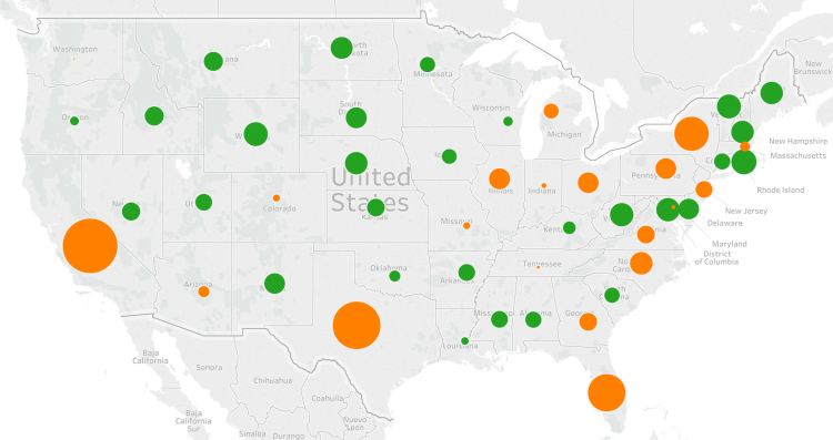
Above is a map displaying the relative difference among the states regarding their ‘over representation’ or ‘under representation’ given population. Orange colored bubbles mean the state has a higher fraction of US population than the fraction of electoral college votes. For example, California has 12.2% of US population, yet only 10.2% of electoral college votes. This is also the case for Texas (8.5% of population verse 7% of electoral college) and likewise for all other orange colored states. The size of the bubble signals a larger margin of under representation.

On the other end of the spectrum, the green colored bubbles mean the state has a higher fraction of electoral college votes compared to their fraction of US population. For example, Wyoming has 0.18% of US population yet has 0.56% of the electoral college – that is, 3 votes out of 538. Again the larger the green bubble signals a wider margin between electoral college votes compared to relative population.

The smaller the bubbles, whether green or orange, means that state was very close to proportional representation between the electoral college and population. For example, Washington state had 2.2% of US population and 2.2% of electoral college votes.

Comparing how the 18 most over represented states voted results in 9 Republican and 9 Democratic states. That is, for every rural over represented Republican state like Wyoming, Alaska, and North Dakota – there are an equal number of small over represented Democratic states like Vermont, Washington DC, and Delaware. To claim the election was lost due to under populated Republican states is inaccurate. The election was won in the battle ground, medium sized swing states of Ohio, Michigan, Wisconsin, and Pennsylvania – all of whom voted Republican this year instead of Democratic was they did in 2012 and 2008.

Screen Shot 2016-11-13 at 5.27.51 PM.png

Above is a table of the 18 most over represented states by electoral college votes. The ‘Elect Diff’ column is the difference between the electoral college percentage minus the US population percent the state has. The ‘Demo16’ column is the Democratic vote percentage, ‘Rep16’ is the Republican vote percentage, ‘Other16’ is the sum of third party vote percentage, and ‘D-R Spread’ is the Democratic vote percentage minus the Republican vote percentage.

Guns and Suicide

Screen Shot 2016-10-21 at 1.26.53 AM.png

The third presidential debate finished a few days ago and one of the first topics discussed concerned the second amendment, the right to bear arms. Pro-gun advocates claim that more guns make an area safer, while gun regulation advocates claim the opposite. What does data reveal on the topic?

Each year the Law Center to Prevent Gun Violence releases the “Gun Law State Scorecard”. This scorecard grades states from A to F on the laws in place to regulate firearm purchases. Above is a map of the US displaying these grades: An “A” grade is colored black, B dark grey, C light grey, D pink, and F red.

Comparing state grades with the suicide rate reveals some insightful findings. Why compare gun regulations to suicide rates you ask? From 2010 to 2014, suicide was the highest cause of gun related deaths in the US – 64.9% of all gun deaths in the US resulted from suicide. The comparison with gun laws revealed there is a high correlation between the number of gun laws and the number of suicides. States with grade A or B gun laws tended to have the lowest suicides rates per capita. In fact, their is a consistent trend of increasing suicide rates for decreasing gun law grades. Said differently, as gun regulations decrease, suicide rates increase. This increase are not trivial either. The average grade F state has 3 times the number of suicides than the average grade A state.

White Male Election

POST_White election.png

There was a time in US history (quite a long time in fact) when only white land owning men could vote. If this were still the case, how would our elections differ compared with men, women, and people of all races now allowed to vote? Above is a map of the election results from the 2012 presidential election (Obama-Romney). If only white men could vote, Romney would have won by an electoral college margin of 501-37.

Gay Marriage Percentage by State

Gas marriage heat map.png

Above is heat map displaying same-sex marriage as a percent of all marriages in each three-digit zip code area. The darker the color, the higher percentage of same-sex marriages. Below is a bar-chart displaying results at the state level (Only the top 25 states by population are shown). The number displayed is the percentage of same-sex marriages relative to all marriages in the state. Only 7 of the 25 states have a percentage above the national average of 0.35%. They are: Massachusetts, Washington, California, New York, Maryland, Minnesota, and Arizona.

Gay marriage % for top 25 states.png

Gun Policy and the US Congress

Screen Shot 2016-07-11 at 1.12.07 PM.png

Gun Control is a polarizing issue between the two major parties in the United States. Of representatives currently serving in congress (the 114th) the split is clear – 93% of Republicans support gun rights, while 97% of Democrats support more gun control. With virtually no overlap between the parties, it seems the only way to change existing gun policy is for one party to have a clear majority across each level of government – the House of Representatives, the Senate, and the President.

Gun Deaths by Country

Gun deaths.png

With proposed gun regulations in the news in the US, its insightful to ask –  how does the United States compare with other developed countries in gun violence? Above is a graphic displaying the number of gun related deaths per 100k population for all 34 countries in the OECD (Organization for Economic Cooperation and Development), a group of the most developed nations in the world.

There is one clear outlier – the US has 2 to 3 times the number of gun related deaths per capita than all other comparable countries. Although the number gun related deaths have gone down drastically since the 1980’s, the United States still has twice the number of deaths per capita than the next highest OCED country. Numbers like these seem to indicate that more guns in a society lead to more gun related deaths – not less – as some pro-gun advocates remark.

US Bombed Countries (Post 1945)

POST_Countries US has bombed since 1945.png

Above is a map of countries the United States has bombed since the end of WWII. A small portion of China was bombed by the US during the Korean War when the US government did not recognize the “People’s Republic of China” as the legitimate government of mainland China. (that lasted up until the mid-1970’s).

Here is a complete list of countries bombed by the United States:

Korea and China 1950-53 (Korean War), Guatemala 1954, Indonesia 1958, Cuba 1959-1961, Guatemala 1960, Congo 1964, Dominican Republic 1965-66, Peru 1965, Laos 1964-73, Vietnam 1961-1973, Cambodia 1969-70, Guatemala 1967-1970, Grenada 1893, Lebanon 1983-84, Libya 1986, El Salvador 1980’s, Nicaragua 1980’s, Iran 1987, Panama 1989, Iraq 1991 (Gulf War), Kuwait 1991, Somalia 1993, Bosnia 1994-95, Sudan 1998, Afghanistan 1998, Yugoslavia 1999, Yemen 2002, Iraq 1991-2003 (US and UK regular bombings), Iraq 2003-present, Afghanistan 2001-present, Pakistan 2007-present, Somalia 2007-08, 2011, Yemen 2009, 2011, Libya 2011