College Basketball Final Fours, since 1975

Screen Shot 2017-03-26 at 5.09.42 PM.png

The map above displays the number of Final Fours reached by each school since 1975 (the year the NCAA tournament was expanded to 32+ teams). Side note: Only teams that have reached at least 2+ Final Fours are displayed in the map above (29 teams). Regionally, the upper south dominates college basketball with many of its teams reaching the final four, such as: North Carolina with 14 final fours, Duke 13, Kentucky 11, and Louisville 8.

Advertisement

Who Moves? Who Stays?

Screen Shot 2016-12-15 at 10.52.43 PM.png

Recent data from the Pew Research Center gives insight into the demographic profile of US citizens and their moving behavior relative to age, location, and education level. Some highlights: 37% of people have never lived outside their hometowns, 57% of adults have never lived outside their home state, and on the opposite side of the spectrum, only 15% of people have lived in four or more states. The effect of college is a significant difference between ‘movers’ and ‘stayers’ – 77% of college graduates have changed communities at least once compared to only 56% for high school graduates.

The above graph shows the age profile for movers. Most movers are between the age of 18 and 35. There is an initial peak at 18 years old as a large portion of people leave high school for college and there is an even higher peak for movement post college graduation. The most likely age someone will move is around 24 years old – about 37% of people change locations at this age. The graph below shows the net regional US migration patterns in 2007. The South and West are making the largest population gains at the expense of the Northeast and Midwest.

Screen Shot 2016-12-15 at 10.55.40 PM.png

Voter Demographics 2016

Screen Shot 2016-11-19 at 9.43.36 PM.png

Above is a graphic displaying the Republican share of the two-party votes relative to square miles per voter (i.e. population density). As expected, Democrats won a larger fraction of urban areas, on average, while Republicans won more rural areas. Democrats also won a larger share of college graduates, all be it a slim margin 49% to 45%, but won by a substantial margin in both non-white college graduates and the non-white non-college graduate population – 71% and 75% respectively.

Below is a graphic displaying the percentage change in voting behavior for various demographic groups compared to the 2012 election. Trump won a larger percentage of votes in all categories (including Male, White, Black, Hispanic, and Asian) except for Women voters who voted by a 1% larger margin for Hillary than for Obama in 2012.

Screen Shot 2016-11-19 at 9.42.05 PM.png

Price Changes Since 1996

Price changes 20 years.png

The above graphic displays price changes for various items over the last 20 years – 1996 through 2016. Overall inflation was 55% over the period (about 2.7% annually not factoring compounding). What is striking is how much technology prices have fallen while medical and tuition cost have soared well over inflation rates. Tuition costs have increased on average at 3.7 times the rate of inflation and medical costs at about 2 times inflation. Meanwhile, various technologies as decreased in relative cost. As overall prices have increased annually at around 2.7%, Wireless Service has decreased in price by 2.3% per year, Software is down 3.3% per year, and TV’s are down 4.8% per year. Housing and Food costs have remained on par with inflation year by year.

World University Rankings

Screen Shot 2016-05-07 at 10.14.44 PM.png

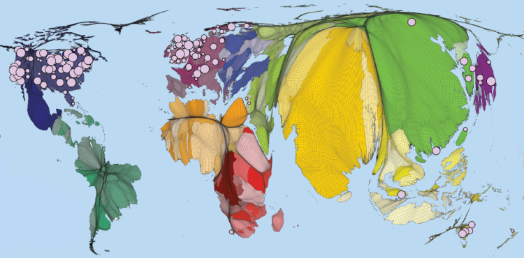
The graphic above displays a world map distorted relative to the population of each country and has pink bubbles indicating the location of the top 200 ranked universities in the world. The relative size of the bubbles indicate that the university is located closer to the top of the rankings and vise versa for smaller bubbles. What is striking about this map is the inequality of top universities globally, with virtually all of the top 200 schools located in the developed world.

Further, the concentration gets even more extreme at the very top of the rankings. From the 2015 numbers, the top 50 universities in the world are located in just 12 countries. The United States has a huge advantage in premier universities with 25 of the top 50 and 10 of the top 15! The next closest on the list is the United Kingdom with 7 in the top 50 (3 of these 7 in the top 10 – Oxford, Cambridge, and Imperial College London).

North America, Europe, and Australia account for 45 of the top 50 universities in the world. The remaining 5 located outside the western world are: National University of Singapore (26th), Peking University (42nd), University of Tokyo (43rd), University of Hong Kong (44th), and Tsinghua University (47th).