Netflix Subscription Growth

Screen Shot 2017-01-22 at 8.30.49 PM.png

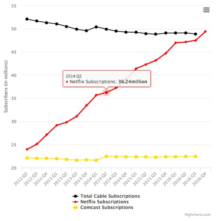
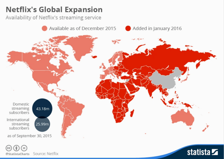
The subscription growth of Netflix over the past 5 has been stunning, especially when you consider the performance of its competitor: cable. As of the fourth quarter in 2016, Netflix now has more subscribers than total cable subscribers – growing from under 25 million in 2012 to nearly 50 million by 2016. Note that these figures only include US domestic subscribers, not global users. Global subscribers are expected to rise as Netflix expanded into new markets in Africa, Asia, and Eastern Europe (pictured in the graphic below). It seems that people are not watching less TV, rather watching it through a different and more mobile friendly medium.

Netflix and the world.png

Advertisement

Historic Economic Power

Screen Shot 2017-02-18 at 2.04.02 PM.png

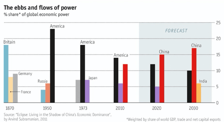
The chart above shows the percent of global economic power (defined as the weighted share of world GDP, trade, and net capital exports) for the top three countries in selected years ranging from 1870 to (projected) 2030. To me, the graph shows the decline in power of Britain from 1870 through 1950, the decline in power for the United States from 1950 through 2030 (although less quickly than Britain), and the rise of China from 2010 into the near future. What once was a European-centric world in the 1800’s is giving why to an East Asian-centric world in the 21 century with the rise of China and India. Side note: If the European Union is considered as a unified entity in the chart above, its scale and decline would closely match that of the US.

US Income Inequality 1970-2010

Screen Shot 2016-12-01 at 4.35.57 PM.png

There is increased attention focused on US income inequality in recent years. It remains a challenge to isolate different contributing factors for this inequality growth over the past generation although some reasons have been cited, such as: increased trade with developing countries, increased income for those with university degrees (only around 30% of the US population), increased role of technology in the economy, etc. This post will not dive into trying to uncover why income inequality is happening, but rather, how the various income groups have been affected since 1970.

Above is a chart displaying the US population grouped into five income brackets. What is clear from the data is for the bottom 80% of US income earners, all groups are receiving a smaller share of total US income than compared to 1970 and 1990. Meanwhile, across this same period, the highest fifth of income-earners in the US have received an increasing share of income compensation – from 43.3% in 1970 to 46.6% in 1990 to 50.3 percent in 2010.

Although, to play devil’s advocate, what makes this issue even more complicated is that individuals are not in the same group over time, it is hard to factor in changes in the quality of goods, or even, the modern luxuries of goods that didn’t even exist 40 years ago such as the internet, smart phones, laptop computers, etc. Even though the percentage of income the bottom 80% of income earners is responsible for has decreased over the period, it’s clear that they are living better lives considering all the improvements in technology, safety, and healthcare.

US Income Distribution 2015

Screen Shot 2016-12-09 at 10.25.56 PM.png

Income data from the 2015 US census reveals some insight. 39% of all households had two or more income earners resulting in 25% of households having a combined income above $100k. Meanwhile, only 9% of US workers (population age 15 or older) have individual incomes over $100k. These high earners are typically associated with high education levels as half of all people with graduate degrees are also among the top 15% of income earners (individual incomes greater than $75k).

In 2015, US median personal income was $30k and the mean personal income was $44k. For the US population aged 15 and above, 43% make less than $25k, 70% make less than $50k, 84% make less than $75k, and 91% make less than $100k. Similar data is displayed in the bar chart above – one chart shows the distribution for ages 25 through 64 and the other for ages 25 and above.

Bay Area Median Home Price 2016

Bay Area Median home price 2016.png

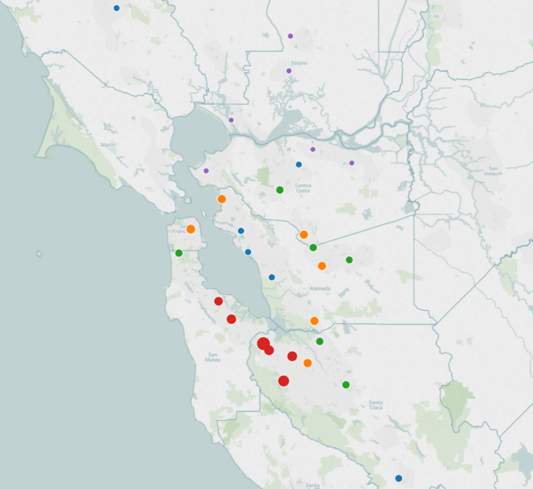
The San Francisco Bay Area is one of the most expensive places to live in the United States. The map above displays the median home price for the top 30 most populated cities in the Bay Area. The larger the bubble, the higher the median home price. The bubbles are also color coded – Red the highest 20%, Orange the next 20%, then Green, Blue, and Purple the lowest 20% by median home price.

Regionally, the cities comprising Silicon Valley are the most expensive and the cities in the northeastern bay are the cheapest. In order, the most expensive cities in the bay area by median home price (via Zillow) as of 2016: Palo Alto at 2.5 million, Cupertino 1.8 million, Mountain View 1.4 million, Sunnyvale 1.4 million, Redwood City 1.3 million, San Mateo 1.1 million, and San Francisco 1.1 million.

The most affordable housing in the Bay Area (of the top 30 by population) are: Richmond 411k, Vacaville 391k, Fairfield 390k, Antioch 364k, Pittsburg 357k, and Vallejo 326k.

US Median Home Price 2015

Median home price map 2016.png

Above is a map of the top 100 metropolitan areas by population in the United States colored and sized according to the median home price. The larger the bubble, the higher the house price. Also, there are color tiers – Red the highest, Orange upper-mid, Green middle, Blue lower-mid, and purple lowest. The national average home price was $215,000.

In 2015, the metro area with the highest median home price is San Jose, CA at $900,000, followed by San Francisco-Oakland at $850,000, Los Angeles at $590,000, New York City at $585,000, and Oxnard at $507,000. The five lowest metro areas by median home price were Akron, OH at $93,000, St. Louis, MO at $89,900, Youngstown, OH at $88,500, McAllen, TX at $85,000, and Dayton, OH at $63,000.


Job Tenure by Cohort

POST_JobGeneration.png

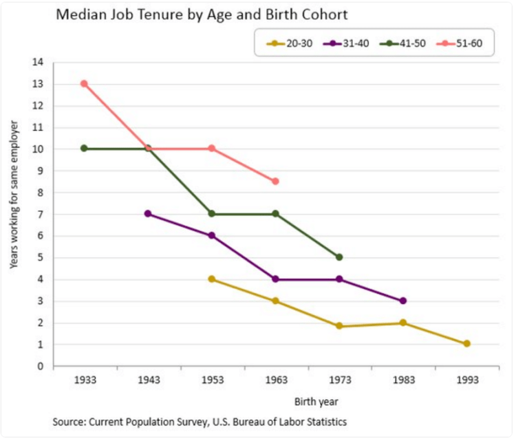
Above is a graphic displaying the number of years working for the same employer relative to birth year. What is clear is that over time, people are working for the same employer for less years on average. This trend is consistent across all age brackets. The change is quite stark, the average worker born in 1933 stayed with the same employer for 13 years, a worker born in 1943 for 10 years, and for someone born in 1993 only one year on average. The takeaway, the workforce is becoming more dynamic and workers in the 21st century economy can expect to work for ten or more employers over the course of their career.

Cities and Affordability

POST_Afford cities.png

Above is a map displaying median home prices by city and the salary needed to afford living there. Most of the mid-west and south have affordable housing requiring income’s below the US average. (Currently US average income is around $53,750) The most expensive cities to live in are located in the northeast and in California. Current data indicates that San Francisco is the most expensive city to afford with a needed salary of $147,996. This is followed by San Diego at $103,165, Los Angeles at $95,040, New York at $86,770, Boston at $83,151, Washington DC at $78,626, and Seattle at $78,425.