
G20 Trade Network

The World GDP as a pie chart. A rough and simple way to look at is: US ~1/4, China ~1/5, Europe ~1/4, Japan ~5%, India ~5%, everyone else ~20%.
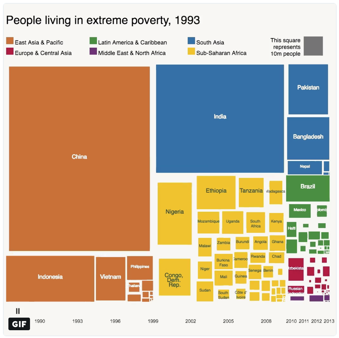
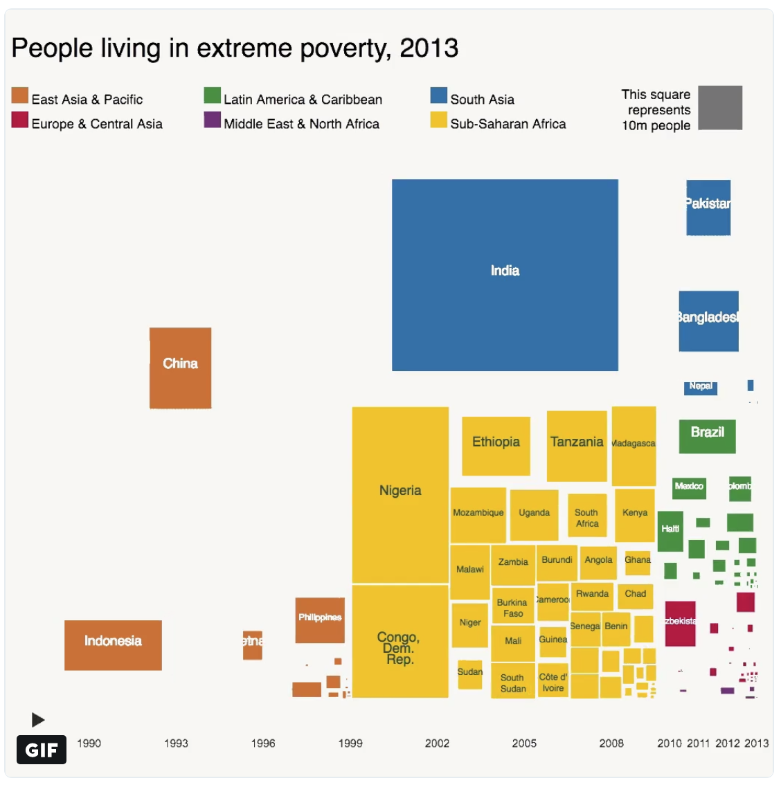
Above is two snapshots of the number of people living in extreme poverty for various countries around the world. Countries are colored by the geographic region they are in — East Asia & Pacific, South Asia, etc. The first snapshot is from 1993 and the other is 20 years later in 2013. What is striking the decrease in extreme poverty in China and for the East Asia/Pacific region generally. For a comparison, China and India have comparable population 1.4 billion and 1.3 billion respectively — however, China has been much more successful in lifting a much larger proportion of its citizens out of poverty; presumably due to double-digit GDP growth year after year over this period.
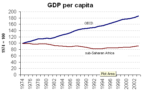
Another comparison: Africa has a population of 1.2 billion, again comparable in size to both India and China. Yet, the number of people in extreme poverty has actually increased over the past 20 years with the largest gains coming from Nigeria (Africa’s most populous country) and the Democratic Republic of the Congo. Economic growth numbers are typically hard to come by for many countries in Africa due to a large proportion of the workforce working in the informal economy (black market). Although, the poverty numbers (shown above) and the GDP per capita estimates (shown below) seem to indicate that African’s experienced negative GDP per capita growth throughout the 1970s, 1980s, and early 1990s.
The following are highlights from the World Urbanization Prospects 2014 report published by the United Nations Department of Economic and Social Affairs

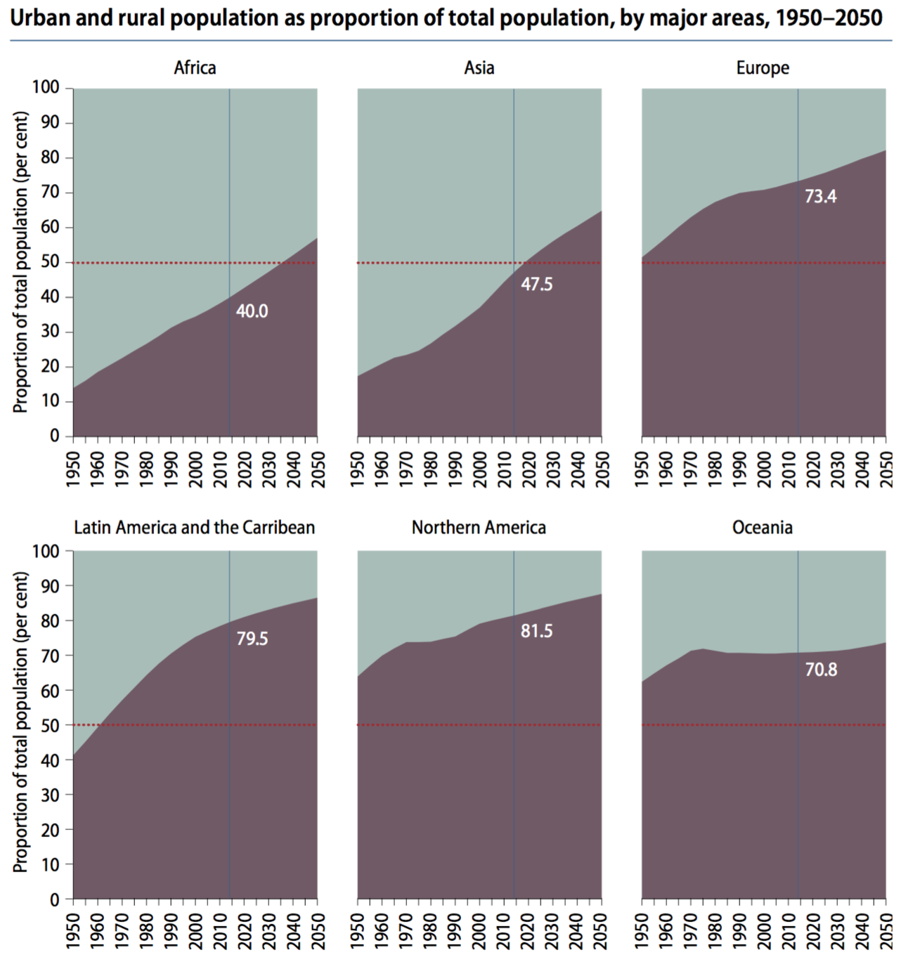
Globally, 54% of the world population lives in an urban area with at least 500k people. (note: urban in purple, rural in grey) The world has become more urban over time and is projected to continue.
Urbanization differs across regions, with North American and Europe being the most urbanized — Africa and Asia least urbanized.
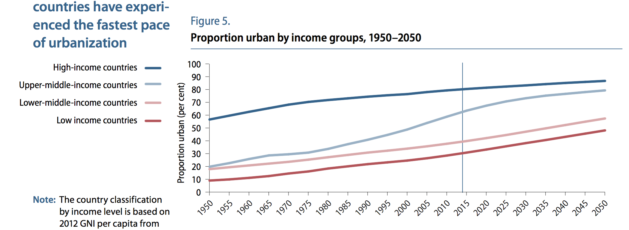
High-income countries tend to be more urban (80%) than low-income countries (30%) — implying that urbanization and development are related
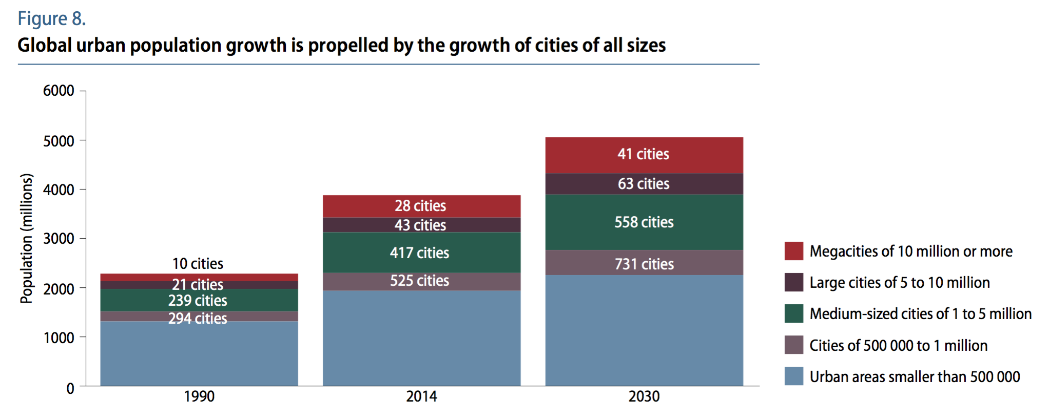
Urbanized areas are displayed below in various groups (ranging from small cities to megacities) for the years 1990, 2014, and projected 2030.
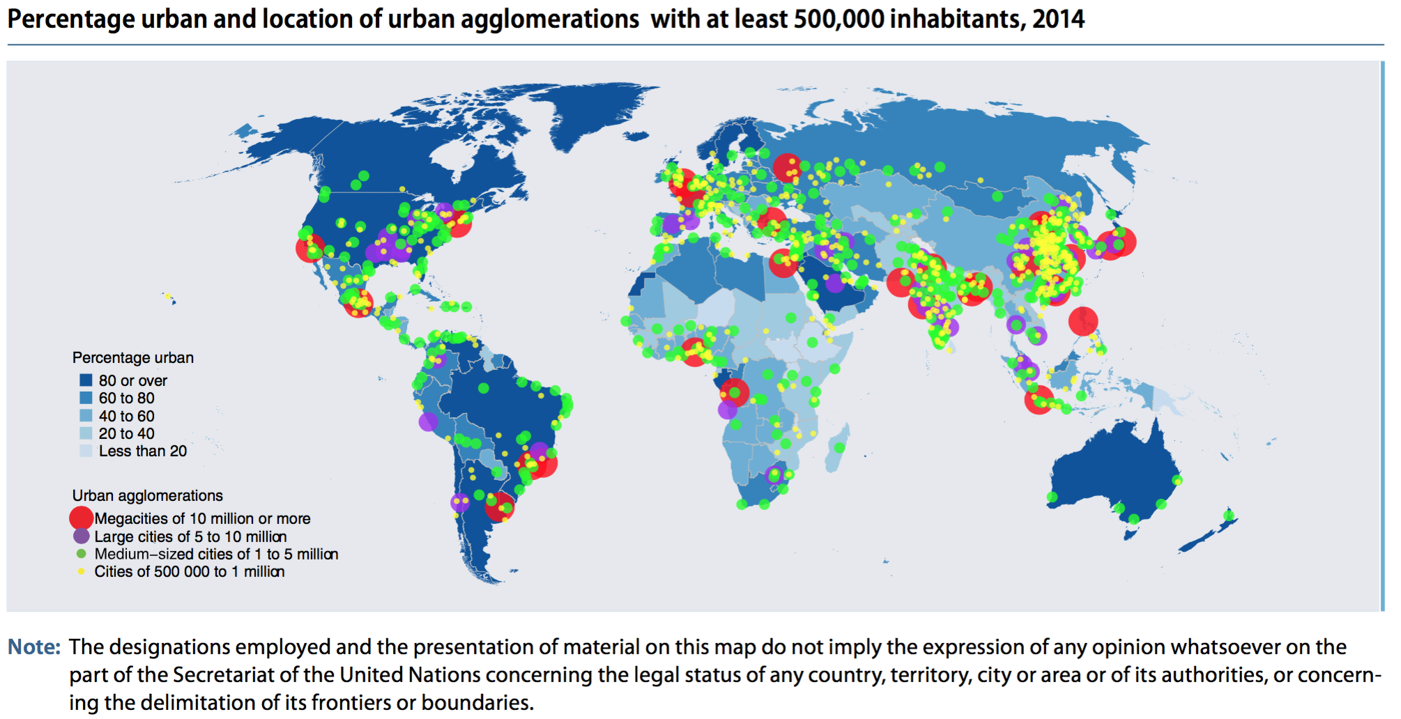
Urbanized areas (500k+ population) in 2014 are displayed on the map below
Other interesting notes:
Africa and Asia are home to 90% of the worlds rural population and have the lowest rate of urbanization by content 40% and 48%.
China, India, and Nigeria will account for 37% of urban pop growth between now and 2050.
One in eight people live in one of the world’s 28 megacities (10m+ pop)
Link to the full report here: https://esa.un.org/unpd/wup/publications/files/wup2014-highlights.pdf

Above is a comparison of GDP per capita (nominal) figures for BRIC countries – that is, Brazil, Russia, India, and China. The data displayed ranges from 1980 through 2016. A few things stand out, both Brazil and Russia’s economies were overvalued post-2007 financial crisis, driven by high oil prices that have regressed back to the mean and inflated currently values. China economy has leveled off in recent years and India is still much poorer than the other three BRIC economies, yet show promise moving forward.

Only about 30 percent of China’s landmass is habitable with approximately 40% of it’s land covered by mountains (in the southwest) and an additional 25% deserts (in the northwest). The maps above display that 94% of China’s population lives on the eastern side of it’s territory. The map below displays the location of China’s deserts and arid regions.
China and India make of 40% of the world’s population and although this figure seems strikingly high, estimates from 1 AD indicate the China and India combined for 60% percent of world population back then! Anyone who has visited either country is aware that both have very high population density. For comparison, world population density is 140 people per square mile – India is about 10 times that with 1008 people per square mile (ppsm) and China is 370 ppsm. Given what we know about the geography of China, this density estimate is quite low and once discounting it’s uninhabitable land, China’s density is more around 1233 ppsm. (Given that about 25% of India’s land is uninhabitable, a more direct comparison would put India density at 1344 ppsm). For those interested, here is the population density for some other countries: European Union (UK included) 304 ppsm, United States 85 ppsm, Brazil 62 ppsm, Russia 21 ppsm, and Canada 9 ppsm.


The chart above shows the percent of global economic power (defined as the weighted share of world GDP, trade, and net capital exports) for the top three countries in selected years ranging from 1870 to (projected) 2030. To me, the graph shows the decline in power of Britain from 1870 through 1950, the decline in power for the United States from 1950 through 2030 (although less quickly than Britain), and the rise of China from 2010 into the near future. What once was a European-centric world in the 1800’s is giving why to an East Asian-centric world in the 21 century with the rise of China and India. Side note: If the European Union is considered as a unified entity in the chart above, its scale and decline would closely match that of the US.

There are currently 7.4 billion people on earth. This number is expected to rise to 10 billion by 2080 (based on U.N. estimates). These numbers beg the question – just how many people can the planet support? And, in what regions is population growing, remaining stable, or decreasing?
The map above colors each county by the number of children a woman is expected to have on average. Virtually all of the developed nations, such as: the US, Canada, Europe (except France), Japan, etc. average somewhere between 1-2 children per woman. This rate is actually below the replacement rate (2.1 children per women) indicating that the countries (labelled in blue above) will have decreasing populations internally over the coming decades. This does not mean, however, that the country’s population will decrease, that will depend on the number of immigrates it attracts. For example, the US and Canada attract the largest number of immigrates from across the globe which continue to bolster their population despite low birth rates internally. Conversely, a country with a low birth rate and restrictive immigration will show signs of drastic population decrease as in Japan – it has one of the lowest birth rates in the world with only 1.4 children per woman and has lost population in the past decade.
On the other end of the spectrum, Africa is exploding in population. The continent today has roughly 1 billion people. This figure is expected to double to 2 billion in just 30 years! Some countries – Niger, Mali, Burundi, Somalia – average more than 6 children per woman. It will be a time of drastic demographic change in central Africa over the next generation that may threaten the stability of the region further.
Middle income countries are mostly labeled in green in the above map indicating a healthy, moderate growth in population. For example, India (the world’s 2nd most populated country) averages 2.5 children per woman and Indonesia (the world’s 4th most populated country) averages 2.2.

The graphic above displays the change in regional and country GDP as a fraction of global GDP from the period 1820 through 2012. The picture tells a story of the rise of ‘the west’ during the industrial revolution and the corresponding fall of the Asian world powers from 1820 through the mid 1900’s. Then following economic reforms in the late 1900’s, Asian giants re-emerging and gaining market share of global GDP corresponding with a fall by western powers.
In 1820, China and India together made up 49% of world GDP, but by the late 1970’s this figure had fallen to less than 5% combined. That is, China and India – countries that make up 37% of the world population, only accounted for 5% of world GDP. Since that time, China and India have had drastic economic growth and now account for 21% of global GDP.
The graphic also tells the tale of the United States emerging as a global super power. From 2% of global GDP in 1820 to a peak of 36% following WWII. In fact, the 36% of world GDP figure is the highest mark by any country in history – All this accomplished by a country with only 5% of world population. The stagnate economic growth since the 1970’s is comparable to Europe, although not quite as drastic. The US and Europe still account for 35% of world GDP combined.

Overseas military bases enable a country to conduct expeditionary warfare and maintain order in their respective areas of control. The vast majority of countries in the world are not powerful enough to exhibit influence outside their defined boarders – they have a difficult enough time maintaining order within ‘their’ country as is. In fact, there are only 9 countries that have a military base located outside their own territory. Further, most of these countries only have influence (bases) around countries that boarder them and are not much of a global force.
The map above displays the location of Russian military bases aboard. All of these are located in former USSR and other past communist allies. Russia has 9 bases located in another country’s territory, fourth most by a country in the world. Below is a list of the 9 countries that have bases located in other nation’s territory (note – this is not the number of total bases, but the number of countries that listed country has bases located in):
Japan – 1, China – 1, India – 2, Turkey – 4, Italy -5, Russia – 9, UK – 13, France – 14, USA – 63
Another way to look at this is:
All other countries combined – 47, USA – 63
