
UN Voting Compared to GDP
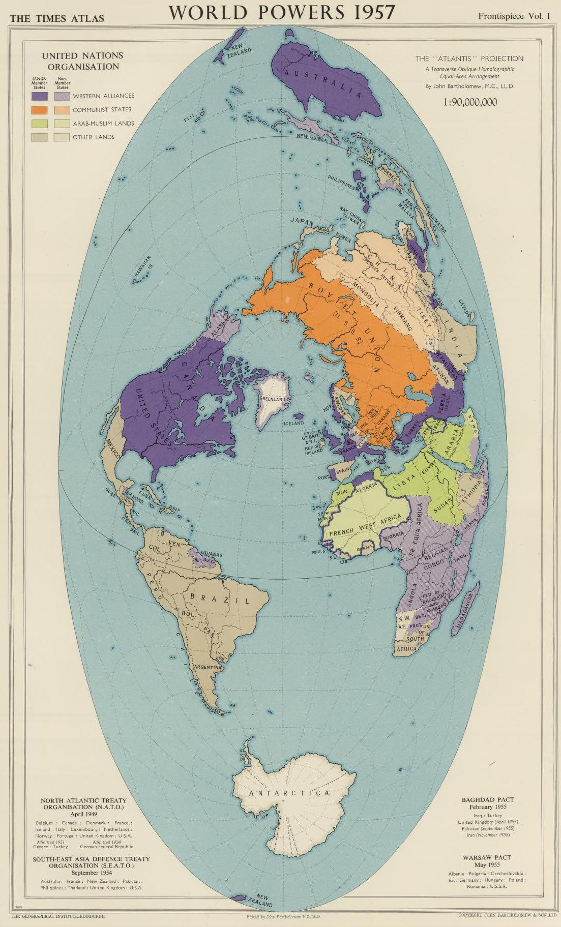
Above is a map of the world in 1957 with highlights displaying various country alliances – NATO/Western allies in Purple/Light Purple, USSR/Communist countries in Orange/Light Orange, and Muslum countries in Green. The map does a great job displaying the encirclement of allies the US had surrounding the USSR, known as the US’s strategy of containment (seeking to prevent the spread of communism to other countries).

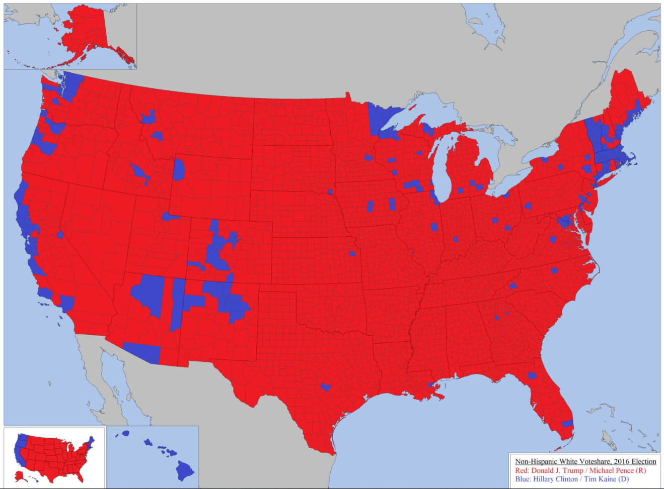
Above is a map of how non-Hispanic white men and women voted in the 2016 presidential election. Only two states voted democratic in every county – Massachusetts and Hawaii. Compare that to several states which voted Republican in every country (such as North Dakota, Oklahoma, Arkansas, etc). One interesting side note: despite the majority of white people voting Republican in Nevada (in every county) the state voted Democratic as a whole in last year’s election.
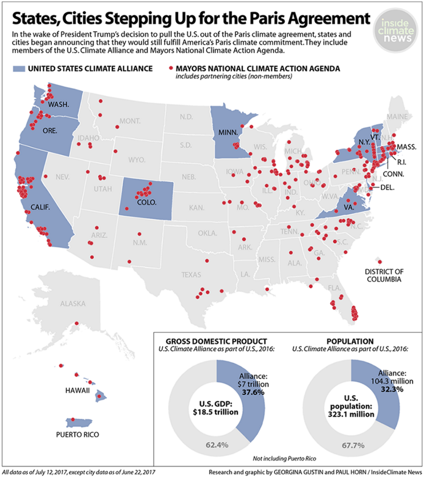
Even though President Trump withdrew the United States Federal Government from the Paris Agreement on Climate Change, it doesn’t prevent US States or cities from continuing to uphold the agreement. So far, 13 states have committed to Paris Agreement and ~300 cities (including the all of the top 10 largest cities: NYC, LA, Chicago, Houston, Phoenix, Philadelphia, San Antonio, San Diego, Dallas, and San Jose). The map above displays the US states that are currently still in the Paris agreement in blue and the states considering joining the group in green. This group (in blue) made up 32.3% of the US population and 37.6% of US GDP in 2016. Roughly speaking, it can be said that 1/3 of the United States is still part of the Paris Agreement on Climate Change. The map below displays the cities in the agreement (in red) and the USCA in green (as of June 1).
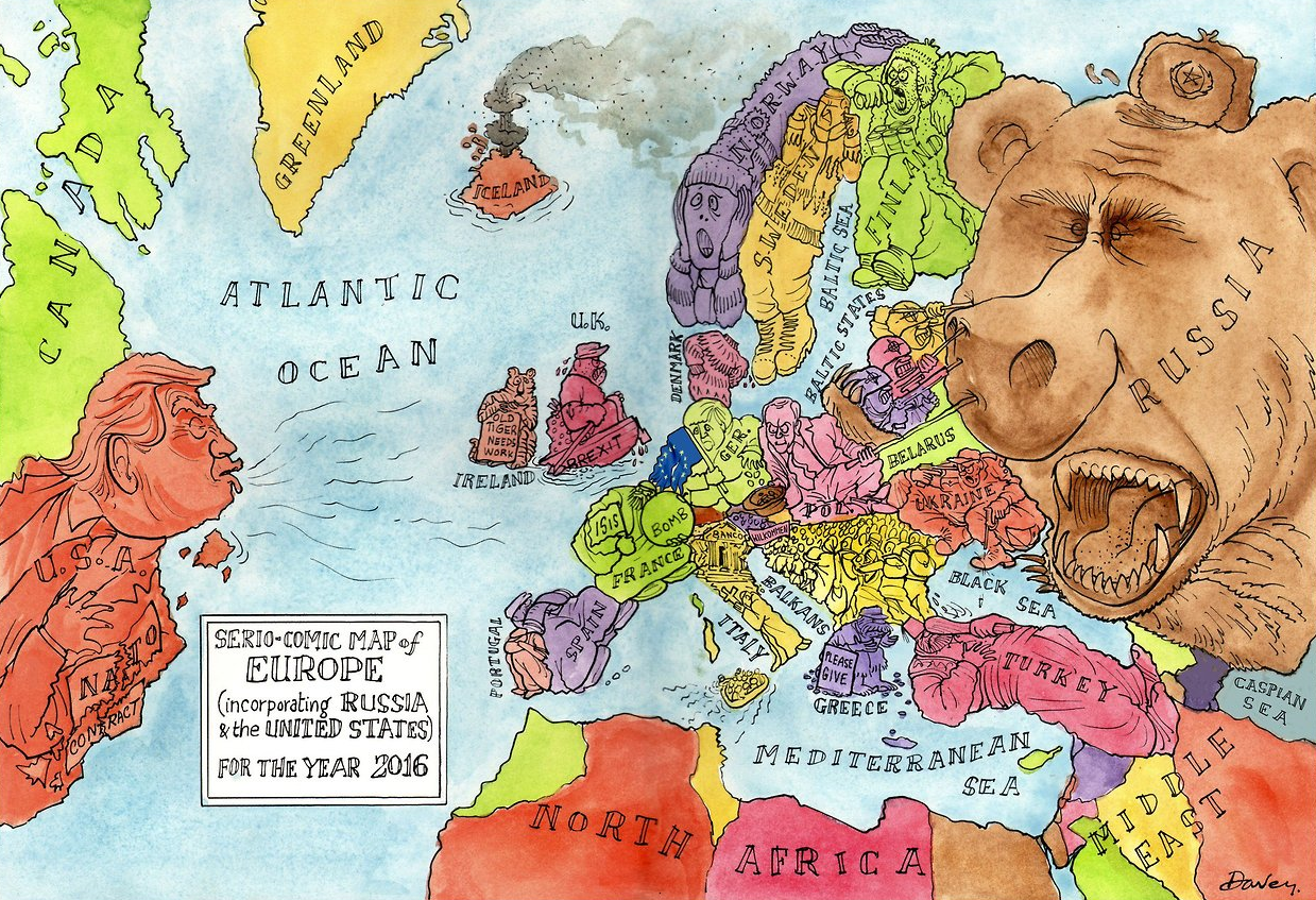
Above is a cartoon map displaying Europe’s current political climate. Trump re-writing the NATO agreement, the Baltic States pushing back Russian expansion into Eastern Europe, Britain moving further away from the EU after their Brexit vote – what else stands out to you from the map?
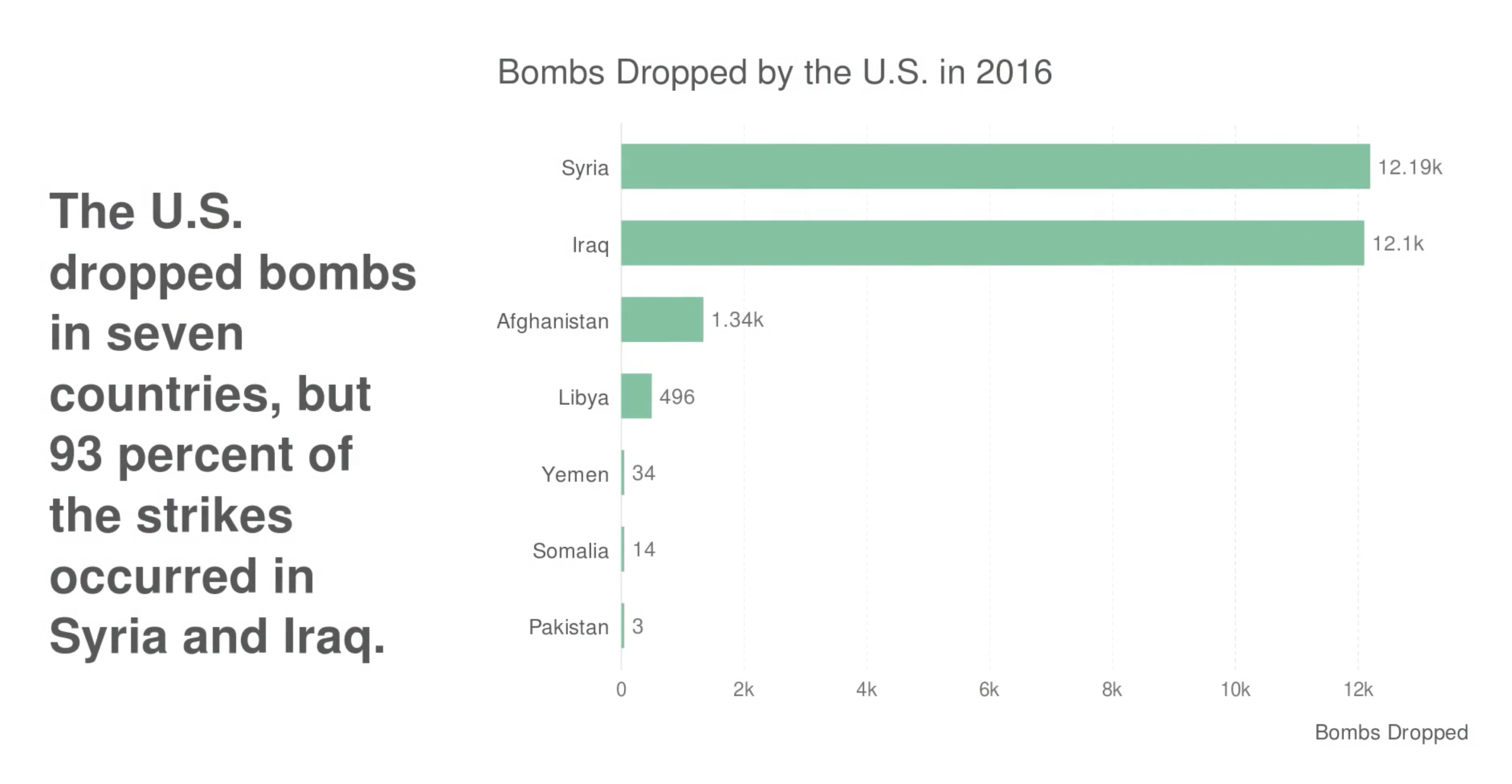
The United States dropped 26,000 bombs on 7 countries in 2016. Above is a bar chart displaying the 7 countries – 93% of which fell on Syria and Iraq/ISIS.
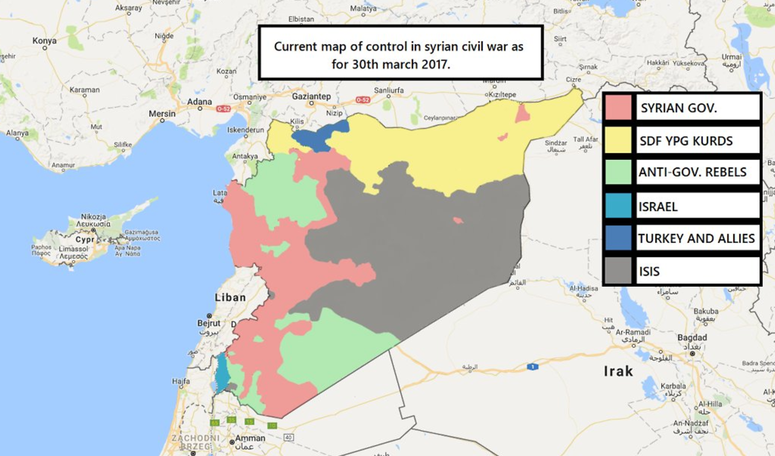
Above is a map of territorial control in Syria by various groups vying for power in the country. This map is accurate as of March 30th, 2017.
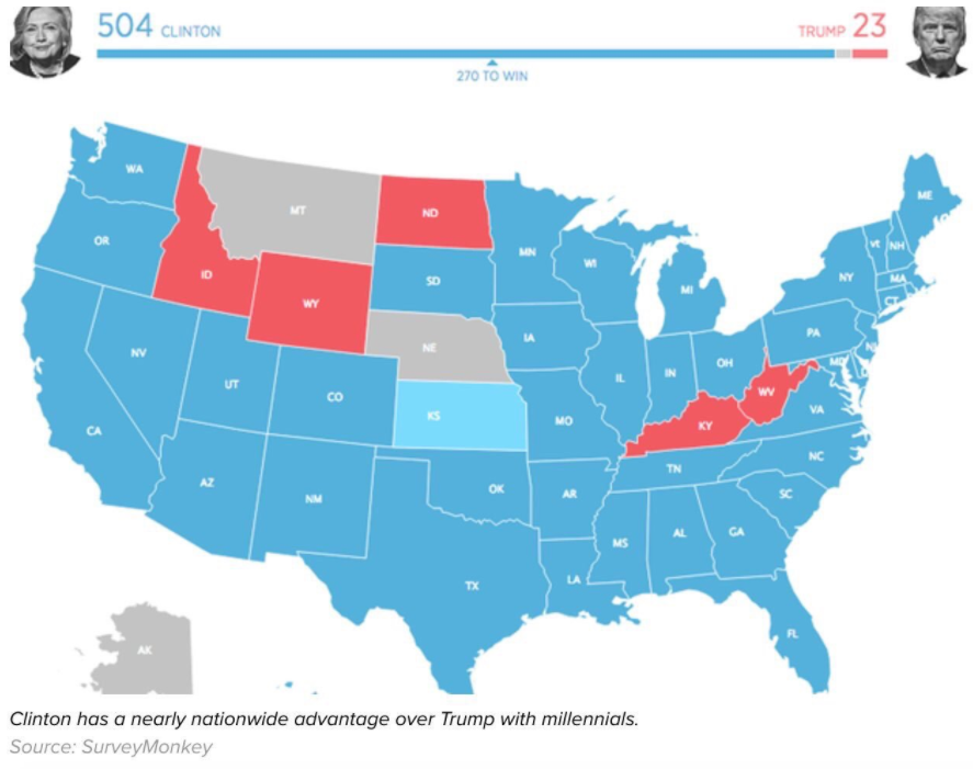
Above is a map displaying how millennials voted in the 2016 election. If only millennials were able to vote, it would have been an overwhelming victory for the Democratic Party: 504 to 23. Demographers William Straus and Neil Howe define ‘Millennials’ as being born between 1982 and 2004 – however, there is not an exact dividing line. Birth years can range between 1983 and 2001 for some demographers, such as Elwood Carlson. What seems to be clear is that as millennials age and become a larger political force, the country may become increasingly democratic in future elections.
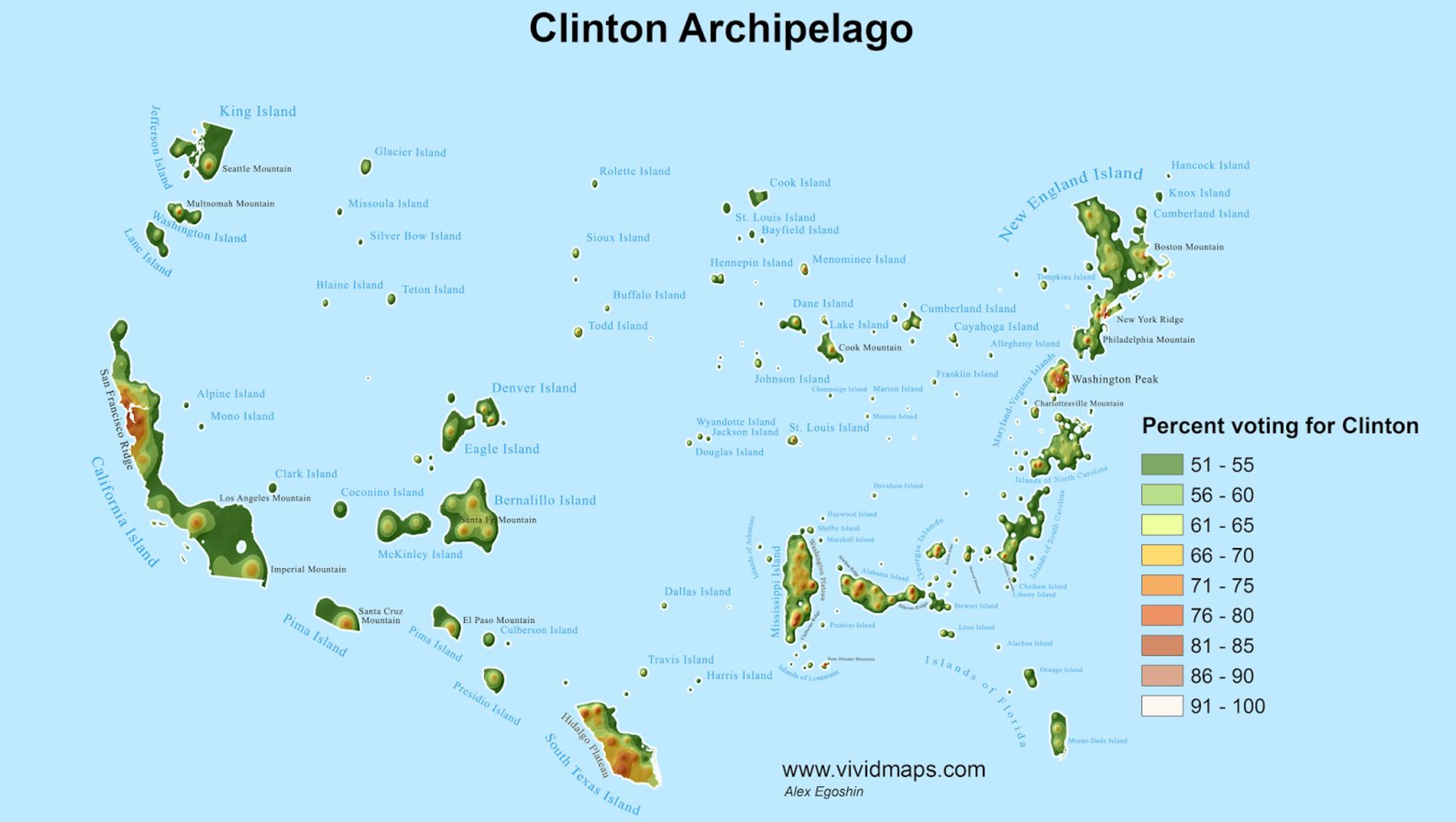
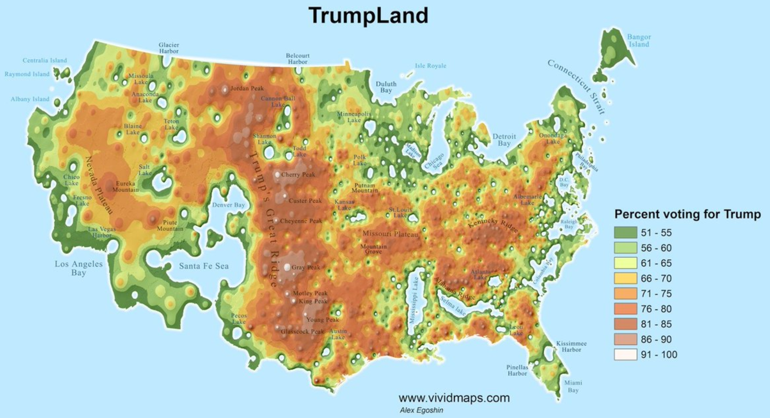
It’s informative to display how small of the country, by area, Hilary Clinton won in the 2016 Presidental Election. Above is a map of the regions of the country Hilary won (Clinton Islands) and below is the area of the country Trump won (Trumpland). Given the area difference alone, it appears that Trump won in a landslide, however, in fact, he lost the popular vote by more than 2% to Clinton! This is due to the large differences in population density each candidate won – put simply, Clinton won in the cities and Trump won in the rural areas. The highest percentage Trump supporting region was the central plans while the largest Clinton supporting regions were the San Francisco Bay Area and eastern seaboard running from Washington DC to Boston.
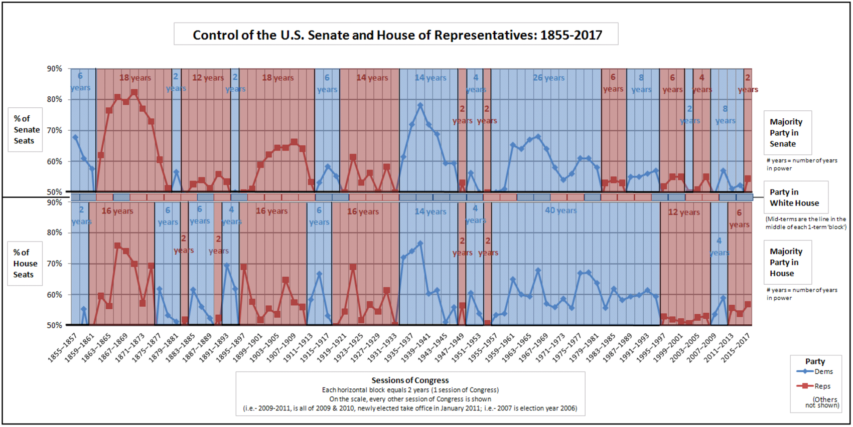
Not only did Donald Trump win the 2016 presidential election, but both the House of Representative and the Senate are majority controlled by the Republican party. Above is a chart displaying which party has controlled congress and the presidency running back through 1855. The Senate is the top chart, the House is the bottom chart, and presidential party in office is the middle color strip between the two. The color indicates which party controlled each branch of congress and the height of the bars in each chart indicate what percentage the controlling party had in those years. Since the great depression, congress has been mostly controlled by the Democrats – having the majority of seats in both the Senate and House for 62 years out of the 84. Since the 1990’s, control in congress has narrowed between the two parties and control as flipped back-and-forth more often than in the previous periods. The 2017 version will feature Republican control in all three for the first time since President Bush II in 2008.
