Cities and Affordability

POST_Afford cities.png

Above is a map displaying median home prices by city and the salary needed to afford living there. Most of the mid-west and south have affordable housing requiring income’s below the US average. (Currently US average income is around $53,750) The most expensive cities to live in are located in the northeast and in California. Current data indicates that San Francisco is the most expensive city to afford with a needed salary of $147,996. This is followed by San Diego at $103,165, Los Angeles at $95,040, New York at $86,770, Boston at $83,151, Washington DC at $78,626, and Seattle at $78,425.

Price Changes Since 1996

Price changes 20 years.png

The above graphic displays price changes for various items over the last 20 years – 1996 through 2016. Overall inflation was 55% over the period (about 2.7% annually not factoring compounding). What is striking is how much technology prices have fallen while medical and tuition cost have soared well over inflation rates. Tuition costs have increased on average at 3.7 times the rate of inflation and medical costs at about 2 times inflation. Meanwhile, various technologies as decreased in relative cost. As overall prices have increased annually at around 2.7%, Wireless Service has decreased in price by 2.3% per year, Software is down 3.3% per year, and TV’s are down 4.8% per year. Housing and Food costs have remained on par with inflation year by year.

United States GDP

In the United States only 2 percent of the land area produces 50 percent of the GDP. These areas (cities) are displayed on the map below. Displaying GDP production this way makes clear how, even if GDP for the country is increasing, it may only have a positive effect on a small part of the country. Disparities like this are common globally also – 54% of the world’s GDP is produced on just 10% of the land.

US Econ activity.png

Tech Job Locations

POST_TechJobs.png

There are approximately 4 million technology related jobs located in the United States – that number translates to about 2% of the US labor force working in tech. How does that 2% figure compare with tech concentrated cities around the country? The graphic above displays the number of tech jobs per 1000 jobs compared with the annual salary of tech workers. What’s striking at first glance is that not only do tech workers make higher incomes the more tech jobs are concentrated, but they make exponentially higher incomes. This finding seems to indicate that tech workers skill sets compliment each other leading to an exponential increase in each worker’s productivity.

Not surprisingly, Silicon Valley tops the list (by a large margin) in the number of tech jobs per capita by city (or region in this case). Silicon Valley has approximately 13% of it’s workforce working in tech – almost 7 times the US average of just 2%. Further, the next closest city to this figure is San Francisco at 8%, literally the next closest city to Silicon Valley by proximity. SV and SF also lead in annual salaries for tech workers in large cities following the model’s prediction above. Other leading tech concentrations are: Washington D.C. with 7.8% of it’s workforce in tech, Seattle 7.6%, Austin 6.4%, Boston 5.2%, and Denver 4.6%

World University Rankings

Screen Shot 2016-05-07 at 10.14.44 PM.png

The graphic above displays a world map distorted relative to the population of each country and has pink bubbles indicating the location of the top 200 ranked universities in the world. The relative size of the bubbles indicate that the university is located closer to the top of the rankings and vise versa for smaller bubbles. What is striking about this map is the inequality of top universities globally, with virtually all of the top 200 schools located in the developed world.

Further, the concentration gets even more extreme at the very top of the rankings. From the 2015 numbers, the top 50 universities in the world are located in just 12 countries. The United States has a huge advantage in premier universities with 25 of the top 50 and 10 of the top 15! The next closest on the list is the United Kingdom with 7 in the top 50 (3 of these 7 in the top 10 – Oxford, Cambridge, and Imperial College London).

North America, Europe, and Australia account for 45 of the top 50 universities in the world. The remaining 5 located outside the western world are: National University of Singapore (26th), Peking University (42nd), University of Tokyo (43rd), University of Hong Kong (44th), and Tsinghua University (47th).

Percent of Global GDP

Percent of Global GDP.png

The graphic above displays the change in regional and country GDP as a fraction of global GDP from the period 1820 through 2012. The picture tells a story of the rise of ‘the west’ during the industrial revolution and the corresponding fall of the Asian world powers from 1820 through the mid 1900’s. Then following economic reforms in the late 1900’s, Asian giants re-emerging and gaining market share of global GDP corresponding with a fall by western powers.

In 1820, China and India together made up 49% of world GDP, but by the late 1970’s this figure had fallen to less than 5% combined. That is, China and India – countries that make up 37% of the world population, only accounted for 5% of world GDP. Since that time, China and India have had drastic economic growth and now account for 21% of global GDP.

The graphic also tells the tale of the United States emerging as a global super power. From 2% of global GDP in 1820 to a peak of 36% following WWII. In fact, the 36% of world GDP figure is the highest mark by any country in history – All this accomplished by a country with only 5% of world population. The stagnate economic growth since the 1970’s is comparable to Europe, although not quite as drastic. The US and Europe still account for 35% of world GDP combined.

Internet speeds

Internet speed.png

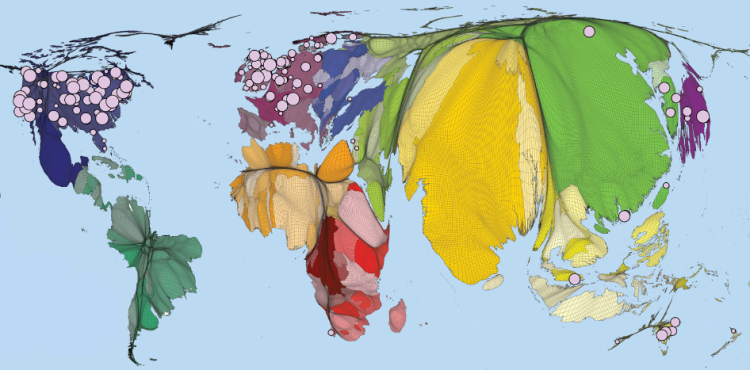
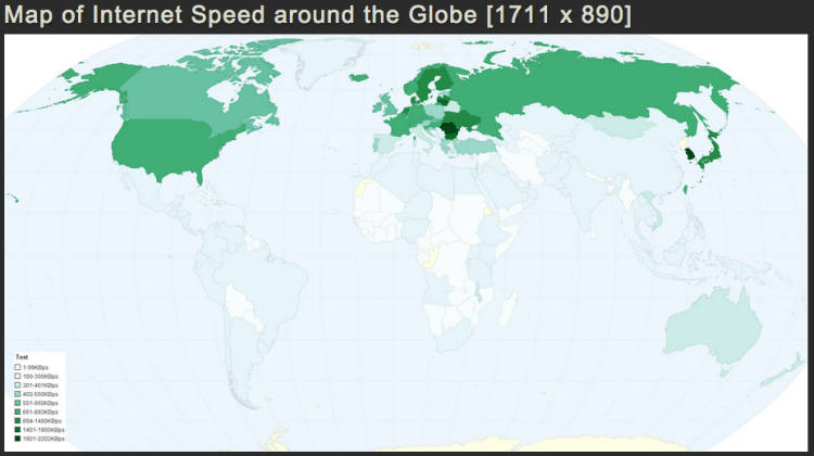
As more of the economy and economic growth is intertwined with the internet – speed and connectivity are highly important to the success of countries in the 21st century. As displayed above, there is large disparities in internet access and connectivity speeds between countries in the developed world and in undeveloped areas.

In the 2015 Q3 ranking by Akamai, the top ten countries by average connection speed (in Mb/s) were: (1) South Korea 20.5, (2) Sweden 17.4, (3) Norway 16.4, (4) Switzerland 16.2, (5) Hong Kong 15.8, (6) Netherlands 15.6, (7) Japan 15.0, (8) Finland 14.8, (9) Latvia 14.5, and (10) Czech Republic 14.5.

In comparison to other developing countries in the world: Mexico ranks 68th at 5.5 Mb/s, China 91st at 3.7 MB/s, Brazil 93rd at 3.6 Mb/s, and India 116th at 2.5 Mb/s.

The United States is ranked 16th in the world by average connection speed at 12.6 Mb/s, slightly above average in the developed world. Although, the numbers are skewed in favor of small density connected countries without rural areas to bring the average down. The US average may be slower than some small dense northern European countries, but when compared the the European Union as a whole, the US is much faster – 12.6 Mb/s to 8.1 Mb/s.

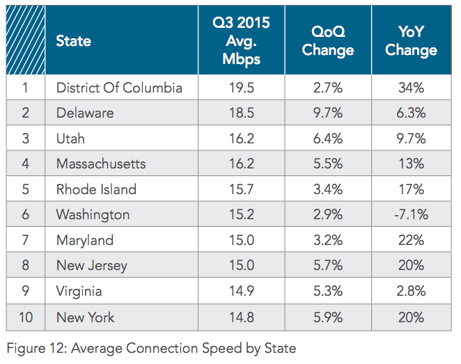
If the US states where ranked individually, Washington D.C. would rank 2nd in the world in average internet connection speed, Delaware 3rd, Utah 6th, Massachusetts 7th, and Rhode Island 10th. As of 2014, the US state with the slowest average internet speed was Alaska at 7 Mb/s.

Screen Shot 2016-04-10 at 9.43.04 PM.png

United Nations Veto Power

Screen Shot 2012-10-04 at 10.04.31 AM.png

A criticism of the United Nations Security Council is the veto power of the five permanent nations – China, France, United Kingdom, United States, and Russia. A veto from any one of these nations can halt any possible action the Council could take. This veto may cripple any UN armed or diplomatic response to a crisis somewhere in the world.

Above is bar chart displaying the number of vetoes by the five permeant members of the UN Security Council. Typically in the western media it is presented that, time and time again, if it where not for vetoes from China or Russia the West could have intervened and prevented some conflict. Yet, a look at history presents a counter narrative.

Early in the history of the UN, the USSR used it’s veto power frequently. From 1945 to 1966 the USSR had a total of 105 vetoes compared to 6 for the four other members combined! However, over the next decades the situation reversed itself.

From 1986 to 2007, the United States took a dominate position using it’s veto power 36 times compared to 18 for the remaining four members. Combining the UK and France with the US (the UK and France voted in combination with the US on all of their vetoes) the total is: Western nations – 47, Others – 7. Further, John J. Mearsheimer is quoted that “since 1982, the US has vetoed 32 Security Council resolutions critical of Israel, more than the total number of vetoes cast by all the other Security Council members.”

POST_UN veto 1986-2007.png

To be fair, since 2007 there has been a large uptick in vetoes cast by Russia and China – virtually all them concerning the situation in Syria and the Ukraine. The total vetoes from 2007 to present are: Russia – 9, China – 5, France, UK, US combined – 1. Further, China voted with Russia on all 5 of it’s vetoes.


US Labor Market Trends

Over the past few decades the US labor market is undergoing some noticeable trends. One such trend is a consistent decrease in the percentage of the US population employed following a recession (highlighted in grey in the top graphic). This makes since as economic recessions cause unemployment, but a puzzling trends is following – After each of the past two recession the fraction of US population employed (the labor participation rate) has not returned to the previous pre-recession level. In 2001, labor participation was around 64.5%, but only returned to 63.5% by 2007 before the great recession hit. The 2007 recession’s impact has been even more drastic pushing labor participation down further to just 58.5%.

The US labor force composition is also changing quite drastically over the past 60 years. In 1950, the labor participation for men was 87% and for women 32%. That is, 87% of working age men where employed and just 32% of working age women. By 2010, labor participation for men fell to 70% and women’s participation rose to just under 60%. We are becoming a more gender neutral labor force.

POST_US labor market trends.PNG