Job Tenure by Cohort

POST_JobGeneration.png

Above is a graphic displaying the number of years working for the same employer relative to birth year. What is clear is that over time, people are working for the same employer for less years on average. This trend is consistent across all age brackets. The change is quite stark, the average worker born in 1933 stayed with the same employer for 13 years, a worker born in 1943 for 10 years, and for someone born in 1993 only one year on average. The takeaway, the workforce is becoming more dynamic and workers in the 21st century economy can expect to work for ten or more employers over the course of their career.

Guns and Suicide

Screen Shot 2016-10-21 at 1.26.53 AM.png

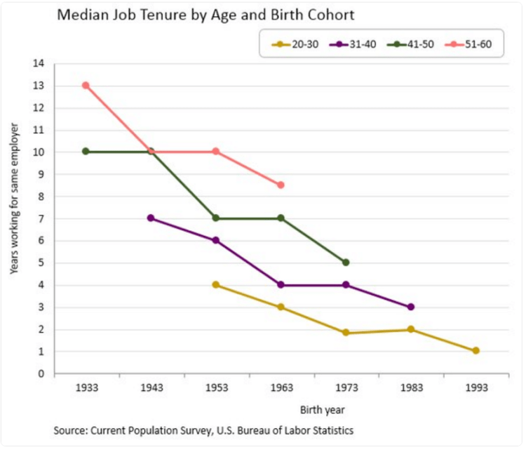
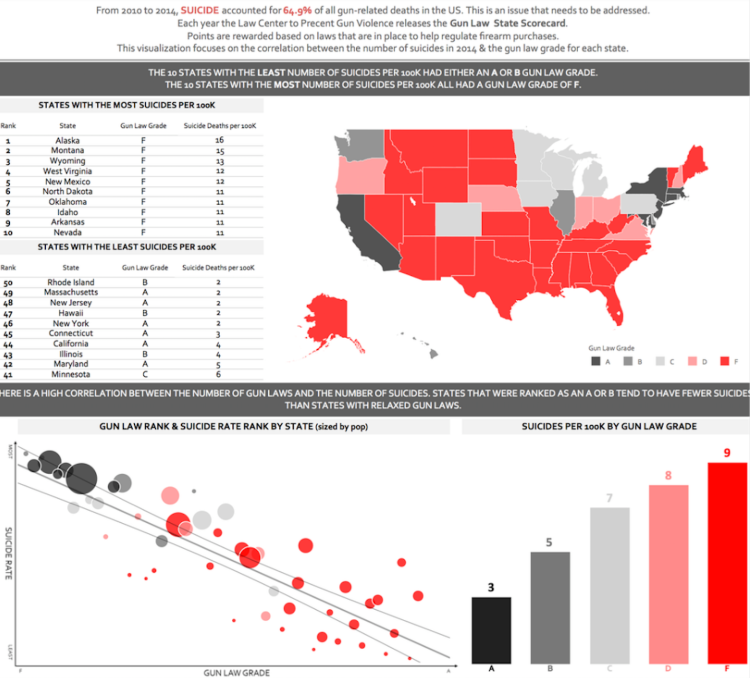
The third presidential debate finished a few days ago and one of the first topics discussed concerned the second amendment, the right to bear arms. Pro-gun advocates claim that more guns make an area safer, while gun regulation advocates claim the opposite. What does data reveal on the topic?

Each year the Law Center to Prevent Gun Violence releases the “Gun Law State Scorecard”. This scorecard grades states from A to F on the laws in place to regulate firearm purchases. Above is a map of the US displaying these grades: An “A” grade is colored black, B dark grey, C light grey, D pink, and F red.

Comparing state grades with the suicide rate reveals some insightful findings. Why compare gun regulations to suicide rates you ask? From 2010 to 2014, suicide was the highest cause of gun related deaths in the US – 64.9% of all gun deaths in the US resulted from suicide. The comparison with gun laws revealed there is a high correlation between the number of gun laws and the number of suicides. States with grade A or B gun laws tended to have the lowest suicides rates per capita. In fact, their is a consistent trend of increasing suicide rates for decreasing gun law grades. Said differently, as gun regulations decrease, suicide rates increase. This increase are not trivial either. The average grade F state has 3 times the number of suicides than the average grade A state.

White Male Election

POST_White election.png

There was a time in US history (quite a long time in fact) when only white land owning men could vote. If this were still the case, how would our elections differ compared with men, women, and people of all races now allowed to vote? Above is a map of the election results from the 2012 presidential election (Obama-Romney). If only white men could vote, Romney would have won by an electoral college margin of 501-37.

Cities and Affordability

POST_Afford cities.png

Above is a map displaying median home prices by city and the salary needed to afford living there. Most of the mid-west and south have affordable housing requiring income’s below the US average. (Currently US average income is around $53,750) The most expensive cities to live in are located in the northeast and in California. Current data indicates that San Francisco is the most expensive city to afford with a needed salary of $147,996. This is followed by San Diego at $103,165, Los Angeles at $95,040, New York at $86,770, Boston at $83,151, Washington DC at $78,626, and Seattle at $78,425.

Price Changes Since 1996

Price changes 20 years.png

The above graphic displays price changes for various items over the last 20 years – 1996 through 2016. Overall inflation was 55% over the period (about 2.7% annually not factoring compounding). What is striking is how much technology prices have fallen while medical and tuition cost have soared well over inflation rates. Tuition costs have increased on average at 3.7 times the rate of inflation and medical costs at about 2 times inflation. Meanwhile, various technologies as decreased in relative cost. As overall prices have increased annually at around 2.7%, Wireless Service has decreased in price by 2.3% per year, Software is down 3.3% per year, and TV’s are down 4.8% per year. Housing and Food costs have remained on par with inflation year by year.

Gay Marriage Percentage by State

Gas marriage heat map.png

Above is heat map displaying same-sex marriage as a percent of all marriages in each three-digit zip code area. The darker the color, the higher percentage of same-sex marriages. Below is a bar-chart displaying results at the state level (Only the top 25 states by population are shown). The number displayed is the percentage of same-sex marriages relative to all marriages in the state. Only 7 of the 25 states have a percentage above the national average of 0.35%. They are: Massachusetts, Washington, California, New York, Maryland, Minnesota, and Arizona.

Gay marriage % for top 25 states.png

US County Population

Screen Shot 2016-09-12 at 3.05.08 PM.png

The United States has 3007 counties. The top 100 by population (3.3% of counties) have a total of 129 million people (40% of US population). The map above displays these top 100 – those colored orange are counties with more than 1 million people and those colored green have less than 1 million people. The cut-off population to be in the top 100 is 626,000 people. There are 39 counties with more than 1 million people and only 14 with more than 2 million people. A third of US States do not have one county in the top 100 and only 14 States have at least one county over 1 million people – CA: 9, NY: 7, TX: 5, FL: 5, PA/OH/MI: 2 each, IL/AZ/WA/NV/MA/VA/UT: 1 each.

United States GDP

In the United States only 2 percent of the land area produces 50 percent of the GDP. These areas (cities) are displayed on the map below. Displaying GDP production this way makes clear how, even if GDP for the country is increasing, it may only have a positive effect on a small part of the country. Disparities like this are common globally also – 54% of the world’s GDP is produced on just 10% of the land.

US Econ activity.png

US Federal Land

Screen Shot 2015-01-29 at 8.44.26 PM.png

The United States Federal Government controls a significant portion of the US total land – it controls 2.27 billion acres – more than 28% of the country’s total area. That figure is more than the territory of France, Spain, Germany, Poland, Italy, UK, Austria, Switzerland, The Netherlands, and Belgium combined! Further, it does not include State owned land which accounts for an additional 196 million acres pushing the combined Federal/State land ownership to approximately 35% of US total land area.

Screen Shot 2016-08-28 at 10.44.33 PM.png