The map above displays from whom countries import more from – either the US, EU, China, or Russia. Border countries import the most from their neighbor country and this trading influence propagates outward. Generally speaking, the US is the export center for a North American zone, France+Germany for a European zone, Russia for a Eurasian zone, and China an Asian zone + the nearly the entire southern hemisphere.
Tag Archives: Germany
FIFA World Cup Stats
Above is map is displaying the number of top 4 finishes for each country in the World Cup (1930 – 2014). The size of the bubbles represents the number of top 4 finishes and is located in the geographic area of the country. Europe is colored blue, South America red, and North America green. This map is intended to display the concentration of top teams in Europe and South America — there has only been a few times ever that a team outside those two regions finished in the top 4. This same data is shown below in a bar chart.
Below is the historical performance of the top 8 teams in the World Cup.
Below is FIFA’s historical ranking for countries. The FIFA world ranking formula was created in 1993 and the average ranking from then until June 2018 is shown on the third column. Brazil is the worlds top team with an average ranking of 3rd, next Germany with an average of 5th — tied with Spain and Argentina.
Patents per Million People, Europe 2012
Above is a map of Europe (broken into sub-country subdivisions) displaying the number of patent applications per one million people. This measure can be used as an innovation proxy metric. It appears that southern Germany, Switzerland, and Southern Scandavaniva are the most innovative locations within Europe.
The World in Domain Names 2017
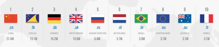
Above is a map displaying the online world, that is, each country’s size on the map represents the number of websites registered to each country code top-level domain (ccTLD). What is clear is there is a large concentration of internet activity in a small number of countries – as of June 2017 there were 302 global ccTLD, the top 10 (shown above) compose 64.8% of all ccTLD domain name registrations.
Two other things jump out from the map above:
First, why is Tokelau (.tk), a New Zealand territory in the south Pacific – a county with a population of 1,499 people – second in the world with 19.1 million domain name registrations? Tokelau has specialized in web hosting by allowing any individual or business to register any number of domain names free of charge with very minimal restrictions or oversight. These policies have lead .tk domains to have a bad reputation. According to a 2011 report by the Anti-Phishing Working Group, .tk domains were involved in ~21.5% of all phishing attacks in the second half of 2010 internet-wide.
Second, why is the .us ccTLD not among the world’s largest? The United States is such an internet world power that most of its the first websites were already registered and growing their brand on Generic top-level domains (gTLD) before ccTLD domains were developed and extended for country-specific use. Americans are more familiar with gTLDs such as: .com, .org, .net, .info, .gov, .edu, and .mil – and have been low to transfer to the ccTLD .us. To have a more accurate picture of the internet world map – as of 2017, across all gTLDs, there were 331.0 million registered domains and only considering .com, .net, .org, and .info (the top 4 gTLDs combined) there are 160.6 million registered domains. Compare that with .cn (China’s top domain) the second most used domain in the world with only 21.4 million. The graph below displays the top ten domains, both ccTLD and gTLD combined – the US has four of the top ten in the world (all gTLD).
European Union Unemployment Rate 2017
Above is a map displaying the unemployment rate for European Union member states as of May 2017. What sticks out is the slow economic recovery for the southern European states post-financial crisis, such as: Greece (with an unemployment rate of) 22.5%, Spain 17.5%, Itlay 11.3%, and Croatia 10.7%. Contrast this with the unemployment rate in the United States during the same period of 4.3%. The EU average unemployment rate stands at 7.8%, nearly twice as high of the US! An economic analysis of labor policies in most EU countries leads to this result as there is less fixability in the labor force among other factors. Despite this performance for the European Union as a whole, some countries are performing above average and are on par with the US in employment rate such as: Germany, Austria, Czech Republic, UK, Poland, and others.
Deep Learning research by country
Above is a bar chart displaying the number of research papers published each year on Deep Learning. Two trends are noticeable: One, Deep Learning/Artificial Intelligence research is on the rise across all the most advanced nations in the world and, Two, China and the US are far outpacing the nearest competitor countries. There is also an A.I. patent battle underway being waged mostly in Silicon Valley (Apple, Facebook, Google) and Seattle (Amazon, Microsoft).
(Graphics from MIT Technology Review 2017)
Political Cartoon Map, 2016
Above is a cartoon map displaying Europe’s current political climate. Trump re-writing the NATO agreement, the Baltic States pushing back Russian expansion into Eastern Europe, Britain moving further away from the EU after their Brexit vote – what else stands out to you from the map?
Total World Wealth, 2016
Wealth is a different concept than income. Income is what you earn with your labor (your job) and wealth is the assets you own minus your liabilities (or debt). Said differently, the accumulation of income and property passed from generation to generation over time is wealth. Income inequality has been growing in the United States over the past 30 years and is a hot button issue, but wealth inequality is a different and even more extreme situation – especially at the global level: The richest 1% of adults in the world hold 50% of global wealth, while the top 10% hold 85%!
The total wealth of the world is estimated to be $255 trillion dollars by Credit Suisse in 2016. Of this, $84 trillion (33%) was located in the United States. Other wealthy countries include: Japan $24 T, China $23 T, UK $14 T, Germany $12 T, and France $11 T. One way to picture this distribution is with the map above colored in three tiers – The US has 1/3 of world wealth, Japan-China-UK-Germany-France combined have 1/3 of world wealth, and the remainder of the world, some 188 countries, have 1/3 of world wealth.
What are the assets that make up this wealth? Real estate is a large fraction of the total. Numbers are difficult to find but of the $84 trillion dollars of wealth in the US, $27 T (32%) of the value was real estate (2014 estimate). Another large fraction is located in financial assets: ownership of stocks, bonds, etc. This market is also concentrated with stock exchanges in the United States or Europe representing 80% of the global allocation of mutual fund assets.
US Federal Land
The United States Federal Government controls a significant portion of the US total land – it controls 2.27 billion acres – more than 28% of the country’s total area. That figure is more than the territory of France, Spain, Germany, Poland, Italy, UK, Austria, Switzerland, The Netherlands, and Belgium combined! Further, it does not include State owned land which accounts for an additional 196 million acres pushing the combined Federal/State land ownership to approximately 35% of US total land area.
How Old is Your Country?
The map below displays countries by the median age per citizen. Germany and Japan are the world’s oldest countries with an average age of 46; Conversely, Niger and Uganda are the world’s youngest countries with an average age of 15!
This map signals the future population tends coming — Europe is the world’s oldest continent by median age has been enmeshed in economic stagnation and debt crises (likewise for Japan) — These trends are likely to persistent into the future. Africa is the world’s youngest continent and is full of potential and economic growth. The current projections are Africa’s population will double from 1 billion to 2 billion people in the next 30 years. These drastic demographic changes are likely to upheave society (and possibly governments) in the region as these energetic youngsters will reshape the status quo.