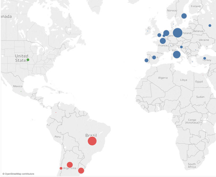
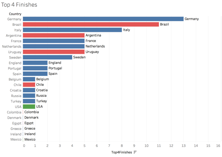
Above is map is displaying the number of top 4 finishes for each country in the World Cup (1930 – 2014). The size of the bubbles represents the number of top 4 finishes and is located in the geographic area of the country. Europe is colored blue, South America red, and North America green. This map is intended to display the concentration of top teams in Europe and South America — there has only been a few times ever that a team outside those two regions finished in the top 4. This same data is shown below in a bar chart.
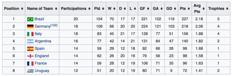
Below is the historical performance of the top 8 teams in the World Cup.
Below is FIFA’s historical ranking for countries. The FIFA world ranking formula was created in 1993 and the average ranking from then until June 2018 is shown on the third column. Brazil is the worlds top team with an average ranking of 3rd, next Germany with an average of 5th — tied with Spain and Argentina.

