G20 Trade Network
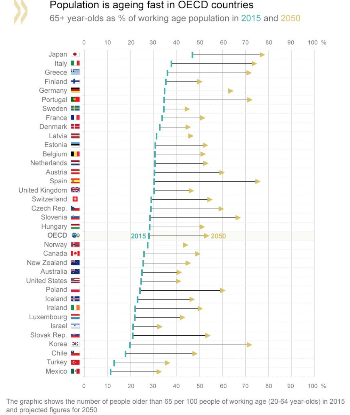
In 2015, the percentage of the population 65+ years old in OECD countries was 28%, this figure is expected to rise to over 50% by 2050. The graphic above display where each country stands or the population projects in the next 40 years. Japan, Italy, and Greece are already the oldest countries with 46%, 37%, and 35% of their population over 65 years old (in 2015), by 2050 these countries are projected to continue to lead with 78%, 75%, and 73% respectively. This is amazing to imagine. Think about it, Japan in 2050 with nearly 80% of its population over 65 years old. What will a country like that look like?
On the other end of the spectrum in the OCED – Mexico and Turkey are looking stable with only 35% and 37% of their population above 65 years old. This figure is approximately already what the average OCED country is at. The US, Canada, Australia, and New Zealand all look stable with a healthy inflow of immigrants that aid in slowing the growth in elderly people as a fraction of the overall population. Side note: South Korea is projected to undertake the most drastic population change. It is currently one of the youngest countries in the OCED, but in 40 years it will be among the oldest – moving from 19% of its population over 65 to over 70% by 2050.
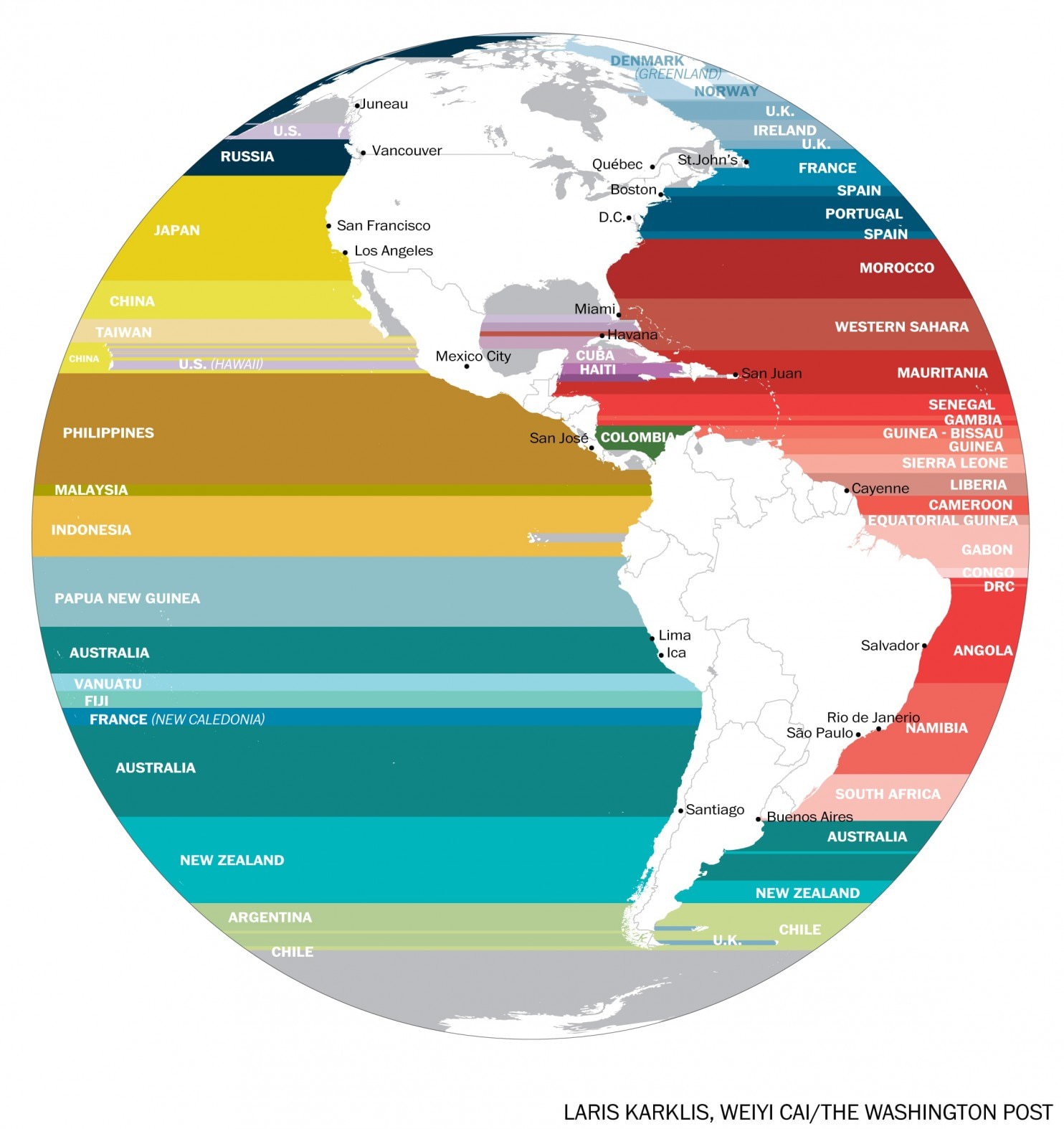
The map above displays the western hemisphere and shows with extending a horizontal line (longitudinal) which country is across the ocean from it. This is an interesting perspective from which to view the world given that these matching countries are likely to share the same climate and culture based on their position in the world. It’s amazing to see the north-south size of Africa projected onto the Americas – Its northern reach with Morocco across from (approximately) Washington DC in the United States to its southern point with South Africa across from Buenos Aires. Another stunning display is the north-south size of Japan which it the closest country to virtually the entire west coast of the US.
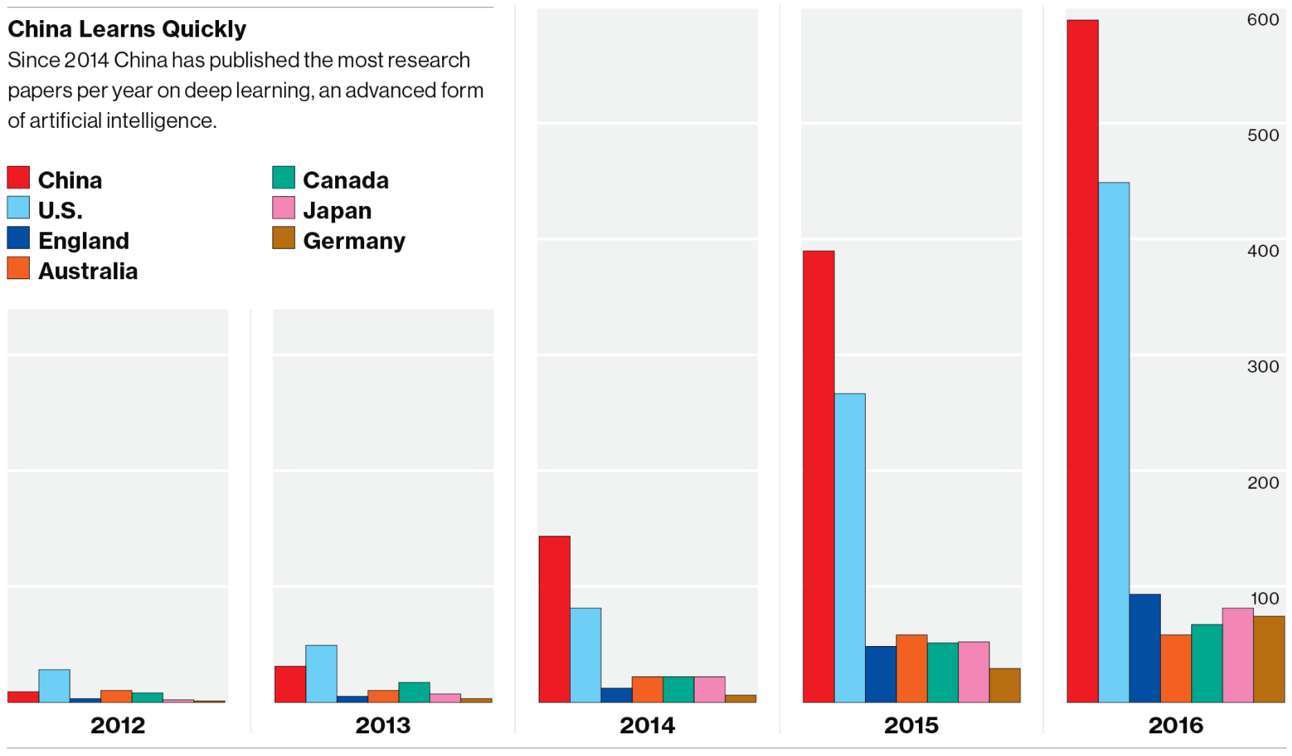
Above is a bar chart displaying the number of research papers published each year on Deep Learning. Two trends are noticeable: One, Deep Learning/Artificial Intelligence research is on the rise across all the most advanced nations in the world and, Two, China and the US are far outpacing the nearest competitor countries. There is also an A.I. patent battle underway being waged mostly in Silicon Valley (Apple, Facebook, Google) and Seattle (Amazon, Microsoft). 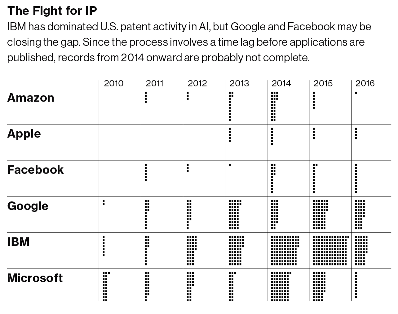
(Graphics from MIT Technology Review 2017)
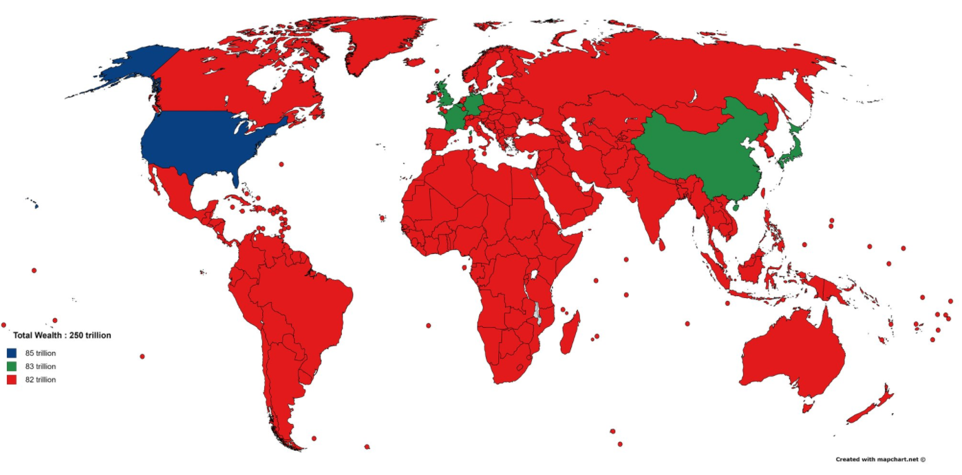
Wealth is a different concept than income. Income is what you earn with your labor (your job) and wealth is the assets you own minus your liabilities (or debt). Said differently, the accumulation of income and property passed from generation to generation over time is wealth. Income inequality has been growing in the United States over the past 30 years and is a hot button issue, but wealth inequality is a different and even more extreme situation – especially at the global level: The richest 1% of adults in the world hold 50% of global wealth, while the top 10% hold 85%!
The total wealth of the world is estimated to be $255 trillion dollars by Credit Suisse in 2016. Of this, $84 trillion (33%) was located in the United States. Other wealthy countries include: Japan $24 T, China $23 T, UK $14 T, Germany $12 T, and France $11 T. One way to picture this distribution is with the map above colored in three tiers – The US has 1/3 of world wealth, Japan-China-UK-Germany-France combined have 1/3 of world wealth, and the remainder of the world, some 188 countries, have 1/3 of world wealth.
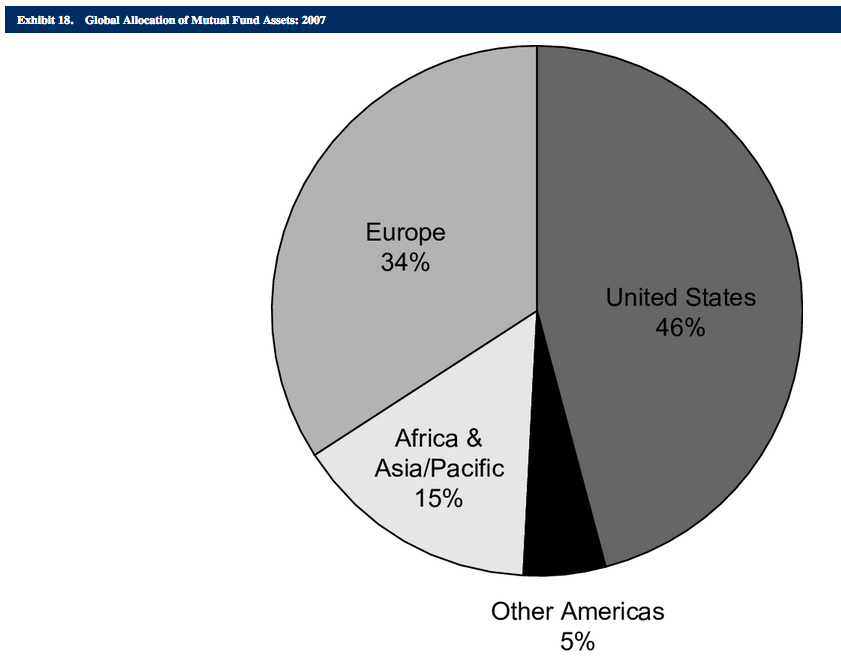
What are the assets that make up this wealth? Real estate is a large fraction of the total. Numbers are difficult to find but of the $84 trillion dollars of wealth in the US, $27 T (32%) of the value was real estate (2014 estimate). Another large fraction is located in financial assets: ownership of stocks, bonds, etc. This market is also concentrated with stock exchanges in the United States or Europe representing 80% of the global allocation of mutual fund assets.
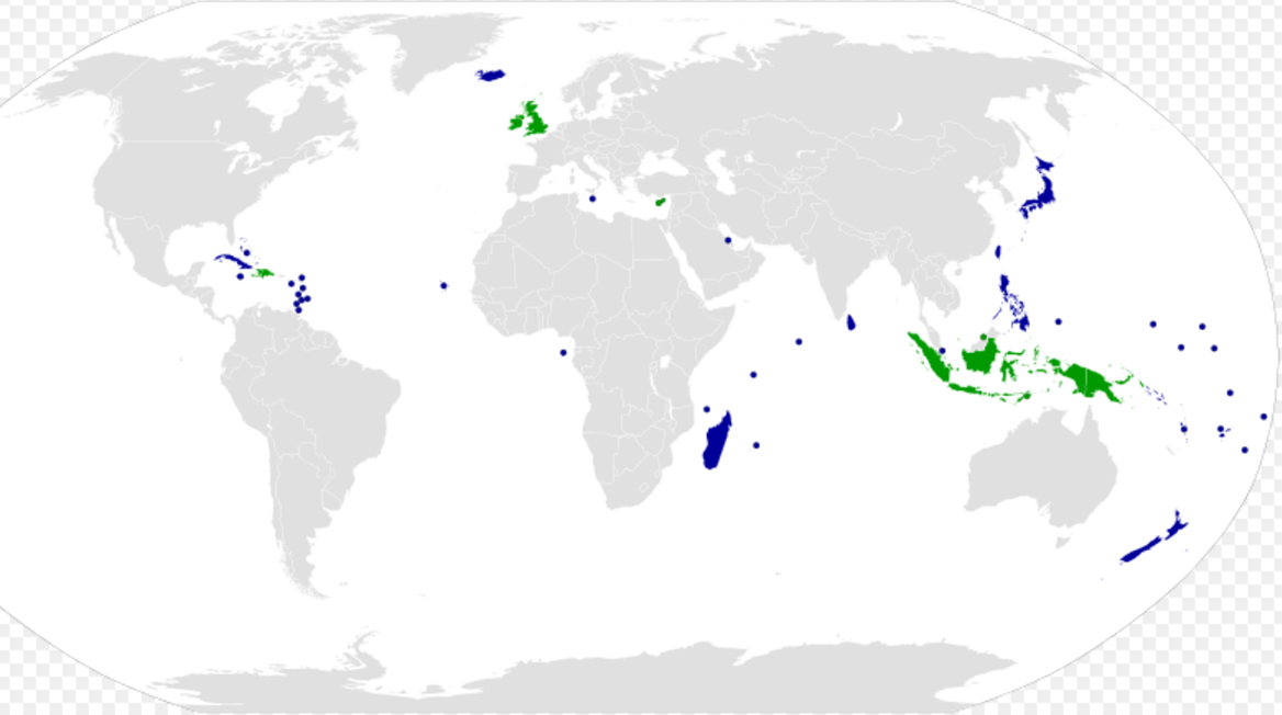
Of the 193 UN member nations, 46 are island nations. This means that nearly a quarter of the world’s sovereign countries are islands. The largest island nations by population are Indonesia (260 million), Japan (126 m), Philippines (102 m), and the United Kindom (65 m). Of the 46 island nations, 13 are in the Caribbean, 13 are in Oceania, 10 are off the coast of Asia, 6 are off the coast of Africa, and 4 are off the coast of Europe.
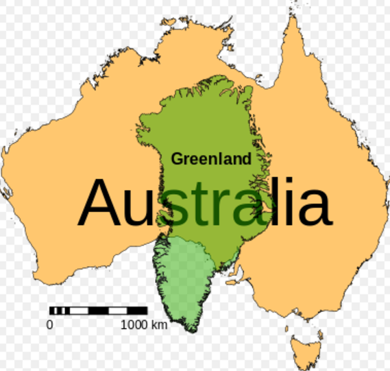
For those wondering why Australia is not considered an island due to its status as the world’s smallest continent – The size comparison below shows the world’s largest island by area (Greenland) next to Australia. Australia is 3.5 times larger than Greenland!

The chart above shows the percent of global economic power (defined as the weighted share of world GDP, trade, and net capital exports) for the top three countries in selected years ranging from 1870 to (projected) 2030. To me, the graph shows the decline in power of Britain from 1870 through 1950, the decline in power for the United States from 1950 through 2030 (although less quickly than Britain), and the rise of China from 2010 into the near future. What once was a European-centric world in the 1800’s is giving why to an East Asian-centric world in the 21 century with the rise of China and India. Side note: If the European Union is considered as a unified entity in the chart above, its scale and decline would closely match that of the US.

There are currently 7.4 billion people on earth. This number is expected to rise to 10 billion by 2080 (based on U.N. estimates). These numbers beg the question – just how many people can the planet support? And, in what regions is population growing, remaining stable, or decreasing?
The map above colors each county by the number of children a woman is expected to have on average. Virtually all of the developed nations, such as: the US, Canada, Europe (except France), Japan, etc. average somewhere between 1-2 children per woman. This rate is actually below the replacement rate (2.1 children per women) indicating that the countries (labelled in blue above) will have decreasing populations internally over the coming decades. This does not mean, however, that the country’s population will decrease, that will depend on the number of immigrates it attracts. For example, the US and Canada attract the largest number of immigrates from across the globe which continue to bolster their population despite low birth rates internally. Conversely, a country with a low birth rate and restrictive immigration will show signs of drastic population decrease as in Japan – it has one of the lowest birth rates in the world with only 1.4 children per woman and has lost population in the past decade.
On the other end of the spectrum, Africa is exploding in population. The continent today has roughly 1 billion people. This figure is expected to double to 2 billion in just 30 years! Some countries – Niger, Mali, Burundi, Somalia – average more than 6 children per woman. It will be a time of drastic demographic change in central Africa over the next generation that may threaten the stability of the region further.
Middle income countries are mostly labeled in green in the above map indicating a healthy, moderate growth in population. For example, India (the world’s 2nd most populated country) averages 2.5 children per woman and Indonesia (the world’s 4th most populated country) averages 2.2.
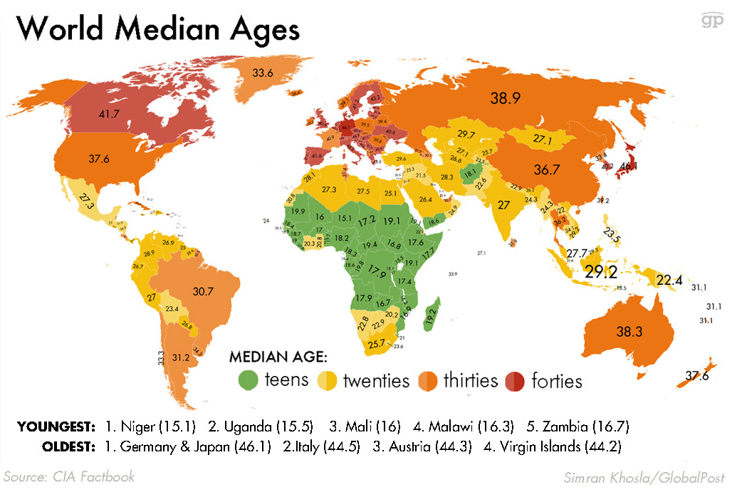
The map below displays countries by the median age per citizen. Germany and Japan are the world’s oldest countries with an average age of 46; Conversely, Niger and Uganda are the world’s youngest countries with an average age of 15!
This map signals the future population tends coming — Europe is the world’s oldest continent by median age has been enmeshed in economic stagnation and debt crises (likewise for Japan) — These trends are likely to persistent into the future. Africa is the world’s youngest continent and is full of potential and economic growth. The current projections are Africa’s population will double from 1 billion to 2 billion people in the next 30 years. These drastic demographic changes are likely to upheave society (and possibly governments) in the region as these energetic youngsters will reshape the status quo.