The World in Domain Names 2017

8ceucvu7hmlz.jpg

Screen Shot 2017-09-16 at 12.41.30 PM.png

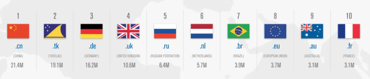
Above is a map displaying the online world, that is, each country’s size on the map represents the number of websites registered to each country code top-level domain (ccTLD). What is clear is there is a large concentration of internet activity in a small number of countries – as of June 2017 there were 302 global ccTLD, the top 10 (shown above) compose 64.8% of all ccTLD domain name registrations.

Two other things jump out from the map above:

First, why is Tokelau (.tk), a New Zealand territory in the south Pacific – a county with a population of 1,499 people – second in the world with 19.1 million domain name registrations? Tokelau has specialized in web hosting by allowing any individual or business to register any number of domain names free of charge with very minimal restrictions or oversight. These policies have lead .tk domains to have a bad reputation. According to a 2011 report by the Anti-Phishing Working Group, .tk domains were involved in ~21.5% of all phishing attacks in the second half of 2010 internet-wide.

Second, why is the .us ccTLD not among the world’s largest? The United States is such an internet world power that most of its the first websites were already registered and growing their brand on Generic top-level domains (gTLD) before ccTLD domains were developed and extended for country-specific use. Americans are more familiar with gTLDs such as: .com, .org, .net, .info, .gov, .edu, and .mil – and have been low to transfer to the ccTLD .us. To have a more accurate picture of the internet world map – as of 2017, across all gTLDs, there were 331.0 million registered domains and only considering .com, .net, .org, and .info (the top 4 gTLDs combined) there are 160.6 million registered domains. Compare that with .cn (China’s top domain) the second most used domain in the world with only 21.4 million. The graph below displays the top ten domains, both ccTLD and gTLD combined – the US has four of the top ten in the world (all gTLD).

Screen Shot 2017-09-15 at 12.24.10 AM.png

Working Class Affordability 2017

Screen Shot 2017-09-05 at 3.23.54 PM.png

The above map was created on howmuch.net (https://howmuch.net/) showing how much a working class family can save or be indebted living in various cities across the United States. The software allows you to select different criteria – such as the number of working adults in the household, how much they earn, the number of children, amount spent on food, and size of the house in square feet – the algorithm then produces a map (such as the one above) that displays where the most and least affordable places for your family to live. The size of the bubbles are a larger dark shade of red for unaffordable locations or are a larger dark shade of green for affordable locations. For example, the map above is generated for a family of four with two incomes – a home appliance repairer and a manicurist/pedicurist with a low-cost food plan living in a 1500 sq ft home. This family would need an additional $91.2K annually to afford to live in New York City or additional $83.3K to live in San Francisco. Conversely, the family could save $10.1K annually if they lived in Glendale, Arizona.

US City Commute Patterns 2008

Screen Shot 2017-09-04 at 10.47.14 PM.png

Above is a graph displaying the percentage of people that commute by public transit on the x-axis and the percentage commuting by car on the y-axis for various cities around the United States. The size of the bubble relates the workforce population of each city. There doesn’t appear to be a relationship between the size of the city’s population and the percentage of those taking public transit, but if one looks at city density a relationship is clear. Of the top 20 cities in the US by population, the highest density in order are: New York City, San Francisco, Boston, Chicago, Miami, Philadephia, and Washington DC. With exception of Miami (commute data not listed), all of top 6 highest density cities also have the highest fraction of their workforce commuting by public transit.

US Rivers by Flow

US-Rivers-flow.png

Above is a map showing the average flow in cubic feet per second for the major rivers in the United States. What is clear is how much water flows through the Mississippi River, especially after the Missouri and Ohio Rivers add to it. Staying with the rivers theme, below is a map displaying the major US rivers as if they were a subway map. Transit along these routes was common before railroads were laid coast-to-coast across the US.

SubwayRivers.png

United States Population Map

Screen Shot 2017-07-31 at 2.52.32 PM.png

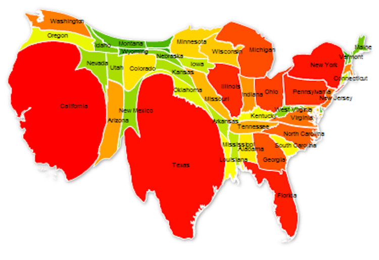
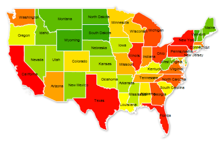
As of 2017, the United States population stands at 324 million – the third largest country in the world by population behind India and China. The population ranges across the nation from state to state, from a high of 39 million in California to a low of 585 thousand in Wyoming. The map above distorts each state’s normal area to display its relative population size. In order words, California population represents 12% of the US total and thus takes up 12% of the map, Texas 8.6%, Florida 6.3%, and so on until Wyoming with 0.18%. The states are color coded by groups of ten with the largest ten in red, the next ten in orange, then yellow, light green, and dark green. California and Texas represent 1/5th of US population and the top 5 states make up 37%. The map below is of the United States as normally displayed, with each state relative to it area.

Screen Shot 2017-07-31 at 2.52.36 PM.png

World Map 1957

WorldPowers.jpg

Above is a map of the world in 1957 with highlights displaying various country alliances – NATO/Western allies in Purple/Light Purple, USSR/Communist countries in Orange/Light Orange, and Muslum countries in Green. The map does a great job displaying the encirclement of allies the US had surrounding the USSR, known as the US’s strategy of containment (seeking to prevent the spread of communism to other countries).

Screen Shot 2017-07-24 at 10.05.16 PM.png

White Voting 2016 Election

Screen Shot 2017-07-15 at 9.31.50 PM.png

Above is a map of how non-Hispanic white men and women voted in the 2016 presidential election. Only two states voted democratic in every county – Massachusetts and Hawaii. Compare that to several states which voted Republican in every country (such as North Dakota, Oklahoma, Arkansas, etc). One interesting side note: despite the majority of white people voting Republican in Nevada (in every county) the state voted Democratic as a whole in last year’s election.

Deep Learning research by country

AI.png

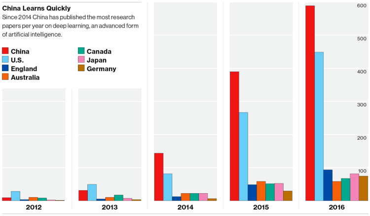
Above is a bar chart displaying the number of research papers published each year on Deep Learning. Two trends are noticeable: One, Deep Learning/Artificial Intelligence research is on the rise across all the most advanced nations in the world and, Two, China and the US are far outpacing the nearest competitor countries. There is also an A.I. patent battle underway being waged mostly in Silicon Valley (Apple, Facebook, Google) and Seattle (Amazon, Microsoft). AI2.png

(Graphics from MIT Technology Review 2017)

The US in State Highway Shields

Screen Shot 2017-06-09 at 3.16.49 PM.png

If you’re like me, you been across the US and noticed the various State Highway Marker Shields. The above map displays all of them, positioned over each state. Some have historical/social meaning (California – the shape of a shovel (as in digging for gold), Utah – a beehive (a signal of Mormonism), or Pennsylvania – a keystone, as in the Keystone state that connects the east coast to the mid-west), some are merely the outline of the state shape (Idaho, Arizona, Missouri, etc.), and some have no significance at all (Texas, Montana, Illinois, etc.). What’s your sign?

Sunset Times in Europe and America

SunsetNorthAm.png

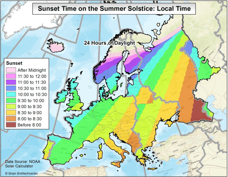
Above is a map displaying the local sunset time on the summer solstice (June 20th), the longest sunlight day of the year. Time zones are indicated by gray vertical lines. You will notice that ‘local’ sunset time will vary based upon your east-west location within your time zone and also vary depending upon your north-south location within your time zone. Said differently, areas to the northwest within their time zones will have a later local sunset time. For example, eastern Alabama (far southeast) has a local sunset time before 8:00 pm, whereas northwestern North Dakota has a local sunset time close to 10:00 pm (both are in US Central Time Zone). Some areas are so far north that, during the summer months, they experience 24 hours of daylight (and conversely, during the winter months 24 hours of darkness). The map of Europe below also displays the local sunset time on the summer solstice.

SunsetEurope.png