
The United States is bound by treaty to protect 25% of the world’s population. These defense treaties (displayed in the map above) are comprised of NATO, OAS, ANZUS, and Bilateral agreements with various countries around the world.
The United States is bound by treaty to protect 25% of the world’s population. These defense treaties (displayed in the map above) are comprised of NATO, OAS, ANZUS, and Bilateral agreements with various countries around the world.

The United States dropped 26,000 bombs on 7 countries in 2016. Above is a bar chart displaying the 7 countries – 93% of which fell on Syria and Iraq/ISIS.
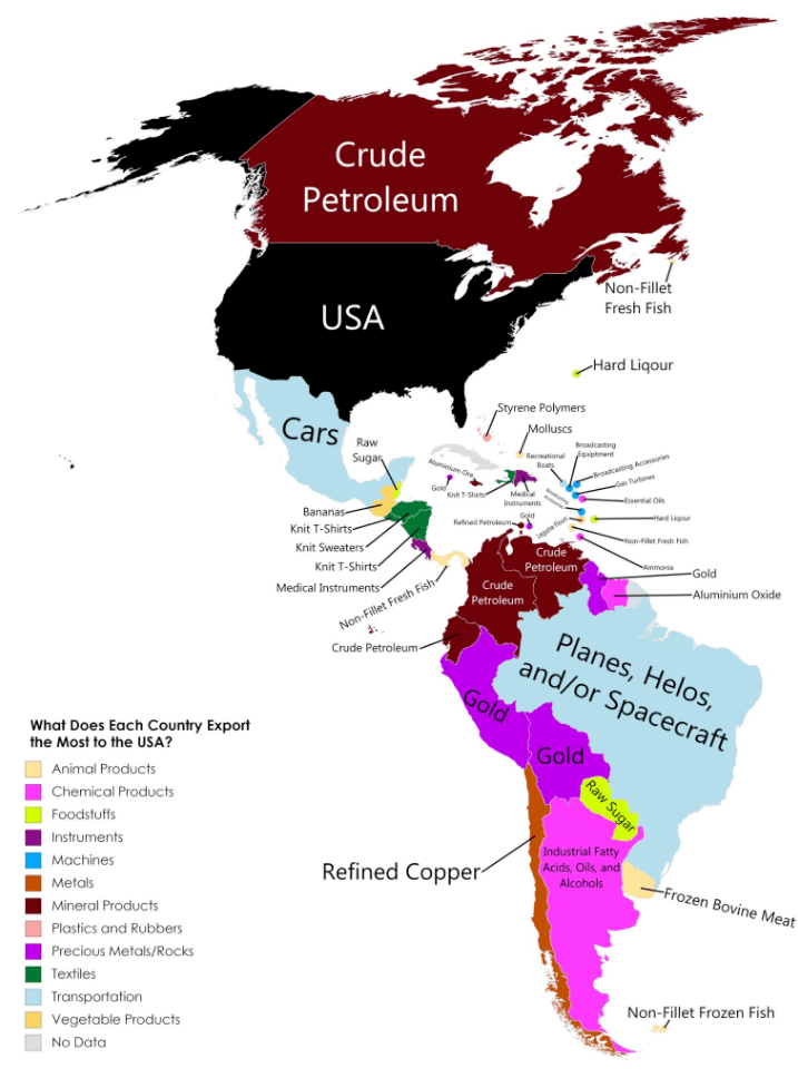
The map above displays each country in the Americas largest export to the United States. It is color coded by various categories listed in the legend. Note that Cuba is grayed out with “No Data” as the US does not trade with them due to the long-standing embargo. Latin America’s two largest economies (Brazil and Mexico) export industrial goods to the US – Planes, Spacecraft, and Cars – while most other countries in South America export natural resources (Sugar, Gold, and Oil). The Caribbean typically exports food products and textiles: bananas, fish, t-shirt, sweaters, etc.

Above is a map of Europe color-coded into three income brackets – Dark green: greater than 40k euros per capita, Light green: between 20k and 40k euros per capita, and red: less than 20k euros per capita. Note the values are calculated in Purchasing Power Standards (PPS) a metric used by Eurostat for cross-country comparisons. PPS tires to correct for cost of living and price level differences, especially among nations with different currencies. For comparison to the United States, 40k euros converts to 44k dollars (2017 prices). US GDP per capita is 55k dollars, with the highest continental state: New York at 72k USD and lowest: Mississippi at 35k USD. This means the area’s in dark green in the map above (among the highest in Europe) would rank on the lower end of US states, around 40th out of 50.
Wealth is a different concept than income. Income is what you earn with your labor (your job) and wealth is the assets you own minus your liabilities (or debt). Said differently, the accumulation of income and property passed from generation to generation over time is wealth. Income inequality has been growing in the United States over the past 30 years and is a hot button issue, but wealth inequality is a different and even more extreme situation – especially at the global level: The richest 1% of adults in the world hold 50% of global wealth, while the top 10% hold 85%!
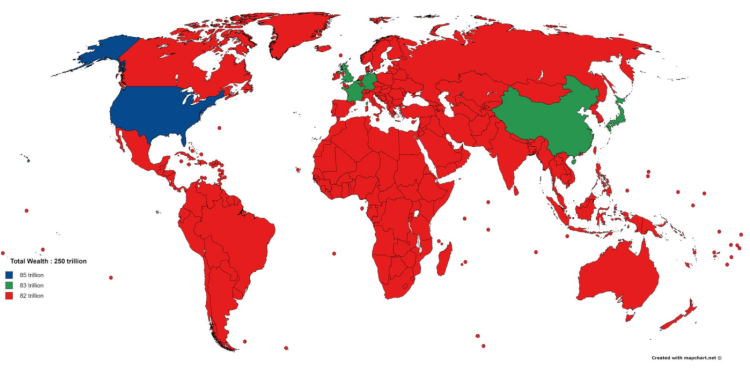
The total wealth of the world is estimated to be $255 trillion dollars by Credit Suisse in 2016. Of this, $84 trillion (33%) was located in the United States. Other wealthy countries include: Japan $24 T, China $23 T, UK $14 T, Germany $12 T, and France $11 T. One way to picture this distribution is with the map above colored in three tiers – The US has 1/3 of world wealth, Japan-China-UK-Germany-France combined have 1/3 of world wealth, and the remainder of the world, some 188 countries, have 1/3 of world wealth.
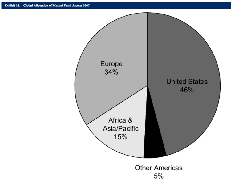
What are the assets that make up this wealth? Real estate is a large fraction of the total. Numbers are difficult to find but of the $84 trillion dollars of wealth in the US, $27 T (32%) of the value was real estate (2014 estimate). Another large fraction is located in financial assets: ownership of stocks, bonds, etc. This market is also concentrated with stock exchanges in the United States or Europe representing 80% of the global allocation of mutual fund assets.
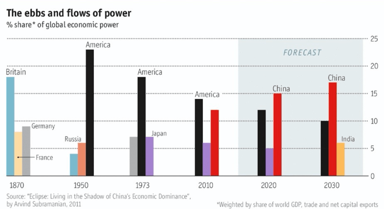
The chart above shows the percent of global economic power (defined as the weighted share of world GDP, trade, and net capital exports) for the top three countries in selected years ranging from 1870 to (projected) 2030. To me, the graph shows the decline in power of Britain from 1870 through 1950, the decline in power for the United States from 1950 through 2030 (although less quickly than Britain), and the rise of China from 2010 into the near future. What once was a European-centric world in the 1800’s is giving why to an East Asian-centric world in the 21 century with the rise of China and India. Side note: If the European Union is considered as a unified entity in the chart above, its scale and decline would closely match that of the US.

The map on the left displays the Hispanic percentage for each US state in 1940. Contrast that with the map on the right displaying the Hispanic percentage for each US state in 2010. The Hispanic population in 1940 was mostly concentrated in the southwest border states of Arizona, New Mexico, and Texas, but over the next 70 years, migration and birth rates spread the population throughout the entire southwest, west coast, and major cities on the east coast. New Mexico continues to be the US state with the highest concentration of Hispanic population with 41% in 1940 to 46% in 2010. Nationwide the Hispanic population has increased dramatically over the past 70 years – from around 1.4% in 1940 to 16.3% in 2010!

The map on the left displays the African American percentage for each US state in 1910. Contrast that with the map on the right displaying the African American percentage for each US state in 2010. The African American population in 1910 was very concentrated in the southeast, but over the next 100 years migration spread up the east coast and into the midwest – this distributing the population more evenly in the eastern half of the US. It is interesting to note that every state in the western US (was in 1910 and remains to be in 2010) below the national average in African American population. Mississippi continues to be the US state with the highest concentration of American Americans but has decreased from 56% in 1910 to 37% in 2010. Nationwide the African American population has remained stable over the past 100 years -from around 10.7% in 1910 to 12.6% in 2010.
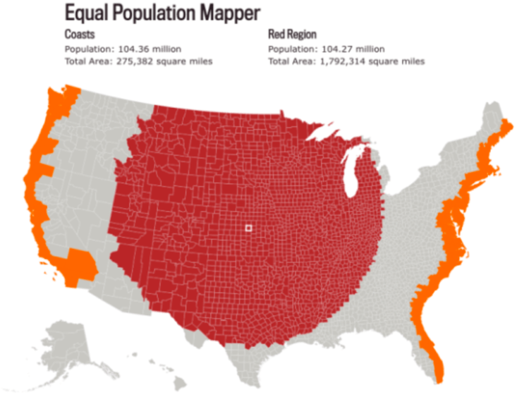
Above is a map comparing the population all of the United States coastal counties (counties boarding the Atlantic or Pacific Oceans) to the same population of counties from mid-point of the US spreading out. The map above has equal population – 104 million to 104 million. The area (in square miles) of the middle counties is 6.5 times the area of the coastal counties.

It’s informative to display how small of the country, by area, Hilary Clinton won in the 2016 Presidental Election. Above is a map of the regions of the country Hilary won (Clinton Islands) and below is the area of the country Trump won (Trumpland). Given the area difference alone, it appears that Trump won in a landslide, however, in fact, he lost the popular vote by more than 2% to Clinton! This is due to the large differences in population density each candidate won – put simply, Clinton won in the cities and Trump won in the rural areas. The highest percentage Trump supporting region was the central plans while the largest Clinton supporting regions were the San Francisco Bay Area and eastern seaboard running from Washington DC to Boston.

