United States Population Map

Screen Shot 2017-07-31 at 2.52.32 PM.png

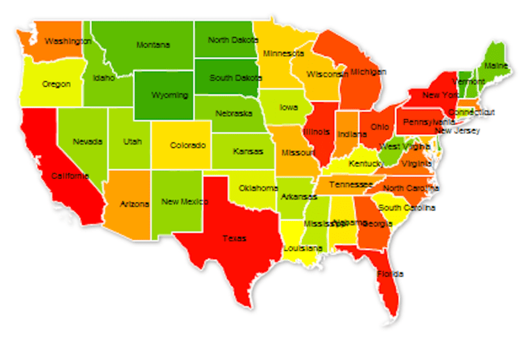
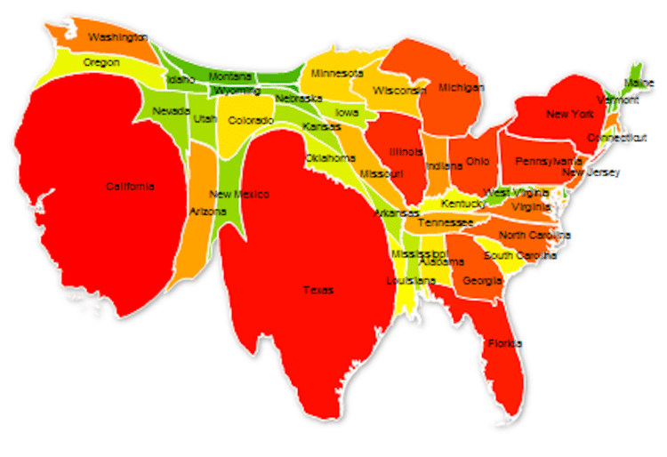
As of 2017, the United States population stands at 324 million – the third largest country in the world by population behind India and China. The population ranges across the nation from state to state, from a high of 39 million in California to a low of 585 thousand in Wyoming. The map above distorts each state’s normal area to display its relative population size. In order words, California population represents 12% of the US total and thus takes up 12% of the map, Texas 8.6%, Florida 6.3%, and so on until Wyoming with 0.18%. The states are color coded by groups of ten with the largest ten in red, the next ten in orange, then yellow, light green, and dark green. California and Texas represent 1/5th of US population and the top 5 states make up 37%. The map below is of the United States as normally displayed, with each state relative to it area.

Screen Shot 2017-07-31 at 2.52.36 PM.png

World Map 1957

WorldPowers.jpg

Above is a map of the world in 1957 with highlights displaying various country alliances – NATO/Western allies in Purple/Light Purple, USSR/Communist countries in Orange/Light Orange, and Muslum countries in Green. The map does a great job displaying the encirclement of allies the US had surrounding the USSR, known as the US’s strategy of containment (seeking to prevent the spread of communism to other countries).

Screen Shot 2017-07-24 at 10.05.16 PM.png

White Voting 2016 Election

Screen Shot 2017-07-15 at 9.31.50 PM.png

Above is a map of how non-Hispanic white men and women voted in the 2016 presidential election. Only two states voted democratic in every county – Massachusetts and Hawaii. Compare that to several states which voted Republican in every country (such as North Dakota, Oklahoma, Arkansas, etc). One interesting side note: despite the majority of white people voting Republican in Nevada (in every county) the state voted Democratic as a whole in last year’s election.

Deep Learning research by country

AI.png

Above is a bar chart displaying the number of research papers published each year on Deep Learning. Two trends are noticeable: One, Deep Learning/Artificial Intelligence research is on the rise across all the most advanced nations in the world and, Two, China and the US are far outpacing the nearest competitor countries. There is also an A.I. patent battle underway being waged mostly in Silicon Valley (Apple, Facebook, Google) and Seattle (Amazon, Microsoft). AI2.png

(Graphics from MIT Technology Review 2017)

The US in State Highway Shields

Screen Shot 2017-06-09 at 3.16.49 PM.png

If you’re like me, you been across the US and noticed the various State Highway Marker Shields. The above map displays all of them, positioned over each state. Some have historical/social meaning (California – the shape of a shovel (as in digging for gold), Utah – a beehive (a signal of Mormonism), or Pennsylvania – a keystone, as in the Keystone state that connects the east coast to the mid-west), some are merely the outline of the state shape (Idaho, Arizona, Missouri, etc.), and some have no significance at all (Texas, Montana, Illinois, etc.). What’s your sign?