Job Tenure by Cohort

POST_JobGeneration.png

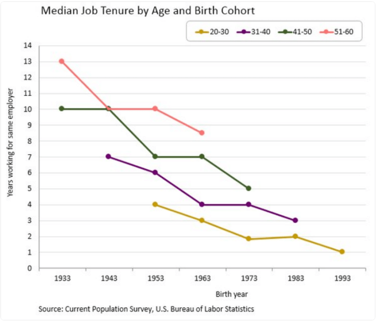
Above is a graphic displaying the number of years working for the same employer relative to birth year. What is clear is that over time, people are working for the same employer for less years on average. This trend is consistent across all age brackets. The change is quite stark, the average worker born in 1933 stayed with the same employer for 13 years, a worker born in 1943 for 10 years, and for someone born in 1993 only one year on average. The takeaway, the workforce is becoming more dynamic and workers in the 21st century economy can expect to work for ten or more employers over the course of their career.

Gay Marriage Percentage by State

Gas marriage heat map.png

Above is heat map displaying same-sex marriage as a percent of all marriages in each three-digit zip code area. The darker the color, the higher percentage of same-sex marriages. Below is a bar-chart displaying results at the state level (Only the top 25 states by population are shown). The number displayed is the percentage of same-sex marriages relative to all marriages in the state. Only 7 of the 25 states have a percentage above the national average of 0.35%. They are: Massachusetts, Washington, California, New York, Maryland, Minnesota, and Arizona.

Gay marriage % for top 25 states.png

US County Population

Screen Shot 2016-09-12 at 3.05.08 PM.png

The United States has 3007 counties. The top 100 by population (3.3% of counties) have a total of 129 million people (40% of US population). The map above displays these top 100 – those colored orange are counties with more than 1 million people and those colored green have less than 1 million people. The cut-off population to be in the top 100 is 626,000 people. There are 39 counties with more than 1 million people and only 14 with more than 2 million people. A third of US States do not have one county in the top 100 and only 14 States have at least one county over 1 million people – CA: 9, NY: 7, TX: 5, FL: 5, PA/OH/MI: 2 each, IL/AZ/WA/NV/MA/VA/UT: 1 each.

United States GDP

In the United States only 2 percent of the land area produces 50 percent of the GDP. These areas (cities) are displayed on the map below. Displaying GDP production this way makes clear how, even if GDP for the country is increasing, it may only have a positive effect on a small part of the country. Disparities like this are common globally also – 54% of the world’s GDP is produced on just 10% of the land.

US Econ activity.png

US Federal Land

Screen Shot 2015-01-29 at 8.44.26 PM.png

The United States Federal Government controls a significant portion of the US total land – it controls 2.27 billion acres – more than 28% of the country’s total area. That figure is more than the territory of France, Spain, Germany, Poland, Italy, UK, Austria, Switzerland, The Netherlands, and Belgium combined! Further, it does not include State owned land which accounts for an additional 196 million acres pushing the combined Federal/State land ownership to approximately 35% of US total land area.

Screen Shot 2016-08-28 at 10.44.33 PM.png

US And Europe Size

US, Europe size.png

The map above projects western and central Europe on top of a map of the United States. The European Union has 510 million people people living within a territory of 4,324,782 square km. Compare that to the Unites States with a population of 324 million people living within 9,883,517 square km of territory – the US is more than twice as big as the EU in area with only 2/3 its population.

What can be inferred from the numbers above is the population density between two areas. The EU has a population density of 304 people per square mile (almost as much as China at 370). Compare that the US with a population density of only 85 people per square mile! The world average population density is 140 people per square mile – if the US increases in population enough meet the world average, it’s population would increase to 530 million people. If the US ever become as densely populated as Europe, its population will swell to over 1.1 billion people – almost as much as present day China!

Tech Company Age

Facebook, LinkedIn, and Salesforce are tech companies with the youngest median employees age, each below 30 years old. Compare that to older tech companies (both in terms of company age and employee age) such as IBM, Oracle, and HP – each with median employee ages older than 37 years.

POST_TechAge.png

Anatomy of Mass Shootings

POST_Mass shootings.png

If you are involved in a mass shooting (defined as gun related death of four or more people) the event will most likely have the following statistics: It will take place at your workplace (49%), will be from a white (59%) male (96%) that will have prior signs of mental illness (45%) and the weapon will have been obtained legally (79%) of the time.