Deep Learning research by country

AI.png

Above is a bar chart displaying the number of research papers published each year on Deep Learning. Two trends are noticeable: One, Deep Learning/Artificial Intelligence research is on the rise across all the most advanced nations in the world and, Two, China and the US are far outpacing the nearest competitor countries. There is also an A.I. patent battle underway being waged mostly in Silicon Valley (Apple, Facebook, Google) and Seattle (Amazon, Microsoft). AI2.png

(Graphics from MIT Technology Review 2017)

The US in State Highway Shields

Screen Shot 2017-06-09 at 3.16.49 PM.png

If you’re like me, you been across the US and noticed the various State Highway Marker Shields. The above map displays all of them, positioned over each state. Some have historical/social meaning (California – the shape of a shovel (as in digging for gold), Utah – a beehive (a signal of Mormonism), or Pennsylvania – a keystone, as in the Keystone state that connects the east coast to the mid-west), some are merely the outline of the state shape (Idaho, Arizona, Missouri, etc.), and some have no significance at all (Texas, Montana, Illinois, etc.). What’s your sign?

Sunset Times in Europe and America

SunsetNorthAm.png

Above is a map displaying the local sunset time on the summer solstice (June 20th), the longest sunlight day of the year. Time zones are indicated by gray vertical lines. You will notice that ‘local’ sunset time will vary based upon your east-west location within your time zone and also vary depending upon your north-south location within your time zone. Said differently, areas to the northwest within their time zones will have a later local sunset time. For example, eastern Alabama (far southeast) has a local sunset time before 8:00 pm, whereas northwestern North Dakota has a local sunset time close to 10:00 pm (both are in US Central Time Zone). Some areas are so far north that, during the summer months, they experience 24 hours of daylight (and conversely, during the winter months 24 hours of darkness). The map of Europe below also displays the local sunset time on the summer solstice.

SunsetEurope.png

United States Climate Alliance

Screen Shot 2017-07-24 at 9.47.15 PM.png

Even though President Trump withdrew the United States Federal Government from the Paris Agreement on Climate Change, it doesn’t prevent US States or cities from continuing to uphold the agreement. So far, 13 states have committed to Paris Agreement and ~300 cities (including the all of the top 10 largest cities: NYC, LA, Chicago, Houston, Phoenix, Philadelphia, San Antonio, San Diego, Dallas, and San Jose). The map above displays the US states that are currently still in the Paris agreement in blue and the states considering joining the group in green. This group (in blue) made up 32.3% of the US population and 37.6% of US GDP in 2016. Roughly speaking, it can be said that 1/3 of the United States is still part of the Paris Agreement on Climate Change. The map below displays the cities in the agreement (in red) and the USCA in green (as of June 1).

Screen Shot 2017-07-24 at 9.50.03 PM.png

US defense pacts

The US is bound by treaty to protect a quarter of humanity.png

The United States is bound by treaty to protect 25% of the world’s population. These defense treaties (displayed in the map above) are comprised of NATO, OAS, ANZUS, and Bilateral agreements with various countries around the world.

Country Exports to the US

US imports from Americas.png

The map above displays each country in the Americas largest export to the United States. It is color coded by various categories listed in the legend. Note that Cuba is grayed out with “No Data” as the US does not trade with them due to the long-standing embargo. Latin America’s two largest economies (Brazil and Mexico) export industrial goods to the US – Planes, Spacecraft, and Cars – while most other countries in South America export natural resources (Sugar, Gold, and Oil). The Caribbean typically exports food products and textiles: bananas, fish, t-shirt, sweaters, etc.

China’s Population Density

Screen Shot 2017-04-12 at 9.37.57 AM.png

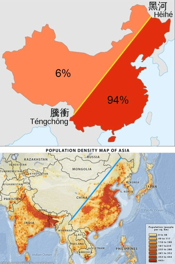
Only about 30 percent of China’s landmass is habitable with approximately 40% of it’s land covered by mountains (in the southwest) and an additional 25% deserts (in the northwest). The maps above display that 94% of China’s population lives on the eastern side of it’s territory. The map below displays the location of China’s deserts and arid regions.

China and India make of 40% of the world’s population and although this figure seems strikingly high, estimates from 1 AD indicate the China and India combined for 60% percent of world population back then! Anyone who has visited either country is aware that both have very high population density. For comparison, world population density is 140 people per square mile – India is about 10 times that with 1008 people per square mile (ppsm) and China is 370 ppsm. Given what we know about the geography of China, this density estimate is quite low and once discounting it’s uninhabitable land, China’s density is more around 1233 ppsm. (Given that about 25% of India’s land is uninhabitable, a more direct comparison would put India density at 1344 ppsm). For those interested, here is the population density for some other countries: European Union (UK included) 304 ppsm, United States 85 ppsm, Brazil 62 ppsm, Russia 21 ppsm, and Canada 9 ppsm.

Screen Shot 2017-04-14 at 2.59.30 PM.png

Expansion of Russia

Screen Shot 2017-03-20 at 12.45.13 PM.png

Russia is the world’s largest country in area with nearly 11% of the world’s landmass. This area is approximately the size of the United States and Canada combined! It is a transcontinental country with territory extending into Europe and Asia. In fact, its Asian land portion alone makes it the largest country in Asia and its European land portion alone makes it the largest country in Europe! Above is a map displaying the expansion of Russian territory from 1613 to 1914. Despite all this growth in territory over the years, approximately 80% of Russia’s population still lives in the Green or Yellow portions on the map above (territory Russia controlled dating back to 1613).

Netflix Subscription Growth

Screen Shot 2017-01-22 at 8.30.49 PM.png

The subscription growth of Netflix over the past 5 has been stunning, especially when you consider the performance of its competitor: cable. As of the fourth quarter in 2016, Netflix now has more subscribers than total cable subscribers – growing from under 25 million in 2012 to nearly 50 million by 2016. Note that these figures only include US domestic subscribers, not global users. Global subscribers are expected to rise as Netflix expanded into new markets in Africa, Asia, and Eastern Europe (pictured in the graphic below). It seems that people are not watching less TV, rather watching it through a different and more mobile friendly medium.

Netflix and the world.png

Historic Economic Power

Screen Shot 2017-02-18 at 2.04.02 PM.png

The chart above shows the percent of global economic power (defined as the weighted share of world GDP, trade, and net capital exports) for the top three countries in selected years ranging from 1870 to (projected) 2030. To me, the graph shows the decline in power of Britain from 1870 through 1950, the decline in power for the United States from 1950 through 2030 (although less quickly than Britain), and the rise of China from 2010 into the near future. What once was a European-centric world in the 1800’s is giving why to an East Asian-centric world in the 21 century with the rise of China and India. Side note: If the European Union is considered as a unified entity in the chart above, its scale and decline would closely match that of the US.